
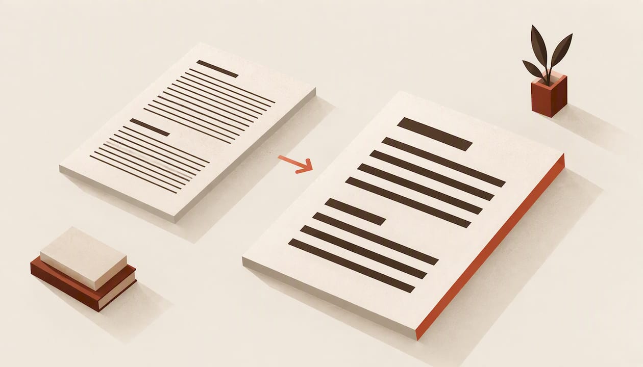
Large print formatting means rebuilding your book's interior for readers with low vision: bigger, bolder type, open spacing, left-aligned text, generous margins and high contrast. It is not a zoom setting. Enlarging a standard layout breaks line endings, pushes headings onto the wrong pages and produces a file that is harder to read, not easier. This guide gives you the specs, the trade-offs in page count and cost, and a preflight routine you can run before you upload.
Key takeaways
- Use at least 18-point type, preferably 20-point, in a clear sans-serif face, left-aligned, with at least 1.5 line spacing.
- Skip italics. Use underlining on a single word, or another non-italic method, for emphasis.
- Expect 1.5 to 2 times the pages of a standard edition, which raises print cost and changes your trim and pricing decisions.
- Label the edition as large print in your metadata and on the cover so readers can find it.
- Validate the file before publishing: check widows and orphans, margins, trim size and contrast on a proof, not just on screen.
Table of Contents
- What large print formatting actually changes
- Type size and typeface
- Spacing, alignment and margins
- Contrast, paper and images
- Page count, trim size and cost
- Labeling and discoverability
- What about large print ebooks?
- Our perspective
- Run a preflight before you publish
- Format your large print edition with Alhora
- FAQ
- Sources
What large print formatting actually changes
A standard paperback interior is designed around density. Small type, tight leading and justified text fit an 80,000-word novel into a manageable page count. A large print interior reverses every one of those choices. The goal is legibility for readers who may be using the last of their usable vision, so every layout decision answers one question: does this make the line easier to find and follow?
That is why large print is a separate edition, not a font-size change. Pagination, running heads, chapter openings, front matter and the cover spine all shift once the text grows. Treat it as a second interior built from the same manuscript.
The guidance in this article comes mainly from the Best Practices and Guidelines for Large Print Documents, a U.S. professional resource, and from research on low-vision reading. It was written for documents in general, so apply it with judgment to book-length fiction and nonfiction. Where a publisher, retailer or printer gives you stricter numbers, follow theirs.
Type size and typeface
Size
The guidelines recommend at least 18-point type, and preferably 20-point. That is well above the 10 to 12 points common in trade paperbacks. If you are starting from a standard book, expect to scale body text by roughly 60 to 100 percent.
Headings must stay clearly larger than body text, so a 20-point body implies chapter titles and subheads well above that. Page numbers and running heads should scale up too. A tiny folio on a large print page defeats the purpose.
Typeface
The same guidelines recommend bold sans-serif, mono or fixed-space type, and name Arial, Verdana and Helvetica as examples. The research behind this is consistent: APH's review of accessible testing reports that readers with low vision read wide-bodied sans-serif fonts faster and with better comprehension than variable-spaced serif fonts.
This surprises many novelists, who expect a serif to feel more like a book. For this audience, function wins. Choose a face with open letterforms, clear differences between similar characters (I, l, 1; O, 0) and sturdy strokes. Avoid light weights, condensed widths and decorative display faces for anything but, at most, a short chapter title.
If your standard edition uses one font for body and another for headings, you can keep that structure. Make sure both are legible at the size you pick, and test the pairing on a printed proof.
Emphasis without italics
The guidelines state that italics are not acceptable for low-vision readers, while underlining an individual word is an acceptable way to emphasize it. This matters for fiction, where italics carry thoughts, titles, foreign words and stress. Plan a replacement convention before you format: underline for stress, quotation marks for thoughts or titles where the sense allows, and plain text where the italic added little. Apply it consistently across the whole book and, for a series, across every volume.
Spacing, alignment and margins
The spacing rules are where most home-made large print editions fail.
| Element | Large print setting |
|---|---|
| Body type | 18-point minimum, 20-point preferred |
| Typeface | Bold sans-serif or fixed-space |
| Alignment | Blocked, left-aligned paragraphs |
| Line spacing | At least 1.5 |
| Between paragraphs | Double spacing |
| Margins | At least 0.75 inch |
| Emphasis | No italics; underline single words |
| Widows and orphans | Eliminated |
All of these figures come from the large print guidelines. The guidelines specify the 0.75-inch margin as the minimum needed to accommodate page numbers, so treat it as a floor. In a bound book, the gutter needs more than the outer margin, because text near the spine curves away from the reader.
Left-aligned, not justified
Justified text creates uneven word spaces and rivers, which are punishing at large sizes and for low-vision readers. Use ragged-right text. We cover the reasoning in ragged right versus justified: justification suits conventional print because hyphenation and fine spacing control hide the gaps, but at 18 points on a narrow measure those controls have little room to work.
Line spacing
Set line spacing to at least 1.5. Looser leading helps readers return from the end of one line to the start of the next without losing their place. It also costs pages, which is the trade-off we discuss below. Our note on book line spacing shows how much a small leading change moves the page count, and that applies in reverse when you open it up.
Paragraph breaks
The guidelines call for blocked paragraphs with double spacing between them, instead of first-line indents. For a novel this changes the look of the page, but it gives the eye a clear landing point. Avoid mixing the two styles.
Margins
Start from 0.75 inch, then check your gutter against the final page count. Our guide to book margin sizes explains how to calculate them. It is written around UK practice, but the principle is the same: the thicker the book, the more gutter you need.
Widows and orphans
The guidelines also say to eliminate widows and orphans. At large sizes a single stranded line is very visible and breaks the reading rhythm. Turn on widow and orphan control, then still review every page. Chapter ends and page breaks near headings are where problems survive automatic rules.
Contrast, paper and images
Use high visual contrast: solid black text on a white or very light page. Avoid gray body text, tinted backgrounds behind type and text over images. The guidelines also recommend matte or dull paper, since glare from glossy stock makes reading harder. If you print through a POD service, choose the uncoated option it offers rather than a coated stock, and order a proof to confirm how it looks under normal room lighting.
For graphs, charts and pictures, isolate each on its own page with an explanatory caption. For a nonfiction book with figures, this means planning the page flow so a figure never competes with body text on the same spread. For fiction, it mostly affects maps, family trees and ornaments. Keep ornaments simple and high contrast, or drop them.
Page count, trim size and cost
The cost of large print comes down to paper. According to a print-on-demand guide, large print novels can run 1.5 to 2 times the pages of a standard novel, which raises per-unit cost in proportion, and they often sell at a higher retail price. A 300-page standard novel could become 450 to 600 pages.

Trim size interacts with this. A larger page holds more words and trims the page count, but on Amazon there is a limit to watch. Amazon KDP's trim size help classifies books wider than 6.12 inches or taller than 9 inches as large trim, which carries higher printing costs than regular trim. Choosing something like 6 x 9 inches keeps you out of that bracket, while choosing a bigger size trades a lower page count against the higher per-page rate.
Before you commit, work through this sequence:
- Format the interior at your target type size and spacing on a regular trim.
- Note the page count.
- Repeat on the next trim size up.
- Compare printing cost for both using the retailer's or printer's own calculator.
- Set your list price from the real unit cost, with your royalty goal in mind.
- Check the final page count against the printer's binding limits before you order.
Very long books may need splitting into two volumes. If you do, keep the series information consistent across editions, as described in our guide to series metadata in EPUB.
Labeling and discoverability
A large print edition that readers cannot find does not help anyone. IBPA's guidance on large print production and discoverability advises stating large print explicitly in your book metadata and adding a large print badge to the cover, a designation recognized by ONIX standards.
In practice:
- Put "Large Print" in the edition field or subtitle where the retailer allows it.
- Add the large print badge to the front cover so a shopper or librarian sees it at a glance.
- Use a separate ISBN for the large print edition, since it is a different product from your standard paperback. Confirm the requirement with your ISBN agency or retailer.
- Keep title, author name and series data identical across editions so retailers can link them.
Our article on getting book metadata right covers the fields in detail. When you plan the release itself, a book launch checklist helps you schedule the labeling, proofing and promotion work so the large print edition does not trail the standard one by months.
What about large print ebooks?
Most ebook readers already let the reader change type size, so you do not hard-code a large size in the EPUB. Your job is to make the file respond well: use real text, not images of text, set sizes in relative units, and give the reader's device control of the font. That keeps the layout intact when someone scales it up. Our EPUB accessibility checklist covers the structure, navigation and metadata that make a file work for readers with low vision. The print large print edition and the accessible EPUB are complementary: some readers prefer paper, others prefer a screen they can resize.
Our perspective
We build Alhora for authors who want a professional finish without turning into typesetters, and large print is where that goal gets tested. The rules are not complicated, but there are many of them, and they interact. Change the type size and your page count, gutter, widow control and running heads all move with it.
That is why we think the right approach is validation, not memory. A formatting tool should tell you while you work when a margin is too thin for the final page count, when a line is stranded at the top of a page, or when a trim size crosses a retailer's cost threshold. Alhora checks trim, bleed and gutter, handles widows and orphans, supports custom fonts and includes a proof simulator so you can see the page before you pay for a printed copy.

We also hold a firm line on AI. Our assistant, Inkia, flags issues and never writes or alters your creative content. A large print edition is the same book, in your words, made easier to read. Nothing about the accessibility work should touch your voice.
If you are producing large print for the first time, our advice is simple: build one chapter first, print a proof, and put it in front of an actual low-vision reader before you format the other thirty. Their reaction is worth more than any spec sheet.
— James
Run a preflight before you publish
The open question for most authors is how to check a large print file for problems before it goes to print. There is no single official large print validator for interiors, so build a routine from the specs above:
- Type. Confirm body text is 18 points or larger and that headings, folios and captions are scaled to match.
- Face and emphasis. Search the file for italics and replace them with your chosen convention.
- Alignment. Verify all body text is left-aligned with no justified blocks hiding in front matter or quotes.
- Spacing. Check line spacing of at least 1.5 and double spacing between paragraphs.
- Margins and gutter. Confirm at least 0.75 inch everywhere and a gutter suited to the final page count.
- Widows and orphans. Page through the whole book looking for single stranded lines.
- Images. Make sure each figure sits on its own page with a caption.
- Trim and cost. Re-check trim against the retailer's large trim threshold and recalculate the unit cost.
- Metadata. Confirm the edition is labeled large print and the cover carries the badge.
- Proof. Order a printed copy on matte paper and read it in ordinary room light.
If you publish through Amazon, our KDP book formatting page walks through the ebook and paperback setup.
Format your large print edition with Alhora
Alhora is a book formatting studio for Mac, Windows, Linux and ChromeOS. You set type, spacing and margins, validate the layout against publishing standards as you work, and export print-ready PDFs and EPUBs for KDP, IngramSpark, Draft2Digital, Apple Books, Kobo and Google Play. The license is £99 one-off. If you work on a Mac, start with book formatting software for Mac, or see the Windows version.
FAQ
What is the best font size for large print?
The large print guidelines recommend at least 18-point type, and preferably 20-point. Pair it with a bold sans-serif face such as Arial, Verdana or Helvetica. Check whether your retailer or printer sets its own minimum before you finalize.
Can I just enlarge my standard book file?
Not reliably. Scaling the text alone leaves justified alignment, tight leading, italics and thin margins in place, and it shifts every page break. Rebuild the interior with large print settings and review the pagination page by page.
Does large print cost more to produce?
Yes, mainly through printing. Large print novels can run 1.5 to 2 times the pages of a standard edition, which raises the unit cost proportionally, and these editions often sell at higher prices. Trim size also matters, because KDP charges more for large trim books.
How do I make readers find my large print edition?
Label it clearly. State large print in the book metadata and put a large print badge on the cover, which ONIX standards recognize. Keep the title and author data matched to your standard edition.
Sources
- Best Practices and Guidelines for Large Print Documents
- Making Tests Accessible for Students with Visual Impairments (APH, 2009)
- Set Trim Size, Bleed, and Margins (Amazon KDP)
- Novel Printing guide
- Increasing Accessibility in Publishing with Large Print (IBPA)
- 12 Week Book Launch Checklist for Self Publishers