
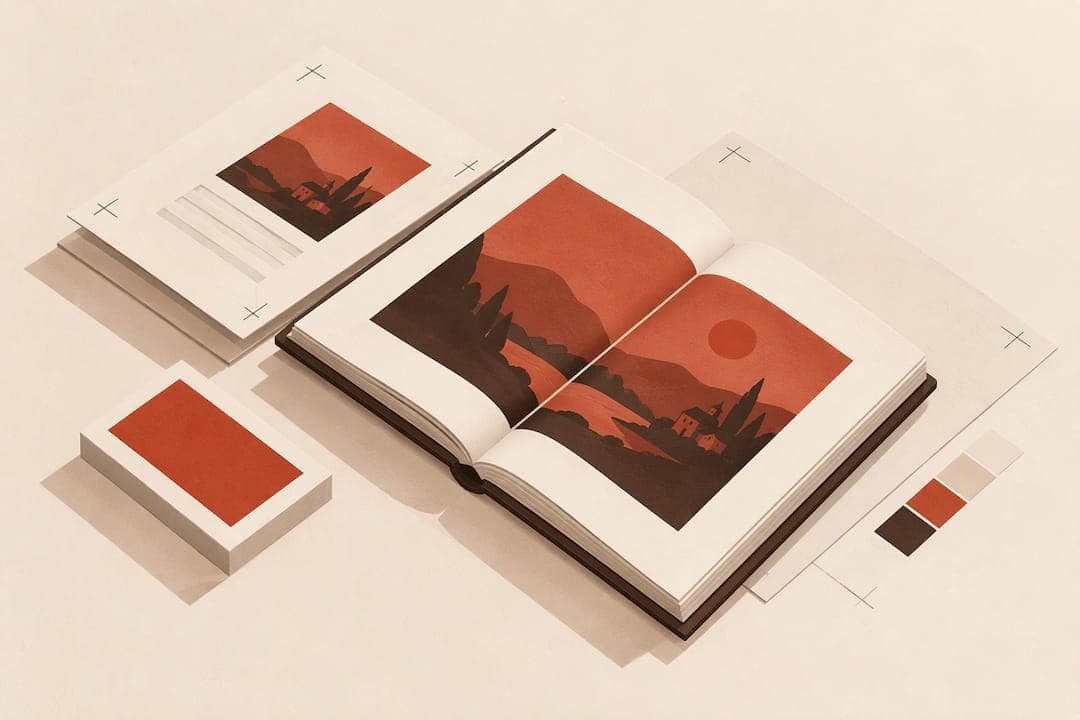
Place every image where it supports the reader's flow, but size and export it for 300 dpi at final print size, with correct bleed and gutter allowance built in. That single technical check prevents most print problems before they reach a proof. Placement and resolution work together: get both right, and your proofing stage becomes a formality instead of a rescue mission.
Key Takeaways
Consistent image placement, precise technical specifications, and thorough proofing are essential to produce professionally printed books with accurate, high-quality visuals.
| Point | Details |
|---|---|
| Proper placement options | Choose placement styles like inline, floating, spread, or grouped plates based on your book type and content needs. |
| Technical image specs | Ensure images meet resolution, color profile, bleed, and safe area requirements to print clearly and accurately. |
| Caption and credit placement | Place captions immediately beneath images and include credits to improve accessibility and maintain standards. |
| Consistent layout practices | Use one grid system, maintain equal whitespace, and crop images early to create uniform and professional interior design. |
| Use of formatting tools | Leverage book formatting software to automate checks on resolution, bleed, gutter safety, and export settings, reducing proofing errors. |
Table of Contents
- Placement options and when to use them
- Technical specs authors must meet for sharp, accurate images
- Captions, credits, and accessibility
- Layout and design tips for strong image integration
- File prep and proofing workflow
- Why consistent image rules cut proof cycles
- Let book-formatting software handle the preflight checks
- FAQ
- Sources
Placement options and when to use them
Print books use five main placement styles: inline images set directly in the text flow, floating frames anchored to a paragraph, full-page images, images that run across a two-page spread, and grouped plate sections printed on their own stock. Each fits a different kind of book.

Narrative nonfiction and memoir usually read better with inline or near-text placement, since the image supports a specific passage the reader just encountered. Reference books, cookbooks, and photo-heavy titles often work better with grouped plates, especially when photos come from different sources or resolutions and need consistent paper treatment.
Spread images need their own rules:
- Keep critical detail (faces, text, focal points) away from the center near the gutter, since binding can obscure part of a spread image.
- Add extra inner margin beyond your standard gutter when a spread is unavoidable.
- Test a spread on a physical proof before trusting it on screen, since binding type changes how much content disappears.
Print-on-demand often pushes authors toward grouped plates because mixed paper stocks or inconsistent image placement throughout the text block can complicate POD press setups and raise costs. If you are printing through a POD service, confirm whether your book is better served by in-text images or a dedicated plate section before you finalize layout.
Technical specs authors must meet for sharp, accurate images
Resolution is non-negotiable. Use an image resolution suitable for its final print size, and check that it has enough pixels across to reproduce clearly. Check image pixel dimensions against your printer’s requirements before layout, not after.
Beyond resolution, four more specs determine whether your images print cleanly:
- Color profile: Confirm whether your printer wants a CMYK profile or accepts RGB files converted at output; ask directly rather than guessing, since profiles vary by press and paper stock.
- File format: Export interior files as PDF/X for submission, and keep image masters as TIFF or another lossless format. Avoid heavily compressed JPGs, since repeated saves degrade detail you cannot recover later.
- Bleed: Standard bleed is 0.125 inch (3 mm) beyond the trim edge on any image that touches the page border, so the press has room to trim without leaving a white sliver.
- Safe area and gutter: Keep text and essential image content inside the trim edge, with extra clearance on the inner edge near the gutter, following your printer’s specifications.
Image resolution at final print size is one of the specifications to confirm with your printer before sending files, since a low-resolution image can be difficult to fix after layout is finished.
Captions, credits, and accessibility
Caption placement follows a convention older than digital publishing. The National Library Service for the Blind and Print Disabled advises placing captions immediately beneath the illustration they describe, treating the caption as a short headline rather than a full sentence. When an image needs more context, a legend, a longer explanatory passage, follows directly after the caption rather than replacing it. This two-part structure also matches longstanding Chicago Manual conventions on captions and legends.
A few habits keep this clean:
- Include credit lines beneath the caption when an image comes from an outside source, and link to bibliographic records where available.
- Keep the caption and legend visually tied to their image through spacing and alignment, never separated by a page break.
- When an image carries real narrative weight, add a short reader's note describing it, following the NLS guidance on levels of narrative impact for how much description that image warrants.
Pro Tip: When several small, closely related photos appear together, write one consolidated reader's note covering the group instead of repeating similar descriptions for each image.
Layout and design tips for strong image integration
Consistency across the interior matters more than any single clever layout choice. The practical design reference The Design of Books makes the case that a book "looks like itself" when chapter openers, image treatments, and grid systems repeat predictably from one chapter to the next, rather than shifting style with every image.
A few rules carry most of the weight:
- Use one grid system for image placement throughout the book, not a different approach per chapter.
- Keep equal whitespace above and below centered images; uneven spacing is one of the clearest signs of amateur formatting.
- Crop and size images to your actual trim dimensions early, rather than forcing a rushed re-crop during final layout.
- Reserve full-bleed spreads for genuine visual impact, and keep the surrounding text flow uninterrupted elsewhere.
- Use a dedicated chapter opener design to signal structure, since a strong opener does more to orient the reader than an extra inline image.
File prep and proofing workflow
Treat the submission stage as a checklist, not a judgment call. Follow these steps in order:
- Export a print-ready PDF/X file with all images embedded at final size and converted to your printer's specified color profile.
- Soft-proof the file on screen in that same color profile, then order one physical proof copy before approving a full print run.
- Inspect every image closely and confirm its pixel dimensions meet your printer’s resolution requirements at the size it prints.
- Choose paper stock early: coated paper holds saturation better for photo-heavy books, while uncoated paper suits text-dominant interiors and usually costs less.
- Run a final pass covering resolution, bleed, image crop paths, caption-to-image linkage, and gutter-safe margins.
| Check | What to confirm |
|---|---|
| Resolution | Meets the printer’s requirements at the image’s final print size |
| Bleed | Meets the printer’s specifications on full-bleed images |
| Color profile | Matches printer's CMYK or accepted RGB specification |
| Gutter safety | Key detail kept clear of the inner margin |
| Captions | Linked directly beneath each image, legend attached where needed |
Understanding the difference between typesetting and formatting helps here too, since image placement decisions often get made at the typesetting stage, after formatting is otherwise locked.
Why consistent image rules cut proof cycles
Every time I've seen a manuscript go through an extra proof round, the cause traces back to one skipped check: a low-resolution image, a caption left unlinked, or a spread that lost detail in the gutter. Applying the same grid and caption treatment throughout a book, the kind of consistency The Design of Books argues for, removes most of that guesswork before a printer ever sees the file.
— James
Let book-formatting software handle the preflight checks
Running every bleed, gutter, and resolution check by hand works, but it takes time you could spend writing. A dedicated formatting tool can help validate those specs: check whether it flags images that fall short of 300 dpi at final size, whether it checks bleed and gutter margins, and whether it exports directly to PDF/X with your chosen color profile.

Alhora is book-formatting software for authors, designed to turn manuscripts into professionally typeset ebooks and print-ready PDFs. If you want to see how automatic preflight checks and print-export templates handle image placement, visit the Alhora features page to see the full typesetting and export toolset.
For your overall visual presentation, a consistent visual brand language across your cover, interior, and marketing materials reinforces the same professional impression your image layout is working to create.
FAQ
What is the best way to place images in a print book?
The best approach places images where they support the surrounding text, using inline placement for narrative books and grouped plates for photo-heavy or reference titles. In every case, size images to meet your printer’s resolution requirements for their final print dimensions, with bleed and gutter margins respected.
How do I lay out a book for print?
Place images according to their role in the text, export to PDF/X in your printer's color profile, and confirm everything with a physical proof before approving the run.
Where can I buy books with blank pages for pictures?
Photo albums and blank scrapbook journals for personal photo collections are sold through craft retailers, bookstores, and general photo-printing services, separate from the custom print-on-demand process authors use for published books. Authors formatting an original illustrated book instead work through a print-on-demand platform or offset printer using their own laid-out files.
How do I place pictures in a book manuscript?
Insert images directly into your manuscript or layout file at the exact position they should appear relative to the surrounding text, then confirm resolution, caption placement beneath the image, and gutter clearance before export. Placement should follow the reading flow rather than filling available space.
Does offset or digital printing change how images should be placed?
Offset printing generally reproduces fine detail and color consistency more precisely across long runs, which gives slightly more flexibility with spreads and full-bleed images. Digital printing, the standard for most print-on-demand runs, handles standard placements well but makes a physical proof even more important for catching gutter and color issues before a full order.
Sources
- The Design of Books: An Explainer for Authors, Editors, Agents, and Other Curious Readers, Berne
- Guidelines for Image Descriptions - National Library Service for the Blind and Print Disabled (NLS) | Library of Congress
- 3.2 Illustrations: Captions and Legends