
Typesetting is the fine-grained composition of text for a specific print or digital output: kerning, hyphenation, widow and orphan control, page balance. Formatting is the structural layer underneath: chapter breaks, consistent styles, clean tagged source ready for export. If your manuscript has tables, poetry, footnotes, or needs to look right in a $30 paperback, you need typesetting, likely from a studio using standards like those the CIEP documents, or a tool like Alhora. If you just need a tidy EPUB with consistent chapter headings, formatting alone will get you there.
TL;DR:
- Typesetting involves precise control over micro-typography elements like kerning, hyphenation, and page layout, beyond basic formatting.
- Formatting covers macro-structure tasks such as style consistency, chapter organization, and semantic tagging, which prepare the manuscript for export.
- Complex features such as tables, math notation, floated images, or multi-column layouts require professional typesetting to ensure proper reflow and print quality.
- Simple prose manuscripts usually do not need a professional typesetter if they lack embedded media, images, or specialized layout demands.
- Automated tools like Alhora can handle many typesetting tasks for authors and produce print-ready files, but complex projects still benefit from expert intervention.
Table of Contents
- Typesetting vs Formatting: The Definitions Authors Actually Need
- Typesetting vs Formatting: Mapping Tasks to Outcomes
- When Should You Hire a Typesetter Instead of Formatting It Yourself?
- The Pre-Export Checklist Every Author Should Run
- Common Mistakes That Break Books Across Platforms
- What a Professional Typesetting Studio Actually Does
- How Digital Publishing Blurred These Two Roles Together
- Why This Distinction Matters for Accessible, Inclusive Books
- A Formatter's Honest Reflection on Making the Switch
- Get Print-Ready Files Without Learning Typography Yourself
- Sources
Typesetting vs Formatting: The Definitions Authors Actually Need
The confusion between these two terms is not your fault. Publishing has blurred the line for decades, and word processors made it worse by letting anyone "format" a manuscript without touching the deeper typographic decisions that separate an amateur PDF from a professionally printed book.
Typesetting is the composition of text for publication, arranging glyphs with precise control over kerning, leading, hyphenation, and page layout. The definition traces back to hot metal type and survives, mostly intact, into digital systems like TeX and LaTeX, whose box-and-glue models still shape how modern software decides where a line breaks. A typesetter thinks in millimeters and characters per line. They decide whether a widow (a single line stranded at the top of a page) gets fixed by adjusting tracking or by rewriting a sentence upstream.
Formatting, in the modern self-publishing sense, means preparing the manuscript's structure: paragraph styles, chapter headings, italics used consistently, front matter in the right order, and a file that survives conversion to EPUB or PDF without breaking. It is closer to information architecture than typography.
Here's where the two overlap and where they split:
- Typesetting handles micro-typography: kerning, leading, justification, hyphenation zones, and page composition.
- Formatting handles macro-structure: styles, chapter breaks, consistent italics and headers, and clean tagged source.
- Both feed into the same output, but formatting can exist without typesetting (a plain, styled Word document), while typesetting always assumes formatting is already done correctly.
- The CIEP draws a sharp line between a typesetter and a designer, too: a typesetter optimizes for technical readability, a designer for visual composition, and neither role is interchangeable with basic formatting.
The historical arc matters here. Manual typesetting with metal type gave way to phototypesetting, then to TeX and LaTeX in the 1970s and 1980s, then to desktop publishing tools in the 1990s. Each shift pushed more control down to the person preparing the document, which is exactly why the terms started colliding. Formatting used to be a typesetter's job. Now it is often the author's, and typesetting has become the specialized layer that sits on top.
Typesetting vs Formatting: Mapping Tasks to Outcomes
Once you separate the two by task, the decision about who does what gets much easier. Formatting produces a structurally sound manuscript. Typesetting turns that manuscript into a validated, publication-ready file.
What formatting typically covers:
- Consistent paragraph and heading styles applied through a style sheet, not manual overrides
- Correct order of front matter (title page, copyright, dedication, table of contents)
- Clean, tagged source with semantic markup instead of visual-only formatting
- Removal of double spaces, manual tabs, and stray line breaks
What typesetting typically covers:
- Hyphenation and justification tuned to the specific trim size or screen
- Widow and orphan control across every page, not just the ones you happened to check
- Kerning and tracking adjustments for headings, drop caps, and display type
- Page composition: running heads, folios, and balanced facing pages in print
The deliverables differ just as sharply. Formatting typically hands you a styled manuscript file, maybe a clean Word document or a well-tagged EPUB source. Typesetting hands you a print-ready PDF with embedded fonts and correct trim and bleed, or a validated EPUB that passes platform checks on the first try. IngramSpark's own guidance is blunt about this: formatting in a word processor is not a substitute for typesetting, particularly when the output is a printed book.
A few signals tell you the job has moved into typesetting territory. Complex tables that need to survive reflow. Mathematical notation. Floated images or sidebars that have to stay near their reference text. Multi-column layouts, which almost never survive a naive EPUB export. Footnotes that need to renumber correctly across chapters. Any one of these pushes a project past what formatting alone can fix.
There's also a technical reason typesetting produces better line breaks than formatting ever will. Systems descended from TeX evaluate hyphenation at the paragraph level, weighing every possible break across several lines at once, rather than deciding line by line. That paragraph-level optimization is why professionally typeset pages look evenly spaced while a quickly formatted Word document often has ragged, uneven color on the page.
Pro Tip: Open your exported PDF at actual size and scan just the right-hand edge of every paragraph for three pages in a row. If you see more than one hyphen stacked on consecutive lines, or a single short word orphaned at the end of a paragraph, that's a typesetting problem formatting tools won't catch.
When Should You Hire a Typesetter Instead of Formatting It Yourself?
The decision usually comes down to manuscript complexity, not budget alone, though budget shapes the timeline you can afford.
Hire a professional, or use dedicated typesetting software, if your manuscript includes any of the following:
- Illustrations, photographs, or charts that need precise placement relative to text
- A nonstandard page design, such as a cookbook, poetry collection, or illustrated children's book
- Mathematical or scientific notation requiring specialized spacing
- Extensive footnotes or endnotes that must renumber correctly across edits
- Accessibility requirements, including a properly tagged, audit-gated EPUB for screen readers
If your manuscript is straight prose fiction with a single font, standard chapter breaks, and no embedded media, you can likely handle formatting yourself and rely on software to manage the typesetting-level details automatically.
Budget and timeline trade off predictably. DIY formatting costs time, not money. Hiring a typesetter or formatting studio costs money but compresses the timeline and removes the risk of platform rejection. A freelance typesetter working on a standard novel typically needs one to three weeks depending on proof rounds; a formatting studio's automated pipeline can turn the same manuscript around in a short time.
When you do solicit quotes, ask for specific deliverables up front: how many proof rounds are included, which file types you receive (print PDF, EPUB, or both), and whether export validation against store requirements like KDP or IngramSpark is part of the service. A vendor who cannot answer those three questions clearly is worth a second look before you commit.
The Pre-Export Checklist Every Author Should Run
Most conversion failures trace back to a handful of preventable habits. Run through this before you upload anything to a storefront.
Structure and style checks:
- Strip all local formatting overrides and rebuild paragraph and heading styles from a style sheet
- Confirm special characters (em dashes, curly quotes, ellipses) are consistent throughout, not a mix of straight and curly
- Flag unusual content like poetry, tables, or long block quotes so a typesetter or your software knows to handle them differently
Typography checks:
- Target a line length of roughly 55 to 75 characters per line for single-column body text, a range IEEE's typesetting guidance cites as the comfortable reading zone
- Set a hyphenation policy and confirm it applies consistently, not just on the first few pages you happened to review
- Scan every page for widows and orphans, not just a random sample
Export checks:
- Embed all fonts in your print PDF; a missing embedded font is one of the most common reasons a print file gets bounced back
- Confirm image resolution sits at 300 DPI for print interiors
- Validate your EPUB file against the specific requirements of each platform you're targeting, since KDP, Apple Books, and Kobo don't all enforce identical rules
That 55 to 75 character range is not arbitrary. Lines much shorter force the eye to jump too often; lines much longer make it easy to lose your place mid sentence. It's one of the few typographic rules of thumb that holds across trim sizes and screen types.
Common Mistakes That Break Books Across Platforms
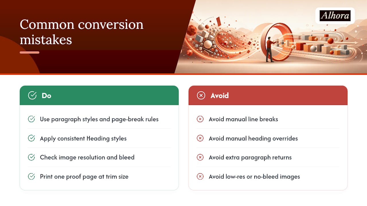
Manual page breaks and hard line breaks are the single most common cause of ugly EPUB conversions. A line break typed with Shift+Enter to force text onto the next line looks fine in your word processor and then collapses into a jumbled mess once an e-reader reflows the text for a different screen size or font setting. Use paragraph styles and page-break rules instead of manual keystrokes.
Inconsistent styles cause a quieter but equally damaging problem. If half your chapter headings use a manually bolded and enlarged font while the other half use an actual Heading style, your table of contents, your EPUB navigation, and your print running heads will all disagree with each other. Practitioner guidance on self-publishing consistently flags manual overrides, extra paragraph returns, hard tabs, stray line breaks, as the root cause of documents that pass a visual check but fail technical validation.
Image and trim mistakes surface late, usually in the final proof, which is exactly when they're most expensive to fix. Low-resolution images that looked fine on screen turn blurry in print. Full-bleed images without the correct bleed margin get cropped unpredictably by different printers.
Pro Tip: Before you approve a final proof, print one physical page from the middle of the book at actual trim size, not just view it on screen. Screens hide margin and bleed problems that a printed page reveals instantly.
What a Professional Typesetting Studio Actually Does
A studio built specifically for book production, rather than a general word processor, closes the gap between formatting and true typesetting without asking you to learn LaTeX. Alhora's approach maps directly onto the checklist above:
- Automatic hyphenation and justification tuned to the output format, print or ebook
- Built-in widow and orphan control that checks every page, not a manual sample
- Trim, bleed, and gutter checks before export, so print files don't bounce back from a printer
- Platform-specific validation for outputs like KDP, IngramSpark, and EPUB, catching issues before you upload
The AI-assisted checks in that workflow flag typographic and structural issues, such as awkward hyphenation or inconsistent style, without generating or rewriting your text. Suggestions come from the software; the words stay entirely yours.
If you're evaluating any typesetting supplier, whether that's a studio, a piece of software, or a freelancer, ask to see a sample proof and a validation report before you commit. A vendor confident in their process will hand both over without hesitation.
How Digital Publishing Blurred These Two Roles Together
Typesetting and formatting used to be separate jobs performed by separate people. A typesetter worked from a copyeditor's marked manuscript and handled every typographic decision by hand or with dedicated composition software. Formatting, as a distinct author-facing task, barely existed, because authors rarely touched the production pipeline directly.
Desktop publishing changed that in the 1990s, and self-publishing platforms finished the job in the 2010s. Suddenly any author with a laptop could "format" a manuscript in a word processor and export something that looked like a book. The typesetting layer didn't disappear. It just became invisible, buried inside templates, default styles, and export settings that most authors never examine closely.
That invisibility is exactly why so many self-published books read fine on a phone screen but look amateurish in print: the formatting held up, the typesetting never happened. Modern tools are starting to close that gap again by automating the typesetting decisions, hyphenation, justification, widow control, that used to require a specialist, while leaving structural formatting in the author's hands. The two roles are merging back into a single workflow, just with software doing the specialist's half of the job.
Why This Distinction Matters for Accessible, Inclusive Books
Formatting choices directly determine whether a book is usable by a reader with low vision, dyslexia, or a screen reader, and typesetting choices determine whether that same book reads comfortably for everyone else. Neither one alone produces an accessible book.
Semantic structure, real heading tags rather than bold, oversized text, is a formatting job, and it's the foundation a screen reader depends on to navigate a book at all. Typesetting decisions layer on top: adequate line spacing and a body-text line length in the 55 to 75 character range that research on typesetting recommends both reduce reading fatigue for readers with dyslexia, not just readers with a print disability.
An EPUB that passes an accessibility audit needs both layers done correctly at once. Tagged source without sensible typographic defaults still produces an awkward reading experience. Beautiful typography wrapped around an untagged, purely visual document locks out screen reader users entirely. Authors who treat accessibility as a single checkbox at the end of production usually discover it requires revisiting both the structural and typographic layers together, not a one-time fix bolted on at export.
A Formatter's Honest Reflection on Making the Switch
The clearest sign you've under invested in typesetting isn't a bad review. It's the third proof round, still fixing widows a formatting pass never caught. Once a manuscript runs through proper hyphenation and page balance checks, that rework mostly disappears, and readers simply stop noticing the pages at all, which is the whole point.
— James
Get Print-Ready Files Without Learning Typography Yourself
Most of the checklist in this article, hyphenation, widow and orphan control, trim and bleed validation, is exactly what Alhora's book formatting software automates for you. You still make the creative decisions; the software handles the typographic rules that usually take a specialist years to learn, and its AI-assisted checks flag issues without ever touching your actual text.

Whether you're preparing a paperback for IngramSpark, an ebook for KDP, or a validated EPUB for wider distribution, Alhora runs the platform checks before you export, not after a rejection email. If you want to see how it handles your own manuscript, start with the book formatting software page and run a chapter through it. If you're on a Mac, there's a dedicated build ready to go.
Sources
- Preparing text for typesetters | CIEP
- Typesetting — Wikipedia
- Typesetting | IEEE Technology Navigator
- What is Typesetting and Why Does it Matter? | IngramSpark