
A properly formatted paperback comes down to two files: a print-ready interior PDF and a cover file sized exactly to your trim and page count. The fastest path there is setting your trim size first, applying consistent paragraph styles, exporting as PDF/X with embedded fonts, and ordering a physical proof before you approve anything for sale. If you'd rather skip the manual settings entirely, a template or a typesetting tool that checks platform rules before export will get you there with far fewer redo cycles.
TL;DR:
- The choice of trim size impacts all other formatting decisions and should be based on genre, with common sizes including 5.5 by 8.5 inches for fiction and 6 by 9 inches for non-fiction.
- Gutter and bleed settings vary with page count, and errors often occur when authors treat all pages the same; larger books need more gutter space, especially for perfect binding.
- Proper front, body, and back matter sequencing, along with correct pagination styles, are crucial to avoid unprofessional formatting and should be followed precisely.
- Print-ready PDFs require specific export standards, including embedded fonts, 300 DPI images, and even page counts, with proofs recommended before final sale approval.
- Using dedicated tools like Alhora can automate typography rules, hyphenation, and validation, saving significant time and reducing formatting errors during book production.
Table of Contents
- How Do You Choose a Trim Size and Set Up Your Document?
- What Margins, Gutter, and Bleed Settings Do You Need?
- What Goes in Front Matter, Body Matter, and Back Matter?
- What Typography Choices Make a Paperback Look Professional?
- How Do You Export a Print-Ready PDF and Preflight It?
- What Tools and Templates Actually Save You Time?
- What Are the Barcode and ISBN Requirements for a Paperback Cover?
- How Do You Format Images and Graphics for Print?
- What's Different About Formatting for Print-on-Demand vs. Offset Printing?
- How Does Gutter Space Change Between Binding Types?
- How Do You Design a Cover and Spine That Match Your Trim and Page Count?
- A Formatter's Honest Take on What Actually Goes Wrong
- How Alhora Handles the Formatting Work For You
- Sources
How Do You Choose a Trim Size and Set Up Your Document?
Trim size is the decision everything else depends on. Pick it before you touch fonts or margins, because changing it later forces you to redo pagination, gutter width, and often your cover file too.
Genre carries real weight here. Literary fiction and general trade novels typically run 5.5" x 8.5", thrillers and romance often go smaller at 5" x 8", and nonfiction or memoir frequently uses 6" x 9" for a sturdier, more authoritative feel on the shelf. Amazon KDP's formatting guidance walks through setting these exact dimensions in your page setup before you paste in a single word of manuscript.
Once you've settled on dimensions, three setup decisions matter immediately:
- Set your document's exact page width and height to match your chosen trim, not a generic letter size.
- Turn on facing pages (also called mirror margins) so the software understands your book has a left and right side.
- Decide your pagination scheme: front matter gets lowercase Roman numerals (i, ii, iii), and the main text restarts at Arabic numeral 1 on chapter one.
Most fiction also opens every new chapter on a right-hand (recto) page, even if that means leaving a blank verso page before it. Readers expect this rhythm, and skipping it looks like an error rather than a stylistic choice.
What Margins, Gutter, and Bleed Settings Do You Need?
Bleed and gutter are the two settings authors most often get wrong, usually because they treat every page count the same way. Bleed is the extra image area that runs past the trim edge, typically 0.125 inches (3 mm), and you only need it if a graphic or color block touches the edge of the page. Most text-only novels don't need bleed at all.
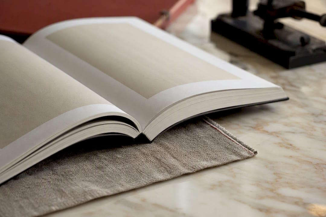
Gutter is different. It's the extra inner margin that compensates for the paper the binding swallows, and it has to grow as your page count grows. A 120-page book barely needs a nudge; a 400-page book needs real extra room or your inside margin visually disappears into the spine.
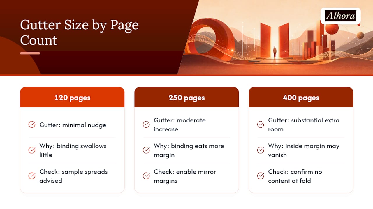
These bands roughly follow the margin recommendations in detailed trim and gutter guidance built around common trim sizes. Enable mirror margins in your word processor's page setup so inside and outside margins automatically swap between recto and verso pages, then generate a few sample spreads to check nothing important sits too close to the fold. The two most common mistakes: using equal margins on both sides (ignoring the gutter entirely) and letting text or images creep into the bleed zone, where a printer's trimmer might cut right through a word.
What Goes in Front Matter, Body Matter, and Back Matter?
Every paperback breaks into three zones, and each has its own pagination rules and content expectations. Getting this sequence wrong is one of the more common reasons a formatting job looks amateurish even when the typography itself is clean.
Front matter comes first and uses lowercase Roman numerals, though the numbers themselves are often not displayed on early pages:
- Half-title page, then a blank verso
- Full title page with author name
- Copyright page (ISBN, printing info, copyright notice)
- Optional dedication, table of contents, and foreword
Body matter is your manuscript, numbered in Arabic numerals starting at page 1. Chapters conventionally start on a right-hand page with a drop or consistent header, and running heads (the small text in the page margin showing book or chapter title) typically appear on interior pages, not the first page of each chapter.
Back matter closes the book: acknowledgments, an author's note, a preview of your next title, or a call to action for reviews. This is also where any reference to your ISBN and barcode gets reinforced, though the barcode itself lives on the cover, not inside the block. Once pagination is locked, update your table of contents last. The 10-step formatting workflow recommends this order specifically because early TOC updates get thrown off by every pagination change that follows.
What Typography Choices Make a Paperback Look Professional?
Print typography rewards restraint. A classic serif font like Garamond, Caslon, or Baskerville reads more comfortably across hundreds of pages than anything designed for screens, and font-selection guidance for authors consistently points back to these workhorse choices rather than trendy alternatives. Body size usually sits between 10.5 and 12 points depending on your trim size and line length.
Use paragraph styles, not manual tabs and spacing, to control indents. Fiction almost always uses a first-line indent (roughly 0.2 to 0.3 inches) with no extra space between paragraphs, which keeps pages dense and readable rather than airy.
Widows and orphans, single lines stranded at the top or bottom of a page, break the visual rhythm of a printed book. Full justification with hyphenation enabled reduces these dramatically, since the software has more flexibility to break lines cleanly.
Pro Tip: Turn on hyphenation only after your fonts and margins are final. Changing either one later reflows every line and can reintroduce the exact widow and orphan problems you just fixed.
How Do You Export a Print-Ready PDF and Preflight It?
Export settings matter as much as the layout itself. A file that looks perfect on screen can still get rejected or print poorly if the underlying PDF isn't built to print specifications.
- Export as PDF/X-1a or PDF/X-3, which locks fonts and color data in a format printers can read reliably. Industry export standards exist specifically because generic PDFs often substitute fonts or mishandle embedded images.
- Set all images to at least 300 DPI at final print size; anything lower prints visibly soft or pixelated.
- Convert color images to CMYK if your printer requires it. Pure black-and-white text files usually don't need this step.
- Strip out crop marks, registration marks, and any print marks your software added automatically.
- Confirm your final page count is even, since printers pad interiors to even numbers automatically and you want to control where that blank page lands.
- Check that every font is embedded, not just linked, and that the file carries no password protection.
- Order a printed proof, or at minimum print a same-size sample at home, before approving the file for sale.
What Tools and Templates Actually Save You Time?
Manual formatting in a word processor works, but the right tool depends on how many books you're producing and how much tolerance you have for repetitive fiddling.
- Official platform templates, like KDP's Word templates, come pre-set to correct trim dimensions and reduce rejection risk, though authors frequently forget to delete the sample placeholder text before export, which triggers an automatic rejection on upload.
- Free office suites like LibreOffice handle basic page numbering and layout competently, but expect more manual work for advanced typography like true hyphenation control or automated widow and orphan prevention.
- Dedicated typesetting tools pay for themselves once you're formatting a series, handling a complex layout with embedded images, or simply don't have the hours to fight with paragraph styles book after book.
Alhora fits that third category directly: it applies typography rules like justification and hyphenation automatically, catches widows and orphans before they reach your PDF, and validates your export against platform-specific requirements. Its AI-assisted checks flag potential issues without ever rewriting your text, so creative control stays entirely with you.
What Are the Barcode and ISBN Requirements for a Paperback Cover?
Your ISBN and barcode live on the back cover, and getting their placement wrong is one of the more common reasons a cover file bounces back from a printer or platform review. The barcode itself is a scannable representation of your ISBN, generated as an EAN-13 image, and most self-publishing platforms either generate one automatically during upload or let you upload your own if you've purchased your own ISBN.
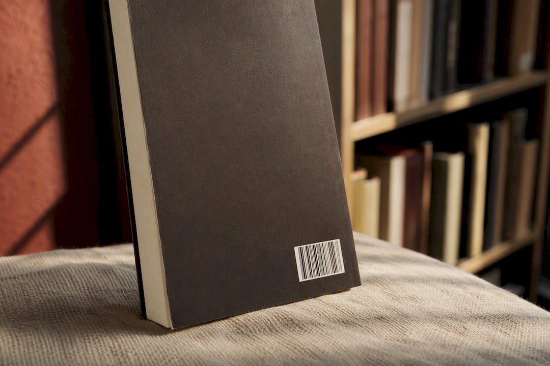
Placement conventions are fairly consistent across print-on-demand platforms. The barcode sits in the lower right or lower left corner of the back cover, inset far enough from the trim edge that trimming variance won't clip it, generally at least 0.25 inches from any edge. Standard barcode dimensions run about 2 inches wide by 1.2 inches tall, though platforms vary slightly on exact tolerances.
The ISBN number itself typically appears in human-readable text near the barcode or on the copyright page inside the book, sometimes both. If you're publishing through a platform that assigns a free ISBN, that number is locked to that specific platform and edition, meaning you can't reuse it if you later distribute the same book elsewhere. Authors who plan to sell across multiple retailers often purchase their own ISBN specifically to avoid this lock-in.
One detail that trips up new self-publishers: barcode placement needs to account for spine width. On a thick book, the back cover panel is narrower than it looks in a flat template, and a barcode positioned too close to the spine fold can end up partially wrapped around the edge. Always check barcode placement against your actual calculated spine width, not a generic cover template.
How Do You Format Images and Graphics for Print?
Print punishes low-resolution images in a way screens never do. Any photo, illustration, or graphic element needs to be at least 300 DPI (dots per inch) at its final printed size, not its screen size, which is a distinction that catches a lot of authors off guard.
Here's the math that matters: an image that looks sharp at 72 DPI on a laptop screen, a common web resolution, will look soft and blurry once printed, because print resolution and screen resolution serve completely different purposes. If you're placing a 4 inch by 6 inch image in your interior, it needs to be at least 1,200 pixels by 1,800 pixels to hit that 300 DPI threshold. Scaling a smaller image up in your word processor doesn't fix this. It just stretches the same pixels further apart.
Color space matters too. Most interior printing for text-heavy paperbacks runs in grayscale or pure black, but any interior color images typically need conversion to CMYK before final export, since RGB files (the format your camera or screen uses) can shift noticeably in hue once converted by the printer.
Placement follows a few consistent rules: images should never bleed into your gutter margin, where the binding would obscure part of the image, and captions or credits should sit close enough to the image that readers don't have to hunt for context. For full-bleed images that intentionally run to the trimmed edge, extend the image slightly past the trim line into the 0.125 inch bleed area so no white sliver appears if the trim shifts even slightly during production.
What's Different About Formatting for Print-on-Demand vs. Offset Printing?
Print-on-demand (POD) and traditional offset printing use fundamentally different production methods, and that difference shapes several formatting decisions before you ever hit export.
POD, the method most independent authors use through platforms like KDP or IngramSpark, prints books one at a time using digital printing technology. That means no minimum print run, but it also means tighter tolerances on file specifications, since there's no human operator adjusting settings between print jobs the way there often is on an offset press run. Your PDF needs to be exactly right on the first try because there's no proofing stage built into the production line.
Offset printing, used for large traditional print runs, physically transfers ink using metal plates, and it tends to produce slightly richer color saturation and finer detail on complex images. Publishers using offset printing typically order runs of 1,000 copies or more, which makes it impractical for most independent authors unless they're confident in strong pre-order or bulk sales numbers.
The formatting implications are practical rather than dramatic. POD files generally need stricter adherence to embedded fonts and exact page count rules, since automated systems reject files that don't match specifications precisely. Offset print shops often allow more flexibility in file preparation because a human prepress technician reviews the file before it goes to plate. For the overwhelming majority of independent authors, POD is both the more accessible and the more formatting-forgiving path once your file passes initial validation, even though the upfront file requirements are stricter.
How Does Gutter Space Change Between Binding Types?
Not all paperbacks bind the same way, and the binding method directly determines how much gutter space you need to protect your text from disappearing into the spine.
Perfect binding, the standard for most paperbacks over roughly 30 pages, glues individual pages to a spine using a strong adhesive. This is the binding method the vast majority of independent authors will use for a full-length novel or nonfiction book. Because perfect-bound books don't open perfectly flat, the pages near the spine curve inward, which is exactly why gutter margins need to grow as page count increases. Gutter recommendations that scale with page count exist specifically to counteract this curve, and testing a printed proof becomes especially important for anything over roughly 300 pages, since that's where the inward curve starts meaningfully eating into your readable inside margin.
Saddle stitch binding, by contrast, uses staples through a folded sheet and is really only practical for thin publications, usually under 60 pages, like chapbooks, novellas, or short story collections. Saddle-stitched books open flatter than perfect-bound books because there's no glued spine block, which means the gutter requirements are considerably more forgiving. A saddle-stitched booklet can often run a standard 0.5 inch inside margin without the same scaling concerns that govern a 400-page perfect-bound novel.
The practical takeaway: check your binding method before you finalize gutter settings, not after. A gutter sized for saddle stitch will leave a perfect-bound novel with text crowding uncomfortably close to the spine, while an aggressively wide gutter built for a 500-page perfect-bound book would waste space and look strange on a 40-page saddle-stitched chapbook.
How Do You Design a Cover and Spine That Match Your Trim and Page Count?
Your cover file is a single flat piece of art: front panel, spine, and back panel, all in one document, and every dimension on it is dictated by decisions you already made in your interior file.
Spine width is the trickiest part, because it's calculated directly from your final page count and paper type. A thicker paper stock or a higher page count produces a wider spine, and that width has to be calculated precisely, because a spine that's even slightly off will cause your front and back cover art to wrap unevenly around the physical book. Most print-on-demand platforms provide a spine width calculator based on page count and paper color (white versus cream stock affects thickness slightly), and you should never guess this number or reuse a spine width from a previous book with a different page count.
Trim size shapes the whole cover template too. A 6 inch by 9 inch cover file has entirely different front and back panel dimensions than a 5 inch by 8 inch one, so cover templates are never interchangeable between trim sizes; you need the exact template for your specific combination of trim, page count, and paper type.
Text and important design elements on both the front and back panel need to stay well clear of the spine fold and the trim edges, since minor shifts during production can crop or fold content that sits too close to either boundary. A good rule of thumb: keep critical text at least 0.25 inches from every edge of the cover, and treat the spine as off-limits for anything except the title, author name, and publisher mark, which typically run centered and legible even at thumbnail size, since that's how most readers first encounter your spine in a retail search result.
A Formatter's Honest Take on What Actually Goes Wrong
Most formatting disasters aren't typography failures, they're skipped-proof failures. Authors approve a file after checking it on screen and discover the gutter is too tight or a widow survived only after the printed copies arrive. Order one proof copy before every full print run, no exceptions, and read it as a reader would, not as a checklist, especially to ensure your files meet Maroon House Press submission guidelines.
Pick one toolchain, whether that's a Word template, LibreOffice, or a dedicated typesetting tool, and commit to it across your catalog rather than relearning a new system for every book.
— James
How Alhora Handles the Formatting Work For You
Alhora is the direct alternative to hours of manual margin math and template troubleshooting. It applies typography rules automatically, corrects hyphenation, justifies text without widows and orphans, and uses consistent styles across every chapter, so you're not manually checking each page for a stray single line. It also validates your export against the platform requirements covered above, catching a spine width miscalculation or a missing embedded font before you upload rather than after a rejection notice.

It earns its keep fastest if you're formatting a series, need an accessible EPUB alongside your print file, or you're simply working against a launch date and can't afford three rounds of manual fixes. Try converting a sample chapter through Alhora to see how your manuscript looks once the typography checks run automatically, and how much of the process you get back for your next book.