
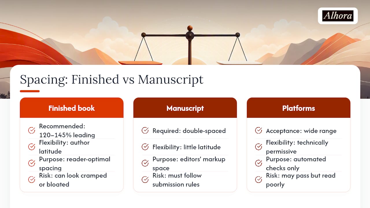
Set finished-book leading between 120% and 145% of your font's point size, with 130% to 140% as the sweet spot most designers land on. For 11-point body text, that means leading of roughly 13.2 to 15.95 points, set precisely rather than by preset. Manuscripts headed to an agent or editor follow a completely different rule: double spacing, always, so they can mark it up. Confuse the two, and you either annoy an agent or ship a book that looks like a Word document.
TL;DR:
- Leading should be set between 120% and 145% of the font size, with 130% to 140% being most common, especially for 11-point body text.
- Adjusting leading by a single point can change the page count by 20 to 30 pages, significantly affecting print costs and readability.
- For accessible large-print editions, leading often needs to increase to 150% or more to accommodate different thresholds and improve readability.
- Fixed leading values are crucial for print, but reflowable EPUBs let readers control spacing, making exact leading less critical outside of fixed-layout formats.
- Authors should differentiate between line and paragraph spacing and aim for zero extra space between paragraphs, reserving extra space for special elements like chapter titles.
Table of Contents
- Why Line Spacing Matters More Than Most Authors Think
- How to Set Exact Leading in Word, InDesign, and Pages
- Finding the Right Balance Between Font, Trim, and Spacing
- Large-Print and Accessibility Formatting Standards
- A Practical Pre-Export Checklist for Print-Ready Files
- Quick-Reference Defaults for Common Novel Setups
- How Genre and Format Shape Spacing Choices
- What Publishing Standards Actually Say About Spacing
- Print Spacing vs. eBook Spacing: Two Different Jobs
- Line Spacing and Paragraph Spacing Aren't the Same Setting
- An Editorial Note on Why Spacing Gets Overlooked
- Let Alhora Handle the Spacing Math for You
- Sources
Why Line Spacing Matters More Than Most Authors Think
Leading is the vertical distance between one line of text and the next, measured either as a percentage of the font's point size or as an exact point value. An 11pt font with 14pt leading is running at roughly 127%. That's the number typesetters actually care about, not "1.0" or "1.5," which are Word's own units and don't map cleanly to typography at all.
Two things push that ideal number up or down: x-height and line length. Fonts with a tall x-height (the height of a lowercase "x" relative to the full character) look bigger and need slightly more air between lines to avoid feeling cramped. Fonts with a smaller x-height, like many classic book faces, can sit a little tighter. Line length matters just as much. Readable lines run about 60 to 70 characters; push past that and your eye starts losing its place at the end of each line, which is exactly what generous leading is meant to prevent.
The payoff for getting this right isn't cosmetic:
- Tighter tracking loss means fewer re-reads of the same line.
- Consistent leading reduces the "amateur PDF" look readers associate with self-published books.
- Comfortable spacing measurably reduces fatigue over a 300-page read.
Statistic to remember: a full-length novel can gain or lose 20 to 30 pages from a single point of leading change. That's not a rounding error. That's a chapter.
How to Set Exact Leading in Word, InDesign, and Pages
Word's line spacing menu is where most formatting mistakes are born. "Single" spacing in Word is actually slightly more than your font size. "1.5 lines" is significantly larger. Neither one lands inside the 120% to 145% zone that actually reads well in print, which is why a manuscript that "looks fine" on screen often looks bloated or cramped once it's typeset into an actual book file.
Here's how to fix it, tool by tool:
- In Word: Home tab → Paragraph → Line and Paragraph Spacing → Line Spacing Options → set "Line spacing" to "Exactly" → enter your point value (for 11pt type, try 14pt).
- In InDesign: select your text, open the Character panel, and type your leading value directly into the leading field next to the font size. No conversion needed; InDesign already thinks in points.
- In Pages: Format sidebar → Text → Spacing → switch from "Lines" to "At Least" or a fixed value, then enter your point figure.
- Convert as you go: 11pt body text maps to roughly 13.2 to 15.95pt leading; 12pt maps to about 14.4 to 17.4pt. Pick a number inside that band and stay there for the whole book.
Pro Tip: Print one chapter at your actual trim size on real paper before you commit. Screens lie about scale, and the only test that matters is the one you can hold.
Finding the Right Balance Between Font, Trim, and Spacing
Line spacing doesn't work in isolation. It's one leg of a three-legged stool that includes trim size and font point size, and moving one without the others usually makes things worse, not better.
A workable sequence looks like this:
- Pick your trim size first (6×9 is the default workhorse for fiction).
- Choose a body font and point size, typically 10.5 to 12pt for adult fiction.
- Set leading somewhere in the 120% to 145% range and print a proof chapter.
- Read it at arm's length, the way a reader actually holds a book.
If your lines are running long because you picked a wide trim with a small font, lean toward the higher end of that leading range to help the eye track back to the left margin. If you're writing for an older readership, generous leading isn't a stylistic flourish. It's the difference between a book people finish and one they set down after chapter two.
Page count reacts fast to these choices. A print-cost-conscious author might be tempted to shave leading down to squeeze out a few pages and save a few cents per unit at IngramSpark or KDP. Resist that instinct. The math rarely works in your favor once you account for returns and reviews mentioning a book that was "hard to read."
Large-Print and Accessibility Formatting Standards
Large print isn't a bigger version of your regular interior. It's a distinct accessibility category with its own thresholds, and the industry doesn't fully agree on where those thresholds sit. Common guidance places the entry point at 14pt, while the American Printing House for the Blind sets a stricter 18pt benchmark for materials meant to serve low-vision readers well.
Leading has to scale up right along with the type. Where a standard novel might sit at 130% to 140%, a large-print edition often needs 150% or more to keep lines from visually merging into each other. A few other adjustments come with the territory:
- Widen margins beyond standard trim conventions to reduce visual crowding.
- Switch from justified to left-aligned text, since ragged-right edges help low-vision readers track line endings.
- Increase word and letter spacing modestly alongside the leading increase.
None of this is guesswork you can eyeball from a screen. Designers producing accessible editions test with real readers who represent the intended audience, because a layout that looks generous on a monitor can still feel tight on a printed page. eBooks sidestep most of this problem entirely: since readers control their own font size and spacing on a Kindle or Kobo device, a dedicated large-print eBook edition is largely unnecessary. The accessibility work belongs almost entirely to the print file.
A Practical Pre-Export Checklist for Print-Ready Files
Before any professional sends a book to press, a short set of checks runs automatically or by hand. Skipping them is how "accepted by KDP" quietly becomes "readers complain about the formatting."
The standard pass includes:
- Leading locked to an exact point value, not a Word multiplier.
- No widows (a single word alone on the last line of a paragraph) or orphans (a lone line stranded at the top or bottom of a page).
- Hyphenation checked so it isn't breaking too many consecutive lines.
- A full proof PDF generated and reviewed at actual trim size, not on a monitor.
Alhora runs several of these checks as part of its typesetting engine. Its Book Margin Calculator helps match margins to your chosen leading and trim, its leading control lets you enter exact point values instead of guessing at a preset, and its AI-assisted checks flag spacing and typography problems, like inconsistent leading or looming widow lines, without ever rewriting your prose.
| Check | What to look for |
|---|---|
| Leading value | Exact point, within 120% to 145% of font size |
| Widows/orphans | Zero on final proof pass |
| Hyphenation | No more than two or three consecutive hyphenated lines |
| Proof format | Export ready for KDP and IngramSpark |
Quick-Reference Defaults for Common Novel Setups
If you want a number to copy and move on with your day, here's the shortcut. A 6×9 trim with 11pt Garamond runs well at roughly 13.2 to 14.5pt leading. Scale that up slightly for wider fonts like Palatino, and down slightly for narrow, high-x-height faces.
Before you export anything, run this list once:
- Leading set to "Exactly," not a Word or Pages preset.
- One full chapter printed at trim size and read on paper.
- Line length checked against the 60 to 70 character target.
- Widows and orphans cleared on the final pass.
- File exported as a print-ready PDF, PDF/X where the platform requires it.
And the one rule that trips up more first-time authors than anything else: double spacing belongs on your submission manuscript, never on your finished book. Mixing those two up is the fastest way to make a professionally written novel look self-published in the worst sense of the word.
How Genre and Format Shape Spacing Choices
Genre conventions shift the numbers more than most authors expect. Literary fiction and character-driven dramas often run slightly tighter leading, closer to 125%, because dense paragraphs and long sentences already carry a lot of visual weight; too much air between lines can make the page feel disjointed rather than elegant. Commercial thrillers and romance, by contrast, tend to favor the looser end near 140%, since these genres move fast and readers are often flipping pages for hours at a stretch. Comfortable spacing keeps pace with quick reading without inducing fatigue.
Poetry and literary anthologies play by different rules entirely. Nonfiction and reference titles, especially those with dense footnotes or sidebars, frequently sit tighter than fiction, prioritizing information density over the leisurely pace a novel invites.
Graphic novels and heavily illustrated formats are the exception that proves the rule; text blocks are often short and hand-placed, so traditional leading percentages barely apply. The through-line across every genre is the same: match spacing to how the book is actually meant to be read, not to a single universal default.
What Publishing Standards Actually Say About Spacing
No single style guide, not the Chicago Manual of Style, not any print distributor's technical specs, hands authors one mandatory leading number. What exists instead is a body of converging practice. Practical Typography's guidance sets the 120% to 145% range that most professional typesetters treat as the working standard, and print-on-demand platforms build their acceptance thresholds around similar figures without ever calling them mandatory.
That distinction matters for a specific reason: IngramSpark and KDP will accept a wide range of spacing values, but "accepted by the platform" and "optimal for the reader" are two different bars entirely. A file can pass every automated check at KDP and still read as cramped or bloated to a human being holding the finished paperback. Submission guidelines are the one place where a genuinely firm standard exists: agencies and awards, including formatting rules published by literary competitions, consistently require double-spaced manuscripts so editors have room to mark up a page by hand. That rule isn't a suggestion the way finished-book leading is; it's close to universal across the traditional publishing world.
The practical takeaway is that authors have more latitude than they think on the finished-book side, and far less latitude than they think on the manuscript side. Treating both stages with the same rule is the single most common formatting mistake self-publishers make when they cross over from drafting to production.
Print Spacing vs. eBook Spacing: Two Different Jobs
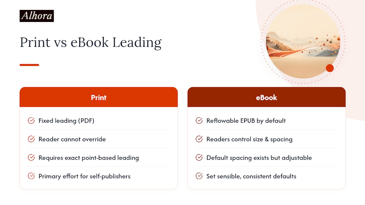
The leading values covered so far apply almost entirely to print. That's worth stating plainly, because it's the single biggest source of confusion for authors formatting their first book. A reflowable EPUB doesn't carry fixed leading the way a print PDF does. Readers control font size, spacing, and even margins on their own Kindle, Kobo, or Apple Books app, which means the careful point-based leading calculation that matters so much for print gets overridden the moment the file reaches a reflowable device.
That doesn't mean ebook formatting is a free pass. Fixed-layout ebooks, common in illustrated children's books or graphic-heavy nonfiction, behave like print and need the same leading discipline. And even reflowable EPUBs carry default spacing values that show up before a reader adjusts anything, so a wildly inconsistent starting point still looks unpolished on first open. The difference is a matter of degree, not absence: ebook readers' ability to resize text reduces the pressure to obsess over exact leading the way a print interior demands.
The practical split for most self-publishers: spend your real effort dialing in print leading, since that's the version nobody can override once it's on the page. Set sensible, consistent defaults for the ebook file, confirm it looks clean at a couple of common size settings, and then let the reader's device do the rest of the work. Fighting a reflowable format's core feature is a losing battle that wastes hours better spent on the print proof.
Line Spacing and Paragraph Spacing Aren't the Same Setting
Authors frequently adjust line spacing to fix a problem that's actually caused by paragraph spacing, or the reverse, and the two settings interact in ways that aren't obvious until a proof print reveals the mess. Line spacing controls the gap between lines within a paragraph. Paragraph spacing (sometimes called "space before" or "space after") controls the gap between one paragraph and the next, and in most novel interiors, that gap should be zero. Fiction typically signals a new paragraph with a first-line indent, not with extra vertical space.
That's a different convention from business documents and blog posts, where a blank line between paragraphs is standard and indents are rare. Import a manuscript written in that block-paragraph style directly into a print template, and you get double the visual separation you meant to: an indent and a gap, stacked on top of each other, making the page feel choppy and inflating your page count for no typographic reason.
Drop caps, scene-break symbols, and chapter-opening treatments complicate the picture further. A drop cap eats into the first few lines of leading space in ways that can look uneven if the surrounding leading isn't dialed in first. The fix is sequencing: set your leading, set your paragraph spacing to zero with a consistent indent, and only then layer in drop caps or ornamental breaks. Adjusting decorative elements before the underlying spacing is settled means redoing the decorative work twice.
An Editorial Note on Why Spacing Gets Overlooked
The spacing mistakes I see most often aren't ambitious formatting choices gone wrong. They're defaults nobody questioned: a Word document exported straight to PDF with "1.15" spacing left untouched, because the author assumed a print-ready file just meant turning off track changes. That single oversight is often the fastest way to make readers assume a book is amateurish before they've read a sentence of it.
The fix isn't complicated, which is exactly why it's frustrating that so few books get it right. It takes one deliberate decision, an exact point value instead of a preset, and one print test at actual trim size. Authors who skip that test are, in effect, judging their book's readability on a screen that has nothing to do with how a reader will actually hold it.
If there's one habit worth building, it's treating leading as a design decision made once and locked in, not something adjusted paragraph by paragraph out of instinct. A tool that can check leading consistency automatically removes the guesswork from that decision entirely.
— James
Let Alhora Handle the Spacing Math for You
Alhora is the practical alternative to eyeballing leading in Word and hoping the exported PDF holds up. Instead of converting percentages to points by hand or guessing whether "1.15" will look right in print, you set exact leading once inside Alhora's typesetting engine, and it applies consistently across every chapter, front matter, and back matter page in your book.

The platform's Book Margin Calculator matches your margins to your chosen trim size and leading automatically, and its AI-assisted checks flag widows, orphans, and inconsistent spacing before you ever hit export, all without touching a single word of your prose. That last part matters: Alhora's AI principles keep the software in a proofing role only, never a writing one.
For authors preparing a print interior for KDP or IngramSpark, Alhora's KDP formatting tools generate export-ready files built around the same leading standards covered here, so the proof PDF you print at trim size is the same file that ships. Import a manuscript, set your leading once, and export knowing the spacing holds from chapter one to the acknowledgments page. Start by importing your manuscript and see the difference a properly typeset interior makes before you commit to a print run.
Sources
- Line spacing | Butterick’s Practical Typography
- KDP Typography: Fonts and Spacing That Work in Print
- Large print guidelines | American Printing House for the Blind (APH)