
For most self-published novels, 6" × 9" is the safest default trim size, with 5.5" × 8.5" a close second for shorter or more intimate prose. Before locking anything in, confirm your choice against Amazon KDP's supported sizes and IngramSpark's specs, since cost, page count, and genre fit all shift depending on which one you pick.
TL;DR:
- Most self-published novels are best sized at 6" x 9" or 5.5" x 8.5", but authors must verify compatibility with KDP and IngramSpark specifications.
- Trim size influences page count, printing cost, spine width, and shelf appearance, requiring careful estimation before layout formatting.
- Genre conventions dictate common sizes, with fiction favoring 6" x 9" and children's books often using square formats like 8.5" x 8.5".
- Larger trim sizes reduce page count and cost but may affect readability and physical handling, especially in wider, heavier books.
- Correct setup of bleed, margins, and spine is crucial for print quality, and tools like Alhora automate validation to prevent costly errors.
Table of Contents
- What are the most common book trim sizes?
- How does trim size affect page count and printing cost?
- How do you choose the right trim size?
- What size and cost rules do KDP and IngramSpark enforce?
- Which trim size fits your genre?
- How do you set up bleed, margins, and gutter correctly?
- How does Alhora handle trim and layout validation?
- What should you know about ebook trim sizes?
- How have popular trim sizes shifted over time?
- How does trim size affect readability?
- How does trim size shape cover design?
- What's the most common trim size mistake authors make?
- Validate Trim, Layout, and Platform Exports With Alhora
- Sources
What are the most common book trim sizes?
Every trim size carries its own set of assumptions about genre, page count, and shelf appearance. Picking one without checking the table below is how authors end up with a paperback that looks and feels wrong for its category, even when the writing inside is strong.

The chart below covers the sizes you'll encounter most often across KDP, IngramSpark, and UK printers, with millimeter equivalents for readers working from European or British specs.
UK publishers often reference A-format (110mm × 178mm) and B-format (129mm × 198mm) as their own naming convention for mass-market and trade paperbacks. These roughly overlap with the 5" × 8" and 5.5" × 8.5" categories above, though UK trim sizes run on slightly different paper stock traditions than their American counterparts.
If you're writing dense literary fiction, 5.25" × 8" gives that compact, "serious novel" feel readers associate with the genre. If you're writing a business book meant to sit next to bestsellers at an airport shop, 6" × 9" is the format readers expect without thinking about it. Multiple POD platforms treat 6" × 9" as the de facto standard for text-heavy books, and 8.5" × 11" as the go-to for anything meant to lie flat and get written in, like workbooks or coloring books.
Square formats like 8.5" × 8.5" show up almost exclusively in children's books and gift editions, where the shape itself is part of the design language rather than an afterthought.
How does trim size affect page count and printing cost?
A bigger page holds more words, which means a bigger trim size produces a shorter book, and a shorter book usually costs less to print per unit. That relationship sounds simple until you actually run the numbers on your own manuscript.
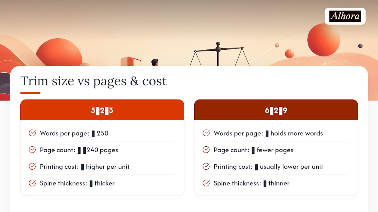
Take a 60,000 word manuscript. At 5" × 8", with roughly 250 words per page, you get a higher page count than at 6" × 9", where pages hold more words. Increasing trim size reduces total page count and printing cost. A shorter book with larger trim size usually costs less per unit to print, but may look thinner on shelves if too small in word count.
Trim size directly drives spine thickness and total print cost, since printers charge per page for interior stock. Fewer pages usually means a lower per-unit cost, but only up to a point: KDP treats any paperback wider than 6.12" or taller than 9" as a "large trim" size, which can shift your printing costs and available paper options.
Pro Tip: *Before finalizing your manuscript's font size or margins, run a quick page count estimate at two or three candidate trims.
How do you choose the right trim size?
Pick your trim size before you finalize interior formatting, not after. Working backward from a size someone else already chose is a fast way to end up fighting your own layout.
- Confirm genre expectations first. A thriller reader expects a different shape in their hands than a memoir reader does. Check five bestsellers in your category and note their trim sizes; they'll cluster tightly, usually within one or two standard formats.
- Estimate your page count at each candidate size. Run your word count against the words-per-page ratio for 5.5" × 8.5" and 6" × 9" specifically, since these two sizes cover most fiction and narrative nonfiction. A manuscript under 40,000 words often reads better at a smaller trim, where it doesn't look underweight.
- Check your distribution platforms' supported sizes and cost thresholds. KDP and IngramSpark don't support identical size lists, and a size available on one might trigger extra printing costs or unavailability on the other.
- Confirm series consistency and interior complexity. If this is book one of a planned series, lock the trim size now. If your interior needs footnotes, sidebars, or images, weigh whether a slightly larger trim gives your layout room to breathe. Order a physical proof before committing to a full print run.
What size and cost rules do KDP and IngramSpark enforce?
Both major POD platforms publish their own size and pricing rules, and they don't always match. Treat their help pages as the final word, not a design blog's summary of them.
- KDP supports a defined list of paperback and hardcover trim sizes, and flags anything over 6.12" wide or 9" tall as "large trim," which can affect available paper types and per-unit printing cost.
- KDP also sets minimum page counts for spine text to appear at all; a slim book might print with a blank spine regardless of your cover design.
- IngramSpark leans more heavily on millimeter-based formats common in UK and European markets, which matters if you're printing for wider international distribution.
- Both platforms periodically update supported sizes and specs, so check the current help pages before finalizing a cover or interior file rather than trusting a guide's snapshot from months ago.
- Always order a physical proof copy before approving a print run at scale. Screen previews hide bleed and margin issues that show up instantly on paper.
Which trim size fits your genre?
Genre convention exists because readers have expectations, even ones they can't articulate. A poetry collection printed at 8.5" × 11" looks like a corporate handout, not a book of verse.
- Novels: 6" × 9" or 5.5" × 8.5" cover nearly every fiction genre from thriller to romance.
- Memoir and literary fiction: 5.25" × 8" or 5.5" × 8.5" give that denser, more literary shelf presence.
- Workbooks and technical guides: 8.5" × 11" or 7" × 10" leave room for exercises, diagrams, and wide margins.
- Children's picture books: square formats or landscape orientations support illustration-heavy spreads better than a standard portrait page.
- Larger formats earn their place when the content demands it. Photo books, coffee-table editions, and anything with two-column layouts or heavy illustration genuinely need the extra real estate that a 6" × 9" page can't offer.
How do you set up bleed, margins, and gutter correctly?
Getting the trim size right on paper means nothing if your file setup is wrong underneath it. This is where most self-published interiors fail their first proof check.
- Set your document size to trim plus bleed, typically adding 0.125" on any edge where images or color extend to the page edge.
- Apply margin minimums based on page count. Thicker books need a wider inside margin (gutter) to account for the binding eating into visible space, often 0.75" or more past 400 pages.
- Calculate spine width by multiplying page count by your paper stock's thickness per sheet, then place spine text only if page count clears your printer's minimum threshold.
- Export at your platform's required settings, run their online proofing tool, and order a physical proof copy before approving the full run.
Pro Tip: Gutter margins that look fine on screen often feel cramped once a 300-page book is actually bound. Add an extra 0.05" to 0.1" past what feels necessary on screen.
How does Alhora handle trim and layout validation?
Alhora automates the parts of trim selection that eat the most time: it checks bleed, margins, and gutter against your chosen size, and calculates spine width automatically for your page count and paper stock. Its AI-assisted checks flag layout or typographic problems, widows, orphans, awkward breaks, without ever rewriting your text, so you stay the sole author of your own words. Exports come pre-validated against KDP and IngramSpark specs, which cuts down the number of proof cycles you'd otherwise spend catching errors printers reject.
What should you know about ebook trim sizes?
Ebooks don't have a trim size in the print sense, and that's the first thing to unlearn if you're moving from print thinking to digital formatting. E-readers reflow text to fit whatever screen size and font setting the reader chooses, whether that's a phone, a tablet, or a dedicated e-reader device.
What actually matters for ebooks is different: image resolution, font embedding, and how your layout degrades on a small screen. A print interior built for 8.5" × 11" with side-by-side columns or footnotes anchored to specific pages will not translate cleanly to EPUB without real rework, since reflowable text can't preserve fixed page relationships.
Fixed-layout EPUB exists for exactly this problem, and it's the right call for picture books, comics, and heavily designed nonfiction where position matters more than reflow. For standard fiction and narrative nonfiction, a reflowable EPUB built from clean, simple formatting will outperform anything modeled too closely on a specific print trim. The safest approach is designing your interior for print first, then treating the ebook version as its own formatting pass rather than a straight export.
How have popular trim sizes shifted over time?
Trade paperback sizes have drifted narrower and more standardized over the past two decades, largely because 6" × 9" became the size POD printers optimized their equipment and pricing around. Before print-on-demand made short runs affordable, publishers had more flexibility to pick sizes based on paper stock availability and regional printing traditions, which is part of why older UK editions still show up in A-format and B-format dimensions that feel unfamiliar to authors used to American standards.
Self-publishing accelerated the standardization further. When KDP and IngramSpark became the default distribution route for independent authors, their supported size lists effectively became the industry's practical boundaries, whether or not that was anyone's intention. Authors gravitated toward sizes that worked reliably across both platforms rather than sizes that matched genre tradition exactly.
Illustrated and photo-heavy publishing moved in a different direction, toward larger and more varied formats as digital printing made short runs of oversized books commercially viable in ways they weren't when offset printing dominated. A photo book in 12" × 12" or 13" × 11" would have been a specialty print job decades ago; now it's a standard catalog option.
The net effect: text-heavy fiction has consolidated toward a handful of sizes, while visual and illustrated work has fragmented into more specialized formats than before.
How does trim size affect readability?
Line length is the hidden variable behind most readability complaints, and trim size controls it directly. A wider page produces longer lines of text, and lines that run too long force a reader's eye to work harder tracking from left margin back to left margin.

Typography convention puts comfortable reading around 50 to 75 characters per line. A narrow trim like 5" × 8" naturally keeps line length in that range with a standard font size, while a wide format like 8.5" × 11" needs either multiple columns or a much larger font to avoid uncomfortably long lines. That's part of why textbooks and workbooks often use two-column layouts at larger trims rather than a single block of text stretched across the full page width.
Page weight matters too. A thick book at a small trim can feel physically awkward to hold open, especially in paperback, where the binding fights against a reader's grip on both sides of a 400-page block. A thinner, wider version of the same manuscript distributes that bulk differently, and some readers find it easier to hold flat on a table or desk.
Font size and trim size aren't independent decisions. A trim chosen for genre convention still needs margins and type sizing tuned to keep the actual reading experience comfortable, not just the cover looking right on a shelf.
How does trim size shape cover design?
A cover designed for 6" × 9" doesn't just scale down cleanly to 5" × 8"; the proportions of title placement, imagery, and spine width all shift. Designers who build a cover before confirming trim size often end up cropping or stretching artwork in ways that weaken the final composition.
Spine width is the piece most authors forget until the last minute. A thin book at a small trim might not clear the minimum page count for spine text at all, which means your title and author name simply won't appear on the spine, a real problem for a book that needs to stand upright on a shelf next to others. Wider trims with fewer pages face the same risk from the opposite direction.
Back cover copy, barcode placement, and any author photo also scale differently depending on trim width. A square format like 8.5" × 8.5" forces a completely different back cover layout than a tall, narrow 5" × 8" spine would allow, since the available white space and reading flow change with the aspect ratio itself.
Getting trim size locked in before a designer starts work saves a full revision cycle. Cover proportions, spine calculations, and even font choices for the title all depend on knowing the final dimensions first, not adjusting them after the fact.
What's the most common trim size mistake authors make?
Switching trim sizes mid-series is the mistake I see most often, and it wrecks shelf presence fast: readers notice when book three suddenly looks different next to books one and two. If you're unsure, print a 20 to 30 page proof at two candidate sizes before committing to the whole series.
— James
Validate Trim, Layout, and Platform Exports With Alhora
Alhora gives you back the hours normally lost to proof cycles and rejected files. Instead of manually checking bleed, margins, and gutter against every platform's rules, you get automatic trim validation, spine width calculation for your exact page count and paper stock, and typography checks that catch widows and orphans before a printer does.

The AI-assisted checks flag problems without ever touching your prose, so the words on the page stay entirely yours. Once your interior and cover meet spec, Alhora exports files pre-validated against KDP and IngramSpark requirements, which means fewer rejected uploads and fewer surprise reprint costs. If you're finalizing a manuscript and want your trim size, spine calculation, and platform files handled in one pass, visit the Alhora landing page to start a trial and see your manuscript formatted for print and ebook release.
Sources
- Book Sizes: Your Complete Guide — The Book Designer
- Set trim size, bleed, and margins — KDP Help
- Books
- Standard book sizes & dimensions — Blurb