
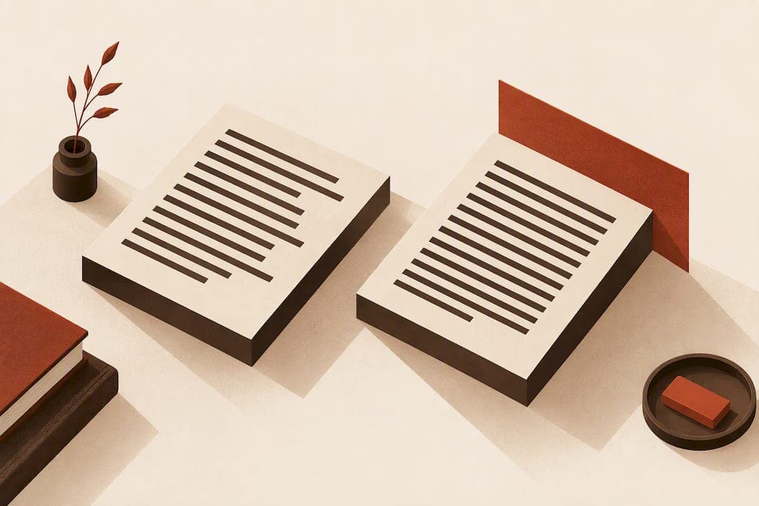
Use ragged right for web pages, responsive layouts, and anything you cannot fully control with hyphenation. Use justified text for print books and magazines, but only when you can hyphenate properly and tune the spacing by hand. The real risk is not the alignment itself: it is justification done badly, which reads worse than a clean ragged-right page every time.
Key Takeaways
Proper hyphenation and spacing control are crucial for high-quality justified text, but ragged right alignment is a safer default when these controls are unavailable.
| Point | Details |
|---|---|
| Justified text can improve readability | When well-tuned with hyphenation and spacing, justified text can marginally outperform ragged right. |
| Bad justification harms readability | Uncontrolled justification causes rivers and irregular gaps, which slow readers and impair comprehension. |
| Ragged right is safer online | For web and responsive content, ragged right avoids rivers and spacing issues across different screen widths. |
| Audience needs matter | Accessibility and short documents benefit from ragged right, especially for readers with visual or cognitive challenges. |
| We recommend Alhora's software | We use Alhora's book formatting tool to automatically identify and fix rivers and hyphenation gaps during typesetting. |
Table of Contents
- What ragged right and justified alignment actually mean
- What research and typography experts say about readability
- Why bad justification breaks readability
- When to choose justified vs. ragged right, by medium
- How to implement each alignment well
- Quick checks before you publish
- Taste matters, but legibility settles the argument
- A practical path to clean justification in your book
- FAQ
- Sources
What ragged right and justified alignment actually mean
Ragged right alignment keeps the left edge of every line flush while letting the right edge fall wherever the words end. Justified alignment, sometimes called "full justification," stretches or compresses word and letter spacing so both the left and right edges line up flush, creating a clean rectangular block of text. The last line of a justified paragraph is typically left unjustified unless it happens to fill the full measure.
A few practical defaults worth knowing:
- Web browsers default to ragged right (flush left) because CSS historically lacked strong hyphenation and spacing controls.
- Word processors like Microsoft Word default to ragged right but offer one-click justification.
- Page layout tools like Adobe InDesign default to justified text for body copy in book templates.
- LaTeX defaults to justified paragraphs unless you explicitly call a ragged-right command.
Readers notice justified text as orderly and formal, almost architectural. Ragged right feels looser and more casual, closer to how we read on a phone or in a text message.
What research and typography experts say about readability
The evidence on alignment and reading speed is thinner and messier than most style guides suggest. Readability research with 300 volunteers found that justified text produced slightly faster reading speeds in some contexts, but the effect was smaller than the natural variation between individual readers. Other studies in the same body of work found the opposite: readers performed worse on right-justified material, particularly when spacing was uneven.
The alignment effect on reading speed is real but small, often smaller than the difference between two individual readers. That single fact should reset expectations for anyone treating alignment as a make-or-break readability decision, according to reading-speed research on format and readability.
What typography practitioners agree on more consistently:
- Line length (measure), leading, and hyphenation quality move readability more than alignment choice alone.
- Justified text can slightly outperform ragged right under good typesetting conditions, but collapses under bad ones.
- Testing with your actual audience beats picking alignment by aesthetic preference.
The practical implication is straightforward: fixing spacing problems matters far more than debating which alignment looks more polished. A justified paragraph with poor hyphenation will almost always read worse than a clean ragged-right paragraph, even though justified theoretically has a slight edge when done right.
Why bad justification breaks readability
Rivers are the most visible failure: vertical or diagonal channels of white space that form when multiple lines stack loose spacing in similar positions. They happen when a justification algorithm stretches gaps between words to fill the line, and several lines in a row end up with wide gaps lined up near the same horizontal position. The eye catches the pattern and drifts along it instead of along the text.
Hyphenation is the main defense against this. Without it, a justification engine has only whole words to work with, so it has to stretch spaces further to make narrow columns fill out. TUGboat's analysis of justification problems describes this as "sloppy" justification: wide, irregular gaps that slow readers down and disproportionately hurt readers with cognitive or visual processing difficulties.
- Rivers form when loose spacing repeats across consecutive lines in similar positions.
- Naive justification without hyphenation forces wider gaps, especially in narrow columns.
- Tight lines (the opposite problem) cram letters together when a justification engine compresses rather than stretches.
Pro Tip: If you cannot control hyphenation and fine-tune spacing, ragged right is the safer default, not the compromise.
When to choose justified vs. ragged right, by medium
- Print books and magazines: justify the body text when your tools can hyphenate and let you tune spacing by hand. A well-justified page reads as an orderly, economical block, and it is the standard readers expect from long-form print, as A List Apart's typography coverage notes in describing how hyphenation and justification together became the print default.
- Web and responsive content: default to ragged right unless you can enable and verify hyphenation across every screen width. Responsive columns resize constantly, and justification that looks fine at one width can produce rivers at another.
- Short documents like resumes or contracts: favor ragged right. These documents are usually short enough that consistent, predictable spacing matters more than a formal block shape, and most word processors handle ragged right more reliably by default.
- Anything accessibility-sensitive: lean ragged right. Uneven spacing from poor justification disproportionately affects readers with dyslexia or other processing differences.
Before deciding, run through a short checklist:
- How many characters fit per line at your intended measure? Narrow columns make justification riskier.
- Does your output format support real hyphenation, or only whole-word wrapping?
- Does your audience include readers with accessibility needs that argue for ragged right?
- Do you have the production time to manually fix rivers and loose lines if you justify?
How to implement each alignment well
For web and CSS, set hyphens: auto whenever you justify text, and keep your measure in the 50 to 75 character range using a max-width set in ch units rather than pixels. Avoid forcing justification on fluid layouts that you cannot test at every breakpoint.

For LaTeX and TeX-based typesetting, the default \raggedright command suppresses hyphenation entirely, which produces awkward short-line breaks. The ragged2e package fixes this by offering configurable ragged-right settings that still allow hyphenation, giving you cleaner line breaks than the plain kernel command. For justified text, the microtype package adjusts letter spacing and protrusion at a level fine enough to reduce visible rivers without touching your hyphenation dictionary.
If rivers show up anyway: widen your measure slightly, turn on or tighten hyphenation settings, adjust tracking or word spacing by a fraction of a point, and avoid columns so narrow that only a few words fit per line.
- Set
hyphens: autoand a sensiblemax-widthin characters for any justified web text. - Use
ragged2einstead of the bare\raggedrightcommand in LaTeX documents. - Pair
microtypewith careful hyphenation tuning when justifying in TeX.
Pro Tip: Widen the measure before you touch tracking, a narrow column is usually the real cause of rivers, not the spacing settings themselves.
For book-length manuscripts, a format-by-format decision guide walks through these tradeoffs in more depth, and dedicated formatting software can catch spacing defects automatically rather than requiring a manual page-by-page scan.
Quick checks before you publish
Do: test your layout with real readers at the width they will actually see, keep your measure between 50 and 75 characters, and enable hyphenation wherever your tools support it.
Don't: justify wide, responsive blocks without hyphenation turned on, and don't assume your word processor's default justification is production-ready without a visual check.
- Scan every justified page for rivers before finalizing a layout.
- Flag any paragraph with three or more consecutive tight or loose lines.
- Preview the same text at several widths if it will appear on more than one screen size.
Fixing rivers after the fact is covered in more detail in this guide to ebook justification fixes, and the same scan is worth running alongside a check for widows, orphans, and runts, since the three problems often appear together.
Taste matters, but legibility settles the argument
Alignment is partly aesthetic, and reasonable designers will disagree on which looks more "finished." We keep coming back to the same rule: when taste and legibility conflict, test the page and let readability win, then use proper tools to catch what a quick glance misses.
— James
A practical path to clean justification in your book
Getting justification right in a full manuscript means checking hyphenation, spacing, and line breaks across hundreds of pages, which is where most authors run out of patience. We built our book formatting software to catch rivers, loose lines, and hyphenation gaps in real time as you format, instead of leaving you to scan page by page before export.

Our typesetting engine applies the same hyphenation and spacing controls professional typesetters use for print and ebook output, validated against publishing standards before you export. Start with Alhora and format your next manuscript with justification you can actually trust.
FAQ
Is it better to align text left or justify it?
Neither is universally better: ragged right (flush left) tends to suit web and responsive layouts, while justified text suits print books and magazines when hyphenation and spacing are properly tuned. The deciding factor is whether you can control hyphenation and fix spacing defects, not personal preference alone.
What does "ragged right" mean?
Ragged right describes text aligned flush on the left edge while the right edge ends wherever each line's words naturally stop, leaving an uneven or "ragged" right margin. It is the default alignment in most web browsers and word processors.
Is it okay to leave the right margin unjustified?
Yes, an unjustified right margin is standard for web content, short documents, and any layout where you cannot guarantee clean hyphenation. Typography commentary from A List Apart notes that the web ecosystem has long favored ragged right precisely because full justification without hyphenation controls tends to produce worse spacing than a ragged margin.
Which is better for a resume: justified or left-aligned text?
Left-aligned (ragged right) text is generally the safer choice for a resume because it avoids the uneven word spacing that word processors can introduce when justifying short, dense blocks of text. Consistent, predictable spacing tends to matter more on a one-page document than the formal look of a justified block.
Does text alignment affect reading speed?
The effect is real but small: readability research found justified text slightly increased reading speed for some readers, though the difference was smaller than the natural variation between individual readers. Poorly implemented justification, however, can measurably hurt readability regardless of the small average effect.
Sources
- Research highlight: the influence of format & readability on children’s reading speed and comprehension
- The look that says book — A List Apart
- Why bad justification hurts readability — TUGboat
- Setting text ragged right — The TeX FAQ