
You can request justified text in your ebook's source file, but the reader's app and device settings often decide what actually shows up on screen. The safer default for body text is left-aligned. If you insist on full justification, pair it with hyphens: auto and test it on real devices before you publish, because unhyphenated justified text on a phone screen creates ugly gaps almost every time.
TL;DR:
- Justification in ebooks depends heavily on the reading app's interpretation of your stylesheet, with many apps overriding author settings entirely.
- Hyphenation and
langattributes are critical for proper justification and should be carefully set and tested across devices.- Automatic hyphenation and keeping line length reasonable can significantly reduce visual rivers and uneven word spacing issues.
- Consistent use of paragraph styles in Word, removing manual formatting, and validation with EPUBCheck ensure reliable rendering across platforms.
- Automated tools like Alhora can streamline validation and hyphenation, saving time and reducing formatting errors before publication.
Table of Contents
- What Controls Text Justification in an Ebook?
- How Do You Set or Remove Justification in Your Manuscript?
- Does Justified Text Hurt Readability?
- Common Ebook Justification Problems and Their Fixes
- What Tools Should You Use to Preview and Test Justification?
- The Justification Debate Misses the Real Question
- Let Alhora Handle Justification for You
- Sources
What Controls Text Justification in an Ebook?
Justification in a reflowable ebook is a negotiation, not a command. You write a suggestion into the file's stylesheet, and the reading app decides how much of that suggestion to honor. That's the single biggest thing to understand before you touch a single CSS property.
Print design works because the page is fixed. Ebooks don't have that luxury. A reader might bump the font size up three notches, widen the margins, or switch to a narrower device orientation, and your file has to reflow around all of it. Microsoft's own documentation on Word describes the basic mechanic clearly: justification adds space between words so both edges of a line hit the margins, while the last line of a paragraph stays left-aligned. That's straightforward in a Word document. It gets messier once that same paragraph has to reflow across a dozen screen sizes.
A few things actually sit in your control, and a few don't:
- You control: the
text-alignvalue in your stylesheet, hyphenation rules, and thelangattribute on your HTML. - The reader controls: font size, margin width, line spacing, and in many apps, whether justification is honored at all.
- Nobody fully controls: how a specific device renders inter-word spacing when justification is forced on a narrow column.
Some readers report on the KDP Community forums that devices override author settings entirely, which is exactly why testing matters more than tweaking CSS values you can't verify blind. Language tags matter too. Hyphenation and line-break rules depend on the reading engine knowing what language it's rendering, according to W3C's typography guidance, so a missing lang attribute can quietly break justification quality even when everything else looks right.
How Do You Set or Remove Justification in Your Manuscript?
Start in Word, before you ever touch a stylesheet. Use paragraph styles, not manual formatting. If your "Body Text" style has a first-line indent baked in, you never need a tab key again, and you eliminate one of the most common sources of ebook spacing bugs: authors mixing manual tabs with style-based indents, which then collide during EPUB conversion.
Here's the sequence that keeps a manuscript clean from Word through to EPUB.
- Clean your Word styles first. Set alignment (left or justified) inside the paragraph style itself, never as manual per-paragraph formatting.
- Strip manual returns and tabs. Find-and-replace double paragraph marks and tab characters before export; they survive conversion and cause inconsistent spacing.
- Export as reflowable EPUB, not fixed layout, unless you're building a heavily illustrated book that genuinely needs fixed positioning.
- Open the EPUB in Sigil or Calibre and search for inline
style=attributes that override your stylesheet. These sneak in during Word-to-EPUB conversion constantly. - Confirm
<html lang="en">(or your language code) is set at the document level, not just assumed.
Once you're inside the EPUB's CSS, here's a minimal, reliable block for justified body text:
p {
  text-align: justify;
  hyphens: auto;
  -webkit-hyphens: auto;
}
That's it. Skip text-justify as your primary tool. MDN's documentation is blunt about it: browser and reader support for text-justify is inconsistent, so pairing text-align: justify with hyphens: auto is the more dependable combination across engines.
| Task | Where to do it | What to check |
|---|---|---|
| Set base alignment | Word paragraph style | Style applies to whole document, not per-paragraph |
| Remove manual formatting | Find and replace | No stray tabs, double returns |
| Add hyphenation | EPUB stylesheet | hyphens: auto present in body CSS |
| Confirm language | HTML root element | lang attribute matches manuscript language |
| Check inline overrides | Sigil or Calibre | No stray style= attributes on <p> tags |
Kindle conversion has its own quirks worth flagging. Amazon's pipeline can rewrite or strip CSS during the conversion from EPUB to its own format, so a stylesheet that looks perfect in Sigil doesn't always survive intact. Always run the converted file through Kindle Previewer before you submit it. It's the only way to see what Amazon's engine actually did to your rules, rather than what you intended.
If manuscript prep itself feels like the harder problem right now, a structured ebook outline before you start formatting saves you from restructuring chapters after the CSS is already in place.
Does Justified Text Hurt Readability?
Sometimes, yes, and the mechanism is visual, not stylistic. When justified text stretches spacing unevenly across short lines, you get "rivers": vertical channels of white space that zigzag down the page and pull the eye off the sentence. On a narrow phone screen with a large font size, rivers show up constantly, because there are fewer words per line to distribute the extra spacing across.
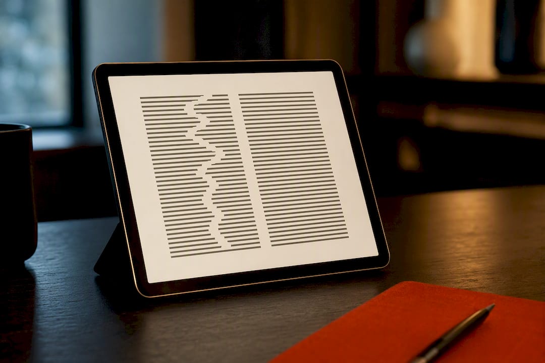
Rivers of white space aren't a cosmetic annoyance. They add friction for any reader tracking lines carefully, and that friction lands hardest on readers with dyslexia or other reading disabilities, where inconsistent spacing patterns make word recognition measurably harder.
That's the accessibility case for defaulting to ragged-right (left-aligned) body text. If you do justify:
- Enable hyphenation and test it, don't assume it's on by default in every reading app.
- Keep line length reasonable; very narrow columns make rivers worse regardless of settings.
- Never force justification on the last line of a paragraph; readers expect it left-aligned.
There are legitimate exceptions. Short pull quotes, front-matter dedication pages, or print-style display text can carry full justification without the same risk, because the block is short enough that spacing rarely gets stretched to the breaking point. Body text across three hundred pages is a different bet entirely.
Common Ebook Justification Problems and Their Fixes
Most justification complaints trace back to three root causes, and they're fixable in under an hour once you know where to look.
- Rivers and uneven word spacing. Add
hyphens: autoto your body paragraph CSS, confirm thelangattribute is set correctly, and never force justification onto a final paragraph line. - Extra indentation or odd spacing between paragraphs. Search your manuscript for manual tabs and double returns, then delete them, relying on your paragraph style's built-in first-line indent instead.
- Inconsistent rendering across devices. Run the file through EPUBCheck to catch structural errors, then open it in at least two different previewers to compare.
Pro Tip: Search your EPUB's HTML files for the string style=" before you submit anywhere. Word-to-EPUB conversion loves to inject inline styles that silently override your stylesheet, and they're invisible until you go looking.
Validation isn't optional if you're shipping to multiple stores. A file that renders fine in one previewer can break in another simply because each engine interprets CSS fallbacks differently.
What Tools Should You Use to Preview and Test Justification?
Three tools cover almost every scenario an indie author runs into. Kindle Previewer shows you exactly what Amazon's conversion pipeline does to your file, which matters because that pipeline can quietly rewrite CSS you thought was locked in. Apple Books' preview (through Apple's tools or a real iPad/iPhone) catches rendering quirks specific to its engine. EPUBCheck validates the file's underlying structure before you ever load it anywhere, flagging broken markup that would otherwise surface as a mysterious formatting bug three stores later.
A simple three-step workflow keeps this from becoming a guessing game:
- Export your EPUB from whatever tool you're using, keeping your stylesheet clean of inline overrides.
- Validate the file structure with EPUBCheck before touching a device.
- Device-test on at least Kindle Previewer plus one other real reading app, checking justification specifically at two or three font sizes.
If that sequence sounds like a lot of manual checking for every book you publish, it is, and it's exactly the kind of repetitive validation that Alhora's typesetting engine is built to automate. It handles hyphenation rules and export validation across platforms without you hand-editing CSS for every title.
The Justification Debate Misses the Real Question
Most advice on this topic treats justification as a style preference, something you pick based on how a print book "should" look. That framing is backwards. The real question isn't whether justified text looks more professional. It's whether your specific combination of font, line length, and reading app can render it without rivers, and most indie authors have no reliable way to answer that before publishing.
That's the gap conventional formatting advice skips over. Telling someone to "just add hyphenation" without mentioning that hyphenation support itself varies across reading engines sets them up to ship a file that looks fine on one device and broken on another. Testing isn't a nice-to-have step tacked onto the end of formatting. It's the only way to know if your choice actually worked.
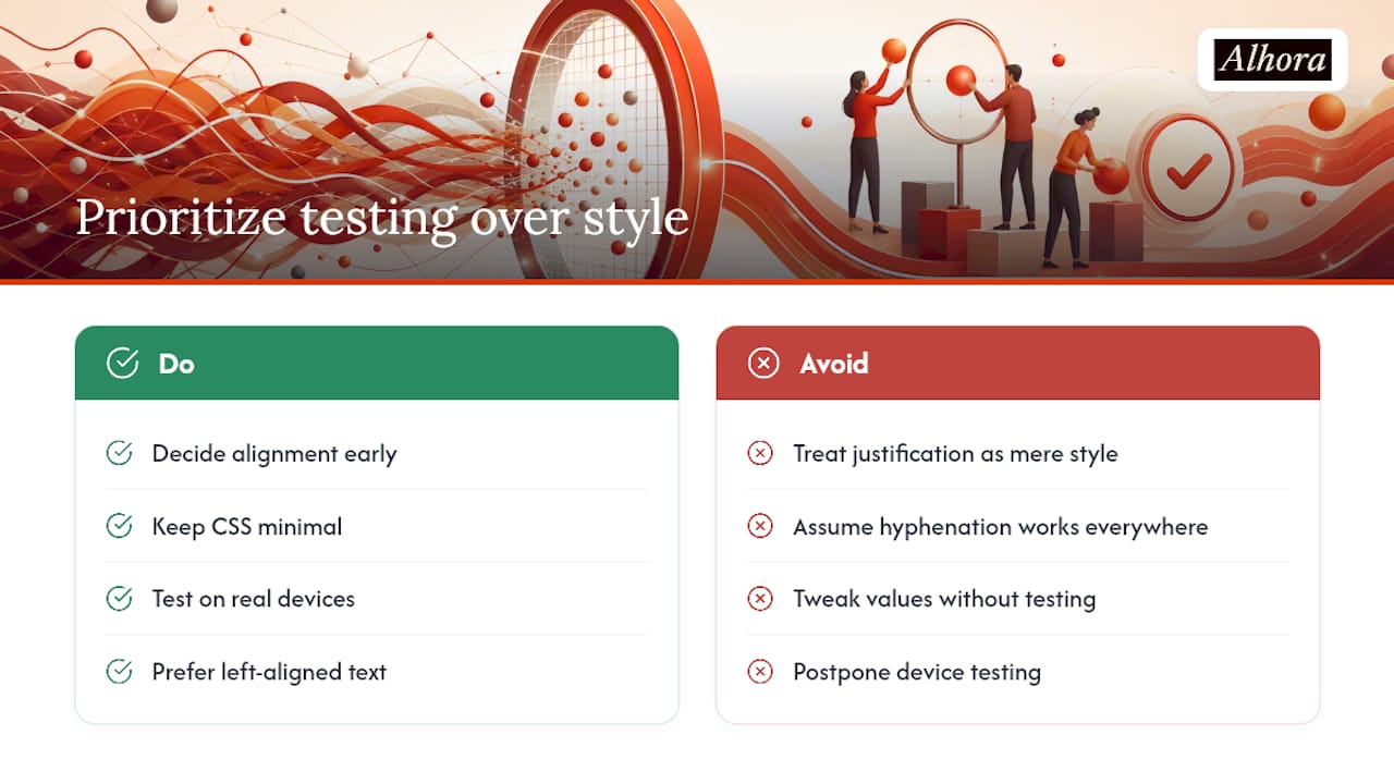
If there's one thing worth prioritizing over the aesthetic debate, it's this: decide your alignment early, keep your CSS minimal, and spend your remaining time on device testing rather than tweaking values you can't verify without a real screen in front of you. Left-aligned body text isn't the boring choice. It's the one that fails less often, on more devices, for more readers.
— James
Let Alhora Handle Justification for You
If manually chasing rivers across five different reading apps sounds like the opposite of writing, that's the exact problem Alhora's ebook formatting software was built to solve. Its typesetting engine automatically applies hyphenation, prevents widows and orphans, and runs export validation for KDP, Apple Books, Kobo, and other major stores, so you're not hand-editing CSS between submissions.

The AI-assisted checks flag formatting issues without ever rewriting your prose, so you keep full creative control while skipping the manual find-and-replace work outlined above. If you're preparing a manuscript for Amazon specifically, the KDP formatting tools walk through platform-specific requirements before export. Import a sample chapter and run it through Alhora's validation checks to see how much of this troubleshooting disappears before you ever open Kindle Previewer.
Sources
- Align or justify text in Word | Microsoft Support
- Approaches to full justification — W3C / International