
A publication-ready style guide for novels must specify exact typography (fonts, sizes, leading, paragraph indent rules), page geometry for print (trim size, margins, gutter, bleed), EPUB 3-compliant structural requirements (navigation document, semantic markup, embedded fonts), export formats (PDF/X for print, .epub for ebooks), and a short pre-upload validation checklist. Here is the core checklist to copy into any project brief or hand to a formatter:
- Trim size: Choose before layout begins (common novel trim sizes typically include approximately 5.5" × 8.5" or 6" × 9")
- Body font and size: Serif typeface, 10–12 pt for print (11 pt is a reliable default)
- Paragraph indent: First-line indent only; no extra spacing between paragraphs in fiction
- Chapter opens and running heads: Drop running head from chapter-opening pages; folio placement consistent throughout
- Gutter: Scale with page count per platform guidance; never use a fixed gutter across all titles
- PDF export: PDF/X-1a:2001 or PDF/X-3:2002, all fonts embedded, transparencies flattened
- EPUB 3 export: Valid package document, navigation document, semantic markup; run epubcheck before upload
- Final proofing: Device proof on phone and tablet, PDF print proof, metadata and ISBN verified
Key Takeaways
A publication-ready novel requires validated EPUB 3 and PDF/X files, correct typography, platform-matched cover templates, and a proofing pass before every upload.
| Point | Details |
|---|---|
| Choose trim size first | Trim drives line breaks, page count, spine width, and gutter depth; lock it before layout begins. |
| Embed all fonts | Missing embedded fonts are the most common cause of print PDF rejection at both KDP and IngramSpark. |
| Validate the EPUB | Run epubcheck and preview in at least two reading systems before submitting to any ebook platform. |
| Use platform templates | Regenerate the cover template from each platform's calculator every time the page count changes. |
| Alhora automates checks | Alhora's engine adjusts gutters, embeds fonts, and runs an audit-gated EPUB export for KDP and IngramSpark. |
Table of Contents
- What does a style guide for novels covers in typography?
- What print specs prevent rejection at KDP and IngramSpark?
- How do EPUB 3 requirements apply to reflowable novels?
- Platform upload checklist for KDP and IngramSpark
- Proofing workflow before you upload anything
- A copyable style guide template for novel interiors
- Accessibility basics every novel style guide should require
- Why a short technical style guide saves more time than you expect
- Alhora handles the formatting so you can focus on the writing
- Sources
What does a style guide for novels covers in typography?
Body text in print novels belongs in a serif typeface. Garamond, Caslon, Palatino, and Minion Pro are all proven choices. Ebook readers frequently let users override the font entirely, so the embedded font matters less there than in print, but including a clean WOFF or WOFF2 file still improves the reading experience on capable devices.
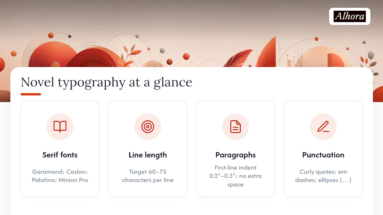
Line length should target 60–75 characters per line, which corresponds to a comfortable measure for most trim sizes. Justification is standard for fiction; pair it with hyphenation tuned to a minimum word length of six characters and a two-consecutive-line limit to prevent laddering.
Paragraph style in fiction is first-line indent only, typically 0.2"–0.3". No extra space between paragraphs. No indent after a chapter heading or after a scene break. Scene breaks use either a centered glyph (# or ✦) or three asterisks on their own line, with one blank line above and below.
Dialogue uses curly (typographer's) quotes, not straight quotes. Em dashes for interruptions and abrupt breaks, en dashes for ranges. One space after a sentence period, not two. Ellipses as a single Unicode character (…) rather than three spaced periods.
Running headers carry the book title on the verso (left) page and the author name or chapter title on the recto (right) page. Folios sit at the outside margin or centered in the footer. Remove the running header entirely from chapter-opening pages.
Pro Tip: Build every rule into named paragraph and character styles in your layout tool, whether that is InDesign, Affinity Publisher, or a dedicated formatter. A global font change then takes ten seconds instead of an hour of manual corrections.
What print specs prevent rejection at KDP and IngramSpark?
Trim size drives everything downstream: line breaks, page count, spine width, and gutter depth. For most adult fiction, 6" × 9" is the standard. Mass-market paperback runs at 4.25" × 6.87". Choose before you flow text, because changing trim after layout means reflowing the entire book.
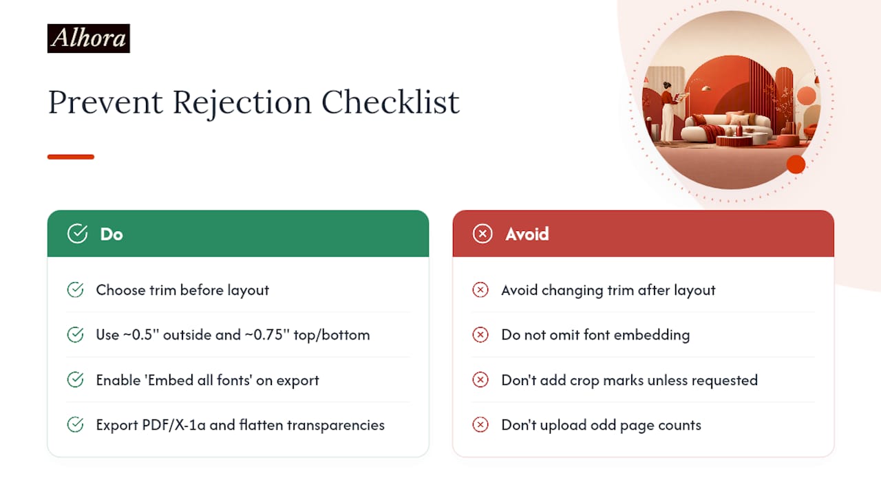
Margins and gutters follow a simple principle: the gutter must increase as page count rises, because binding bite eats more of the inner margin in thicker books. A novel with fewer pages can use a smaller gutter, which should increase as page count rises to accommodate binding bite appropriately. Outside margins should be at least around 0.5", with top and bottom margins around 0.75" to allow space for running headers and folios. Bleed for interior pages is 0.125" on outer edges only when the design requires it; most novel interiors have no bleed.
Font embedding is the single most common cause of cryptic print rejections. Always enable "embed all fonts" in your export settings and confirm in Acrobat's font dialog that every typeface shows "Embedded Subset." Subset embedding is fine and reduces file size. IngramSpark's File Creation Guide makes font embedding a hard requirement, and IngramSpark's interior design guidance confirms that missing embedded fonts are among the most frequent rejection triggers across POD platforms.
Export the interior as PDF/X-1a:2001 for the strictest compatibility, or PDF/X-3:2002 if your workflow requires ICC color profiles. Flatten all transparencies. For color covers, use CMYK. Include crop marks only if the platform explicitly requests them; KDP does not want them on interior files.
Cover files are a separate PDF: a single spread (back, spine, front) with the spine width calculated from trim size plus page count. Use each platform's own cover template calculator and regenerate it every time the page count changes. The barcode area on the back cover must remain clear.
Pro Tip: Run Acrobat's preflight tool against the PDF/X-1a profile before upload, and confirm an even page count. An odd page count will cause an immediate rejection.
How do EPUB 3 requirements apply to reflowable novels?
EPUB 3 defines the publication as a package of interrelated web resources: an OCF container, a package document (OPF), a navigation document (nav), and XHTML content documents. Every conforming EPUB must include all four. For novels, the content documents are XHTML files, one per chapter or section, styled with CSS.
Novels should always be reflowable, not fixed-layout. Fixed layout locks the page geometry and breaks on small screens. The only case for fixed layout in fiction is a heavily illustrated or design-driven book where the visual relationship between text and image cannot reflow.
EPUB 3.4 clarifies media-type support and manifest fallback rules. Supported image formats include JPEG, PNG, GIF, and SVG as core types; WebP and AVIF appear in later subversions with fallback requirements for older reading systems. For novel interiors, JPEG or PNG for any decorative images is the safe choice.
Use semantic markup throughout: <h1> through <h3> for headings, EPUB landmark roles in the nav document (toc, bodymatter, frontmatter, backmatter), and epub:type attributes on chapter sections. Avoid absolute positioning in CSS. Include font fallbacks in every CSS font stack.
Validation workflow:
- Export to .epub from your layout or authoring tool
- Run epubcheck against the file and resolve every error (warnings are advisory; errors are blocking)
- Open in Apple Books, Adobe Digital Editions, and Kindle Previewer
- Check chapter navigation, font rendering, and image display on a phone-sized screen
- Fix issues in the source file, not the EPUB directly
- Re-run epubcheck to confirm a clean pass
Pro Tip: Include a minimal embedded font system using WOFF2 for the body typeface. Capable reading systems will use it; others will fall back to the user's default. The result is better typography where it matters without breaking anything where it does not.
Platform upload checklist for KDP and IngramSpark
Both platforms share a core set of requirements, and the differences between KDP and IngramSpark are significant enough that files should never be shared between them without recalculation.
Applies to both platforms:
- Interior PDF with all fonts embedded and even page count
- Cover PDF generated from that platform's own template calculator
- Images at 300 DPI minimum
- Color space: grayscale or CMYK for print interiors; CMYK for covers
- Spine width verified against current page count
KDP specifics: KDP accepts standard PDFs for interiors and has a file size ceiling. Use the KDP online previewer before approving the proof; it catches rendering issues that are not visible in Acrobat. KDP's preflight is more permissive than IngramSpark's, but that is not a reason to skip your own checks.
IngramSpark specifics: IngramSpark's preflight is stricter and charges a fee for file revisions after submission. Follow PDF/X requirements and use IngramSpark's templates precisely. A file that passes KDP may still fail IngramSpark's preflight on color space or bleed settings.
Pro Tip: Prepare your files to IngramSpark's stricter standard first. A file that clears IngramSpark's preflight will almost always pass KDP without changes.
Proofing workflow before you upload anything
- Export the final interior PDF and .epub from source
- Run epubcheck on the .epub; run Acrobat preflight (PDF/X-1a profile) on the print PDF
- Open the .epub in at least two reading systems (Apple Books and Kindle Previewer cover the widest rendering range)
- Order a physical proof copy or use the platform's digital proof tool for the print file
- Check metadata: title, author, ISBN, language code, and series information
- Confirm the cover template matches the current page count
Common errors to catch: missing or malformed nav document in the EPUB, fonts not embedded in the PDF, odd page count, widow or orphan lines on chapter-opening pages, gutter too narrow for the page count, color-space mismatch on the cover (RGB submitted where CMYK is required), and unflattened transparencies.
Fix errors in the source file, then re-export. Never patch an EPUB or PDF directly; the source is the single source of truth.
Pro Tip: Keep a short QA checklist as a text file in the project folder. Check each item off before every upload, not just the first one.
A copyable style guide template for novel interiors
Copy this into your project brief or send it to your formatter alongside the manuscript file.
Project style guide
- Trim size: 6" × 9" (adjust to 5.5" × 8.5" for shorter novels)
- Body font: Garamond, 11 pt
- Leading: 14 pt
- First-line indent: 0.2"
- Paragraph spacing: None (fiction standard)
- Scene break: Centered # with one blank line above and below
- Chapter opens: New recto page; no running head on opening page; chapter number in small caps
- Running heads: Book title verso / Author name recto
- Folios: Outside margin, same font as running head at 9 pt
- Front matter order: Half-title → Title page → Copyright page → Dedication → Table of contents (if applicable) → Body
- Back matter order: Acknowledgments → About the Author → Other Titles
- Front matter page numbers: Lowercase Roman numerals; Arabic numerals begin at Chapter 1
- Export files: PDF/X-1a:2001 for print interior; .epub (EPUB 3, reflowable) for ebook
- Fonts to supply: All body and display fonts as OTF or TTF files
When handing this to a formatter, include: the manuscript as a clean .docx or .rtf, this style guide, the platform cover template (generated fresh from the current page count), and any special typography notes (foreign-language passages, poetry formatting, tables).
Operationalizing these rules into a repeatable production workflow is where a team style guide pays dividends across multiple titles.
Accessibility basics every novel style guide should require
A valid EPUB navigation document is the baseline. Beyond that, logical reading order must match the visual order, headings must use semantic markup (<h1>, <h2>) rather than styled paragraphs, and the language declaration in the package document must match the book's language.
For images, any image that conveys meaning needs descriptive alt text. Decorative images (ornamental dividers, section glyphs) should carry an empty alt attribute (alt="") so screen readers skip them. Chapter-opening illustrations that set scene or mood need a brief, accurate description.
Following the EPUB Accessibility specification moves a file from technically valid to genuinely usable. The key additions are ARIA landmarks in the nav document and epub:type semantic tagging on structural elements.
Pro Tip: Add an accessibility pass as the final step in your proofing workflow, after epubcheck passes. Keep a running list of accessibility fixes to address before the next title so the standard improves with each book.
Why a short technical style guide saves more time than you expect
The revision cost of not having a style guide is invisible until it hits. A formatter who guesses at the gutter setting, or a designer who exports in RGB because the brief did not specify CMYK, produces a file that fails preflight. That failure costs a revision fee at IngramSpark, a delay, and a second round of proofing. A one-page style guide eliminates most of that.
Consistent templates also compress the time between manuscript and upload. When the trim, fonts, and export settings are decided once and documented, every subsequent title in a series moves faster. Platform rejections drop because the checklist catches the common errors before submission.
Alhora's typesetting engine integrates these checks directly into the export workflow, automatically adjusting gutters by page count and flagging accessibility gaps before the file leaves the tool. That is the practical value of a validation-first approach: fewer surprises at upload, and a shorter path from manuscript to shelf.
Alhora handles the formatting so you can focus on the writing
Producing validated EPUB 3 and PDF/X files from a manuscript takes time, and the margin for error is narrow. Alhora automates the parts most likely to go wrong.

The typesetting engine handles justification, hyphenation, widows, and orphans automatically. Gutter depth adjusts by page count. Fonts embed correctly on export. The proof simulator shows how the interior will render before you upload. For ebooks, the accessible EPUB export path runs an audit gate that catches nav document errors and accessibility gaps before the file is finalized. Batch formatting handles series titles consistently. When the manuscript is ready, Alhora produces the validated EPUB and print PDF in a single workflow, ready for KDP and IngramSpark upload without a separate preflight step.
Sources
- IngramSpark File Creation Guide