
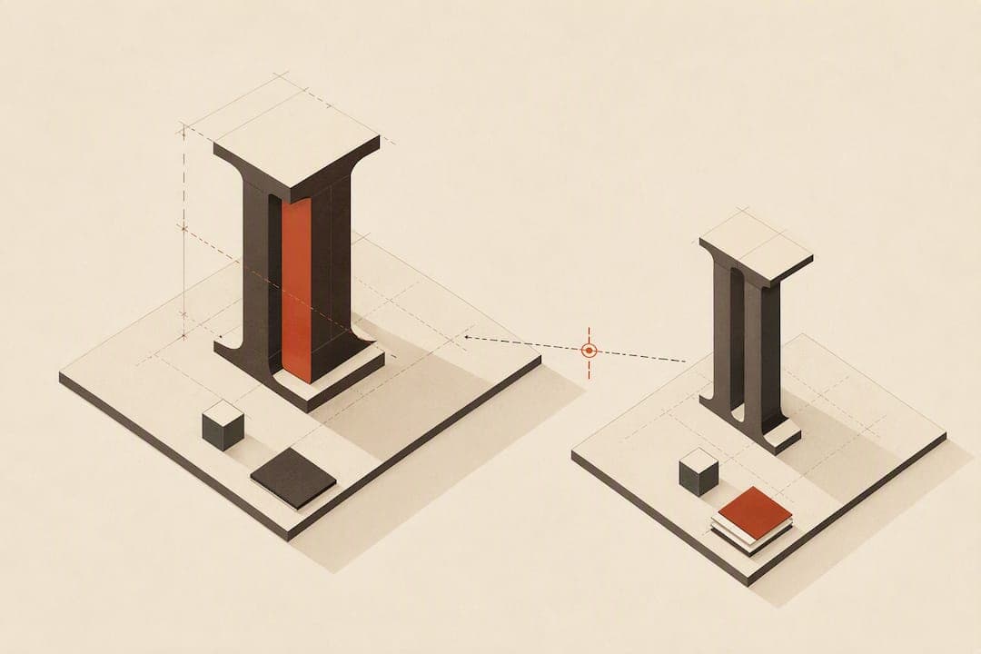
Small caps are uppercase letterforms redrawn at roughly the height of the lowercase x-height, not full capitals shrunk down. The core rule: always prefer true, font-provided small caps over synthetic scaling, and use them sparingly for acronyms, running heads, and short emphasis rather than long passages. Get those two things right and the rest of small caps typography is mostly refinement.
TL;DR:
- True small caps are designed glyphs that match the x-height and stroke weight of lowercase letters, not simply scaled-up or scaled-down versions of capital letters.
- Most software-generated small caps use font scaling, causing thin strokes and visual mismatch, which true small caps avoid through dedicated glyphs.
- Confirm small caps support by checking for OpenType features (
smcpandc2sc) and visually comparing stroke weight and proportions in the font.- Use small caps sparingly for acronyms, running headers, and chapter openings, avoiding long passages that diminish their contrast.
- Automated tools and professional fonts with true small caps improve consistency and prevent errors, especially in digital and print publishing workflows.
Table of Contents
- What Small Caps Are and Why They Exist
- True Small Caps vs. Faux Small Caps: How to Tell the Difference
- Design Anatomy: The Metrics Behind Well-Built Small Caps
- How to Apply Small Caps in Design Software and on the Web
- Where Small Caps Belong: Acronyms, Running Heads, and More
- A Quick Checklist Before You Finalize the File
- What Alhora Sees When Manuscripts Come In
- Getting Small Caps Right Without Doing It Yourself
- Sources
- FAQ
What Small Caps Are and Why They Exist
Small caps solve a problem that full capitals create: visual shouting. A sentence in ALL CAPS reads as loud and flat, while a lowercase word set in small caps sits quietly inside a line of text, signaling "this is different" without disrupting the rhythm of reading.
The Wikipedia entry on small caps defines them precisely: letters that carry the graphic form of uppercase characters but are typeset at a size matching lowercase letters or the x-height. That distinction matters more than it sounds. A true small cap isn't just a capital "A" scaled to 70 percent. Type designers draw it as its own glyph, adjusting the proportions so it doesn't look thin or spindly next to the lowercase letters around it.
This wasn't invented for word processors. Small caps have roots in classical inscriptional lettering and moved into book typography centuries ago, where compositors used dedicated small-cap sorts (physical metal type) alongside regular capitals and lowercase. The tradition survived the shift to digital fonts, though not every font honored it equally.
A few things distinguish a properly built small cap from an imitation:
- It matches the stroke weight of the surrounding lowercase text, not the thinner proportions of a scaled-down capital.
- Its width and spacing are calibrated to sit comfortably between words without looking cramped or oversized.
- It's drawn as a discrete glyph in the font file, often accessible through an OpenType feature rather than generated on the fly.
Understanding that a small cap is a designed object, not a resized one, is the foundation for everything else in this guide.
True Small Caps vs. Faux Small Caps: How to Tell the Difference
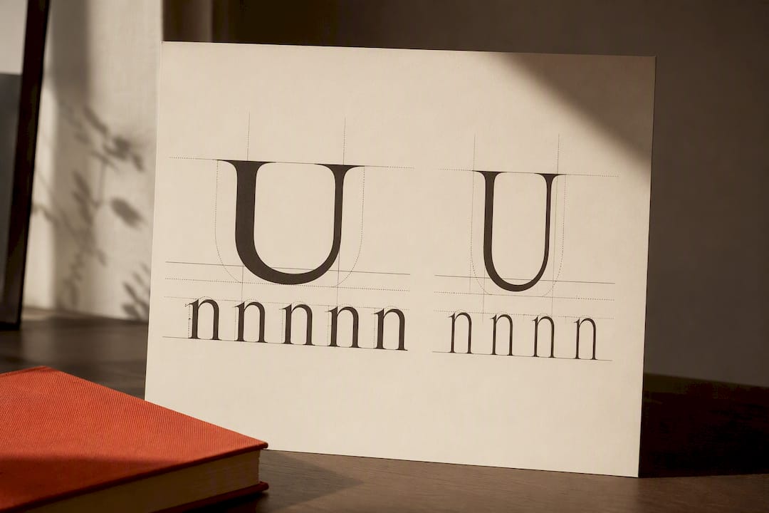
Faux small caps are the default in most software, and they're the reason a lot of "small caps" text on the page and screen looks off without readers knowing why. According to Practical Typography, most word processors and browsers synthesize small caps by scaling down full capitals. The result has thinner strokes than the surrounding lowercase text, because shrinking a letterform reduces its weight proportionally. Text that should sit quietly ends up looking anemic and slightly mismatched.
Real small caps come from one of two places: an OpenType feature built into the font, or a dedicated small-caps font file bundled separately. The two relevant OpenType tags are smcp (small capitals, which converts lowercase letters into small caps) and c2sc (caps to small caps, which converts existing uppercase letters into small caps so an acronym doesn't turn into full-height capitals). A font that supports both gives you full control over mixed-case text.
Here's how to check whether you're looking at the real thing:
- Compare stroke weight. Zoom into a small cap "H" and a lowercase "h" side by side. If the small cap looks noticeably thinner, it's faked.
- Check the font's OpenType feature panel. In InDesign or Illustrator, the OpenType submenu shows whether Small Caps is available as a font feature (grayed out means the font doesn't support it).
- Look for proportion mismatches. Faux small caps often sit slightly too tall or too short relative to the x-height, because scaling doesn't account for optical correction.
If the small caps look starved next to the lowercase strokes, your font is faking it, and you should switch typefaces before finalizing the file.*
Design Anatomy: The Metrics Behind Well-Built Small Caps
Type designers don't just shrink a capital letter to x-height and call it done. Building a small cap that reads correctly involves several coordinated adjustments, and understanding them helps you evaluate whether a typeface is doing the job properly.
Most small caps sit close to the face's x-height, though the exact proportion varies by typeface and design intent. The Wikipedia entry on small caps confirms this sizing logic: small caps are drawn to match lowercase height, not scaled from the cap height. Because a true small cap is a separate drawing, the designer can compensate for the size reduction by thickening the strokes slightly, so the letter carries the same visual weight as the lowercase text around it. Widths and side-bearings (the space on either side of a letter) also get adjusted so small caps don't look cramped when set next to lowercase letters.
Once you're working with real small caps, a few finishing touches make the difference between "correct" and "polished":
- Add letterspacing. Practical Typography's guidance on small caps recommends slightly opening up tracking on small caps, since tight-set capitals of any size look congested.
- Enable kerning. Letter pairs in small caps still need kerning applied, just like regular text.
- Proof at final output size. A small cap that looks fine at 200% zoom can look different printed at 10-point body size, so always check the actual output.
- Consider petite caps for extreme size mismatches. Some type families include a second, even smaller small-cap set (petite caps) designed for use inside already-small text, like footnotes or captions.
Statistic Callout: True small caps are drawn specifically to match a typeface's x-height and adjusted in stroke weight and proportion, according to Wikipedia's typographic definition, rather than derived by scaling capital letters. That's the single technical fact that separates professional typesetting from default software output.
How to Apply Small Caps in Design Software and on the Web
The steps differ by tool, but the goal is identical everywhere: trigger the font's real small-caps glyphs, never a scaling transform.
In InDesign, Affinity Publisher, or similar layout software: open the Character panel's OpenType submenu and select Small Caps, which activates the smcp feature if the font supports it. If the font has no OpenType small caps, check whether the type family ships a separate small-caps font file (common in professional serif families) and apply that file directly instead of using the software's built-in "small caps" style, which almost always scales.
In word processors like Word or Google Docs: the "Small Caps" formatting checkbox is a scaling function in the vast majority of cases, not a font-feature trigger. Practical Typography's core insight here is blunt: skip the checkbox and buy a font with true small caps if the project matters. This is the single most common way faux small caps end up in finished manuscripts.
On the web: CSS gives you the font-variant-caps property, with values including small-caps and all-small-caps. According to MDN's documentation, if the loaded font lacks the OpenType small-caps feature, the browser will synthesize small caps from uppercase glyphs automatically. That's convenient but produces the same thin, mismatched look as any other faux small cap.
A minimal, safe CSS pattern looks like this:
.small-caps {
  font-variant-caps: small-caps;
  font-feature-settings: "smcp";
}
| Environment | Trigger | Common trap |
|---|---|---|
| InDesign/Affinity | OpenType > Small Caps | Style panel "Small Caps" instead of OpenType feature |
| Word/Google Docs | Format > Font > Small Caps | Checkbox scales capitals by default |
| CSS/web | font-variant-caps: small-caps | Browser silently synthesizes when font lacks smcp |
For ebook exports, check EPUB and print PDF files after generation. Reflowable EPUB rendering can strip or override font features depending on the reading app, so proof the final file on at least two e-readers before calling it done. Justification settings can also affect how evenly small caps sit in a line, which ties directly into broader text justification fixes for ebooks.
Where Small Caps Belong: Acronyms, Running Heads, and More
Small caps earn their place in specific, recurring spots rather than as a general display style. The Elements of Typographic Style Applied to the Web recommends small caps for abbreviations and acronyms in running text specifically because they preserve hierarchy without the visual weight of full capitals.
The standard use cases:
- Acronyms inside body text — NASA, FBI, or similar abbreviations set as small caps rather than full caps, so they don't jump off the page.
- Running heads and folios — chapter titles repeated in the header or footer of a printed page, a classic use in book design.
- Chapter openers — the first few words of a chapter, a convention many novels still use for a formal, traditional feel.
- Author names in bibliographies and citations — small caps distinguish the author line from the title without adding italics or bold.
Style guides don't fully agree on the edges. Book Design Basics notes that conventions vary between publishers, particularly around exceptions like "U.S." or "A.M./P.M.", which some house styles keep as full caps regardless of context. When acronyms are spaced in small caps, a touch of letterspacing keeps the letters from crowding, but the same rule doesn't apply to long passages: small caps used across entire paragraphs lose their contrast effect and slow reading down. Digital rendering adds one more caveat. Unicode includes characters that visually resemble small caps (mostly used for phonetic transcription), but they are not a substitute for real font-based small caps in professional typesetting, according to LetterType's breakdown of small caps.
A Quick Checklist Before You Finalize the File
Run through this before sending a manuscript to print or export:
- Confirm true small caps, not scaled capitals. Check the OpenType feature panel or compare stroke weight directly.
- Add slight tracking and confirm kerning is active. Small caps set too tight look congested; too loose looks disconnected from the line.
- Proof at the actual output size, not just at high zoom, since faux small caps hide better on screen than in print.
- Keep usage short and consistent. Acronyms, running heads, and chapter openers, not multi-line passages, and apply the same rule throughout the entire book.
- Check accessibility. Some screen readers interpret small caps or all-small-caps CSS as individual letters rather than words, which can turn an acronym into a spelled-out mess for a listener. Test with an actual screen reader if the file will reach an ebook audience with accessibility needs.
Pro Tip: Keep a one-line note in your style sheet listing every place small caps appear in the manuscript (running heads, chapter openers, specific acronyms). It takes two minutes and saves a full read-through later when you're checking for consistency.
What Alhora Sees When Manuscripts Come In
Faux small caps are one of the most common flags we see during automated typesetting checks. When a manuscript arrives with scaled capitals masquerading as small caps, the mismatch in stroke weight and letter width shows up immediately once the file is run against real font metrics, not just visually but in the underlying glyph data.
The fix is usually straightforward: confirm whether the chosen typeface actually supports smcp or c2sc, and if it doesn't, swap in a font family that does rather than trying to force the effect. If you're briefing a formatter, say explicitly which words or acronyms need small caps, and note whether you want spaced small caps for abbreviations. That one sentence in a formatting brief prevents more back-and-forth than almost any other typography note.
Getting Small Caps Right Without Doing It Yourself
If everything above sounds like a lot of glyph-level checking to do manually across an entire manuscript, that's a fair reaction — which is why many rely on WOVA's automated workflow augmentation to streamline typographic tooling and design tasks. It is. Most authors don't want to open an OpenType feature panel and compare stroke weights letter by letter, and they shouldn't have to.

Alhora's book formatting software is built around exactly this kind of typesetting fidelity: real-time validation catches faux small caps, missing OpenType features, and other formatting mismatches before they ever reach a finished file, whether you're exporting to KDP, IngramSpark, or Apple Books. The engine checks font capability rather than assuming every typeface behaves the same way, which is the gap that causes most small-cap problems in the first place. If you're working on Mac, there's a dedicated formatting build for macOS; Windows authors have their own supported version. Both route through the same typesetting engine and the built-in AI assistant, Inkia, which flags issues without ever touching your prose. Licensing is available via a one-off purchase. Upload your manuscript and run a formatting check to see exactly where your current file's small caps, or anything else, need attention before you publish.
Sources
For the CSS mechanics behind small caps on the web, MDN's font-variant-caps documentation is the definitive source. For typographic doctrine and practice, Practical Typography and Web Typography's small caps guidance cover the reasoning in depth, while Wikipedia's entry offers a concise historical and technical overview.
- Practical Typography — Small caps (Butterick)
- The Elements of Typographic Style Applied to the Web — small caps recommendation
- Small caps — Wikipedia
FAQ
What Are Small Caps in Typography?
Small caps are uppercase letterforms drawn at a size that matches the lowercase x-height rather than full cap height, according to Wikipedia's definition. They're designed as separate glyphs with adjusted stroke weight, not simply shrunk capital letters.
What Is a Small Capital Text Font?
A small capital text font, or a font with true small caps, includes dedicated small-cap glyphs accessible through the OpenType smcp and c2sc features. Not every font includes these; many popular typefaces only support faux small caps through software scaling.
What Is a Good Font for Small Caps?
Classic serif book faces tend to handle small caps best because they were often built with the feature in mind. Minion Pro, Bembo, and Adobe Garamond are widely cited as reliable choices with true OpenType small-caps support, making them solid starting points for print and ebook typesetting.
How Do You Format Small Caps Correctly?
Enable the font's OpenType small-caps feature (smcp for lowercase-to-small-cap conversion, c2sc for existing capitals) rather than using a software scaling checkbox. On the web, use the CSS property font-variant-caps: small-caps, and always proof the result at final output size to confirm the font isn't synthesizing the effect. Tools like Alhora's typesetting engine flag faux small caps automatically during formatting, which catches the mismatch before export.