
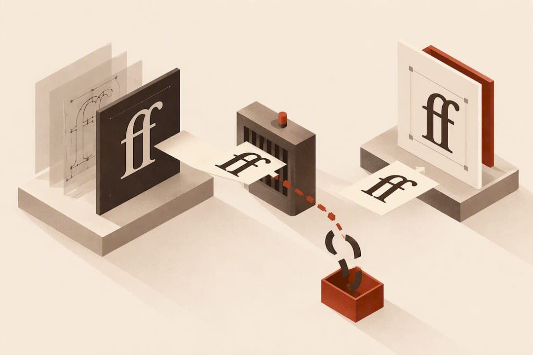
A ligature is a single glyph that replaces two or more letters that would otherwise collide or look awkward side by side, like fi, fl, ffi, ffl, æ, and œ. The practical rule: turn on standard ligatures for body text to fix letter collisions, use discretionary ligatures sparingly in display type, and disable ligatures entirely for accessibility-critical exports where screen readers or PDF tagging might misread them.
Key Takeaways
Using standard ligatures correctly improves typographic readability while discretionary and historical ligatures should be used sparingly to avoid accessibility and clarity issues.
| Point | Details |
|---|---|
| Enable default ligatures | Turn on standard ligatures in fonts to fix letter collisions without affecting reading flow. |
| Use discretionary ligatures selectively | Apply decorative ligatures mainly in display fonts to add style without compromising accessibility. |
| Test for encoding issues | Always verify that ligature glyphs map back to source letters to ensure compatibility with assistive technology. |
| Control ligatures in design software | Manage ligature settings through font features in CSS, InDesign, or Illustrator to optimize text appearance. |
| Prioritize accessibility checks | Run accessibility and screen reader tests before exporting files to prevent misreading ligature-based words. |
Table of Contents
- What ligatures are and common examples
- Types and classification in modern fonts
- Why ligatures existed and how their role changed
- How to enable, disable, and control ligatures
- Accessibility, PDF export, and assistive-technology pitfalls
- Practical best practices and editorial rules
- Finding the line between finesse and readability
- Sources
- FAQ
What ligatures are and common examples
A ligature replaces two separate letterforms with one combined glyph. This is different from typing two characters that merely sit close together: the font substitutes a single shape at the layout stage, and the underlying text still reads as the original letters when copied or searched correctly.
The most common ligatures and their Unicode presentation forms include:
- fi: fixes the collision between the dot on the "i" and the hook of the "f"
- fl: smooths the junction between "f" and "l"
- æ: a true letter in several languages, not just a stylistic fix
- œ: used in French and in borrowed words like "œuvre"
- ß: the German sharp S, historically a ligature of "s" and "z"
It helps to separate ligatures from digraphs. A digraph is two letters that represent one sound, like "th" in English, but stays as two distinct characters. A ligature is a typographic substitution: the Unicode FAQ on ligatures and digraphs treats ligatures as presentation forms that fonts and layout engines decide whether to show, not as separate linguistic units that need their own encoding.
Types and classification in modern fonts
Font designers group ligatures into categories, and OpenType gives each category its own feature tag. Knowing these tags helps you read a font's feature list and decide what to turn on.
- Standard ligatures (liga): the corrective ones, like fi and fl, usually enabled by default because they fix visual collisions
- Discretionary ligatures (dlig): decorative combinations like st or ct, off by default since they change the texture of the text
- Historical ligatures (hlig): archaic forms revived for period pieces or display work, off by default
- Contextual alternates (clig): substitutions that depend on surrounding letters rather than a fixed pair
- Required ligatures (rlig): mandatory in certain scripts, where the ligature is not optional for correct rendering
Most text fonts ship with liga switched on because standard ligatures correct spacing problems rather than add flourish. The rest sit behind a toggle, since a reader skimming a paragraph rarely wants decorative substitutions interrupting the rhythm. Type designers expose these settings in font editing software and in the OpenType feature list bundled with the font file, and design apps read that same list to populate their own ligature menus. Wikipedia's entry on ligatures outlines how these feature tags map to the categories type designers actually use when building a font.
Why ligatures existed and how their role changed
Metal type compositors needed ligatures for a mechanical reason: certain letter pairs, especially those involving "f," physically collided or left ugly gaps when cast as separate pieces of type. Combining "f" and "i" into one sort solved the collision and sped up typesetting.
Digital typography brought ligatures back for a different reason. TeX automated ligature substitution for technical and academic publishing, and OpenType later gave font designers a structured way to bundle dozens of ligatures into a single file. Some display and script fonts now include historical or decorative ligatures purely for tone, useful in wedding invitations, period-style branding, or editorial headlines where a little flourish fits the piece. In long-form body text, the original corrective purpose still matters more than the decorative one.

How to enable, disable, and control ligatures
Control over ligatures depends on where you're working. On the web, the CSS property documented on MDN's font-variant-ligatures reference gives you keyword-level control:
font-variant-ligatures: common-ligatures;turns on standard ligaturesfont-variant-ligatures: discretionary-ligatures;adds decorative pairsfont-variant-ligatures: historical-ligatures;brings in archaic formsfont-variant-ligatures: no-common-ligatures;ornone;switches ligatures off entirely
In InDesign and Illustrator, the toggle lives in the Character panel under OpenType features, where you can check or uncheck Standard and Discretionary ligatures for a selection, a character style, or a paragraph style. Setting the rule at the style level keeps it consistent across a manuscript instead of toggling it line by line.
| Environment | Where to control ligatures |
|---|---|
| CSS | font-variant-ligatures property |
| InDesign | Character panel OpenType features, saved to paragraph/character styles |
| Illustrator | Character panel OpenType features, applied per selection |
| PDF export | Depends on font encoding at export, not a separate toggle |
Avoid typing ligature glyphs manually instead of letting the font substitute them. Manually inserted ligatures break spellcheck, interfere with hyphenation, and can make search and find-and-replace fail silently.
Accessibility, PDF export, and assistive-technology pitfalls
Ligatures create a real accessibility risk when the font's encoding doesn't map the combined glyph back to its component letters. Testing documented in a Microsoft Q&A thread found JAWS misreading words like "coffee" as "coee" when ligature characters lacked correct Unicode mapping, and some Illustrator exports showed the same character-encoding failures.
Export behavior varies by application and version. Mitigate the risk with a few checks before a file goes out the door:
- Confirm the font's encoding maps ligature glyphs to their source letters, not to decorative-only code points
- Run Acrobat's accessibility checker on any PDF destined for screen readers
- Test the actual export with a screen reader rather than trusting the checker alone
- Disable ligatures outright for accessibility-critical deliverables when mapping can't be confirmed
A secondary but real issue is cursor navigation: fonts need caret anchors and correct GDEF table entries so a text cursor can move through a ligature as if it were separate characters. Without them, editing and text selection inside a ligature gets clumsy.
Pro Tip: Treat ligature-heavy fonts as a liability in any file bound for EPUB or PDF distribution until you've confirmed the encoding with an actual accessibility check, not just a visual proof.

Practical best practices and editorial rules
A short set of rules covers most editorial decisions about ligatures:
- Enable standard ligatures (liga) by default in body text: they fix collisions, and readers never notice them doing their job.
- Reserve discretionary ligatures (dlig) for display type, headlines, or branded typographic moments, not continuous reading text.
- Skip historical ligatures (hlig) unless the piece calls for period styling, since they can read as a mistake rather than a choice to an unfamiliar eye.
- Before export, run the editorial QA checklist: test search, confirm hyphenation still works across ligature pairs, and check assistive tech readback.
- Watch for overused discretionary pairs, especially the "Th" ligature in display fonts, which can look like a stylistic tic rather than a deliberate flourish when it appears on every "Th" in a headline.
Practical Typography's guidance on ligatures backs this split: treat standard ligatures as corrective defaults and discretionary ones as something to review case by case, not switch on wholesale.
Finding the line between finesse and readability
Ligatures are a typographic tool, not decoration for its own sake. The temptation with discretionary and historical ligatures is to treat them as free styling, but every one you add is a small bet that your reader, your export pipeline, and your assistive technology will all agree on what that glyph means.
Catching that bet early, during typesetting rather than after a file has shipped, is what separates a clean export from a support ticket. Build the check into your workflow instead of your memory with Ilena for Creative Institutions.
— James
Sources
- font-variant-ligatures - CSS: MDN
- Ligatures | Practical Typography
- JAWS screen reader not reading ligature characters - Microsoft Q&A
- FAQ - Ligatures, digraphs and presentation forms (Unicode)
FAQ
What are the five ligature types in typography?
The common classification covers standard, discretionary, historical, contextual, and required ligatures, each mapped to an OpenType feature tag (liga, dlig, hlig, clig, rlig). Standard ligatures fix letter collisions and are usually on by default, while the others are optional or script-specific.
Are ligatures still used today?
Yes. Standard ligatures like fi and fl remain active by default in most text fonts because they correct visual collisions, and discretionary or historical ligatures appear in display and branding work where Practical Typography recommends using them sparingly.
What are examples of ligatures?
Common examples include fi, fl, ffi, and ffl, along with true letters like æ, œ, and the German ß, which originated as a ligature of "s" and "z." Each one replaces two colliding letterforms with a single glyph.
How do you use ligatures in fonts?
In CSS, the font-variant-ligatures property controls which ligature categories render, with keywords like common-ligatures and discretionary-ligatures documented on MDN. In InDesign and Illustrator, the same toggle sits in the Character panel under OpenType features, applied per selection or saved into a style.
Can ligatures cause accessibility problems in exported files?
Yes. When a font's encoding fails to map a ligature glyph back to its component letters, screen readers can misread the word, as shown in documented JAWS testing. Running an accessibility checker and a screen reader test before export catches this before readers do, a step worth building into any EPUB accessibility checklist.