
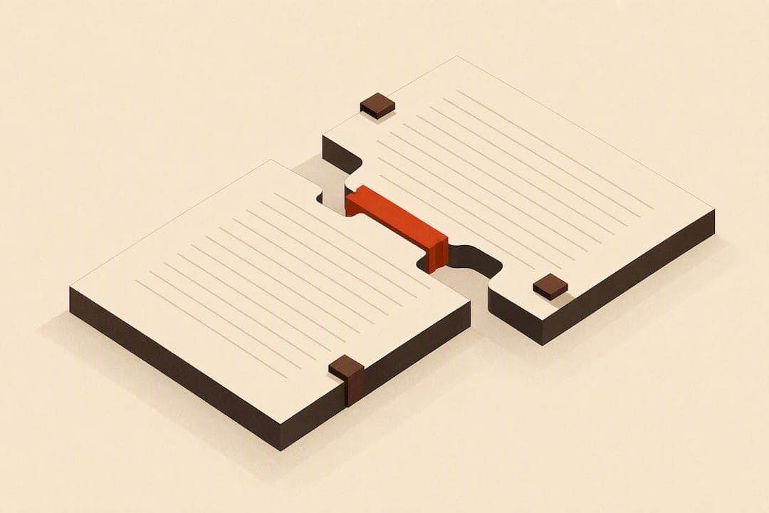
A river in typography is a distracting vertical or diagonal path of white space that forms when the gaps between words on consecutive lines line up. It shows up most in justified text and narrow columns. The fastest fixes: switch to left-aligned text, nudge tracking tighter by a few thousandths of an em, or drop in a discretionary hyphen at the right spot. Treat a river as a real readability problem once it spans three or more lines; a single-line gap is usually just noise.
TL;DR:
- Justified text in narrow columns and excessive word stretching often cause rivers, especially when long words and loose tracking are involved.
- Spotting rivers reliably involves blurring or flipping pages to focus on white-space patterns rather than reading the text.
- Small adjustments like micro-tracking, inserting discretionary hyphens, or slight hyphenation changes are effective first steps to fix rivers without disrupting layout.
- Switching from justified to left-aligned text is a last resort, as it alters the visual rhythm and can introduce new typographic issues.
- Automated tools like Alhora can help prevent rivers during layout by providing real-time validation and localized control over hyphenation and spacing.
Table of Contents
- How Rivers Form: Causes and Typographic Factors
- How to Spot Rivers Reliably on Screen and in Print
- Step-by-Step Fixes, From Least to Most Intrusive
- Typesetting Controls That Actually Move the Needle
- Building River Checks Into Your Proofing Workflow
- A Typographer's Take: Rivers Are a Craft Problem, Not a Bug
- Where a Formatting Tool Fits Into This Workflow
- Sources
- FAQ
How Rivers Form: Causes and Typographic Factors
Justification is the main culprit. When a layout engine forces every line to hit the same right margin, it stretches the spaces between words to fill the line. Do that across several lines, and if the word breaks happen to land near the same horizontal position, those stretched gaps stack into a visible channel. Rivers are most prevalent in fully justified layouts), and narrow columns make the problem worse because there's less room to distribute the extra space.
A few factors decide whether a river appears at all:
- Measure (column width): narrower columns force fewer words per line, which means bigger, more visible gaps.
- Word length: a run of long words leaves fewer natural break points, so spacing has to absorb the slack.
- Typeface: sans-serif faces tend to make word gaps read as sharper, more visible holes than serif faces, where letterforms carry more optical weight.
- Tracking: loose letterspacing widens every gap slightly, compounding the justification stretch.
Repeated long words, stacked em dashes, or ellipses can also create pond-like gaps that mimic rivers even in ragged-right text, since non-space characters can produce the same white-space pattern that word spacing does.
How to Spot Rivers Reliably on Screen and in Print
Rivers hide in plain sight when you're reading for meaning. Your brain fills in words and skips right past the gaps. Breaking that habit takes a few deliberate tricks:
- Squint or blur the page. Reducing focus turns text into gray blocks, so the eye stops parsing words and starts seeing the white-space pattern underneath.
- Print a proof at final trim size. Screen previews at low zoom or the wrong resolution routinely hide rivers that show up the moment ink hits paper, since screen resolution behaves differently than print.
- Run a severity check. Note whether the gap crosses one line (usually cosmetic), three or more lines (a real problem), or repeats across several paragraphs (a systemic H&J issue, not a one-off).
Pro Tip: Keep a printed proof and a blurred screenshot side by side during your final pass. Rivers that survive both checks are the ones worth fixing before you export.
Step-by-Step Fixes, From Least to Most Intrusive
Start small. The goal is to coax the line breaks into a new position without disturbing anything else on the page.
- Apply micro-tracking to the affected lines only. A tenth of a point of tracking, added or removed locally, can shift a word break just enough to dodge the river without any visible letterspacing change. Practitioners recommend tracking by tenths of a point as a first move, sometimes paired with 1% horizontal scaling.
- Insert a discretionary hyphen. A soft hyphen only activates if the line actually breaks there, so it stays invisible everywhere else in the document. Soft hyphens don't become permanent characters that could break a future reflow, which makes them safer than a manually typed hyphen.
- Adjust hyphenation and justification settings. Lower the maximum word spacing a notch and allow a small amount of glyph scaling. This spreads the correction across the whole paragraph instead of forcing one line to do all the work.
- Reflow the copy if the settings alone don't fix it. A two-word rewrite of the offending sentence often solves what no amount of tracking can. Widening the measure is the next option if a rewrite isn't available.
- Reserve a full alignment change for last resort. Switching from justified to left-aligned kills rivers outright, but it changes the visual rhythm of every page in the book, not just the one with the problem.
The order matters because each step above touches less of the document than the one after it. Experts recommend coaxing the text into re-ragging rather than reaching for a global fix, since a broad tracking change or a hard hyphen can quietly create new widows and orphans somewhere else on the page.
Pro Tip: Fix the worst river first, then re-check the page. One correction often shifts enough text that a second, smaller river resolves itself.
Typesetting Controls That Actually Move the Needle
Every layout engine, from InDesign to a browser's CSS renderer, gives you the same handful of levers. Knowing what each one actually does keeps you from guessing.
- Hyphenation controls: the minimum word length before a hyphen is allowed, the hyphenation zone (how close to the margin a break can happen), and whether discretionary hyphens override the automatic engine.
- Justification parameters: minimum and maximum word spacing, letterspacing tolerances, and glyph scaling percentages. Tightening the maximum word spacing is usually the single most effective lever against rivers.
- Tracking versus horizontal scaling: tracking adds or removes space evenly across a range of text, while horizontal scaling squeezes or stretches the letterforms themselves. Use tracking for local fixes; save scaling for true emergencies, since even 1 to 2% is visible on close inspection.
- Typeface and optical color: serif faces tend to soften the visual weight of word spaces, which is part of why classic book typefaces show fewer rivers than geometric sans faces at the same measure. Sans-serif families often need more aggressive hyphenation to compensate.
Get the hyphenation zone too tight and you'll trade rivers for a ladder of hyphens down the right margin. Every one of these settings is a trade, not a fix in isolation.
Building River Checks Into Your Proofing Workflow
Catching a river in the final PDF, after the book is already uploaded, costs you a re-export and a second review pass. Catching it during layout costs you thirty seconds.
- Add a dedicated river check to every proofreading pass: squint at the spread, flip it upside down, then print a page at trim size before signing off.
- Set a working tolerance, such as no stacked-space pattern running more than two lines in body text, so you're not chasing every minor gap.
- When a river keeps reappearing in the same paragraph no matter what you adjust, that's usually a sign the copy needs a small edit, not another typographic patch.
- Log every local tracking or hyphen fix in a style sheet, so a later edit or reflow doesn't silently undo it and bring the river back.
Pro Tip: Do your river check after copyediting is locked, not before. Text edits shift line breaks, and a river you fixed yesterday can reappear in a paragraph you didn't even touch.
A Typographer's Take: Rivers Are a Craft Problem, Not a Bug

Software didn't invent rivers. Justified metal type had them centuries before anyone typed a word into a page-layout program, and the fix was always the same: a compositor's eye and a willingness to make one small adjustment at a time. Robert Bringhurst's framing in The Elements of Typographic Style treats typesetting as a slow, deliberate craft where the goal is even "typographic color," the consistent gray value a page gives off when you squint at it. A river is what happens when that evenness breaks down in one specific spot.
That's why the smallest fix is almost always the right one. A global tracking change or a wholesale switch to left-aligned text solves the river you can see while potentially creating three you can't. The instinct to reach for the biggest available tool is usually the wrong instinct here. Good typesetting software should support that restraint, not override it, by giving you fine-grained control instead of one blunt setting.
— James
Where a Formatting Tool Fits Into This Workflow
Manual river hunting works, but it doesn't scale past a page or two before you're re-checking the same paragraph five times. Alhora was built to catch this class of problem automatically, running real-time validation against publishing standards as you type instead of waiting for a final proof to reveal a river you'll have to trace back through the layout.

The platform's typesetting engine gives you the same hyphenation and justification controls described above, including discretionary hyphen support, so you can apply the exact same small, localized fixes without leaving the app or fighting a rigid template. Its proof simulator shows you how a spread will actually look in print and on-screen before you export, which covers the squint test and the print check in one pass. For authors moving between platforms, Alhora runs on Mac, Windows, Linux, and ChromeOS, and its book formatting software is available for a one-time fee per license. If narrow measures and justified text are giving you trouble on a current manuscript, the Windows and Mac builds are the place to start.
Sources
FAQ
What Is a River in Typography?
A river is a vertical or diagonal channel of white space that forms when word gaps on consecutive lines align, most often in justified text set in narrow columns. It reduces legibility and makes a page look unevenly typeset even when every individual line is correct on its own.
What Is the Golden Rule of Typography?
There's no single official rule, but the closest thing to a consensus is consistency: maintain even spacing, a steady measure, and uniform typographic color across a page so no single element pulls the eye away from the text. Bringhurst's writing treats that evenness as the central goal of good composition, and rivers are simply what happens when it breaks down.
How Do I Describe a River When Giving Feedback on a Layout?
Point to the specific lines involved and describe the shape (a straight vertical channel, a diagonal drift, or a pooling gap) along with how many lines it spans. Saying "the gap runs through lines four to seven near the center of the column," gives a typesetter something concrete to fix, unlike a vague note like "this page looks off."
What Are the Four Main Types of Typography?
Typography is generally grouped into serif, sans-serif, script, and display or decorative typefaces, each suited to different jobs on the page. Serif and sans-serif carry most body text, which is exactly where river checks matter most, since sans-serif faces can make rivers more visible at the same word spacing.
Can a Tool Like Alhora Actually Prevent Rivers, or Just Flag Them?
Alhora's real-time validation flags spacing and justification issues as you work, and its hyphenation and justification controls let you apply the same tracking and discretionary hyphen fixes described above directly in the app. It won't rewrite your sentences for you. Fixing a river caused by word choice still comes down to a small copy edit, which is exactly the kind of decision the novel interior style guide walks through in more depth.