
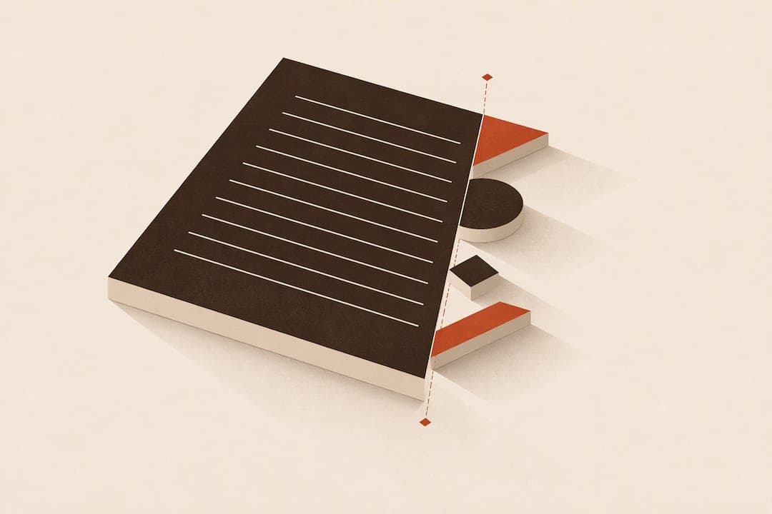
Optical margin alignment, also called hung punctuation or margin kerning, shifts certain glyphs slightly beyond a text block's edge so the margin appears optically straight. Use it for continuous body text and block quotes, where punctuation and angled letters can make a mathematically justified edge look ragged. Test it before applying near tables, gutters, or straight rules, since the illusion breaks down close to a visible geometric line.
TL;DR:
- Optical margin alignment is most effective for continuous body text and block quotes, where small visual gaps can become noticeable in justified paragraphs.
- It requires careful testing at the final size, especially near hard edges like tables, rules, or images, because overhangs become visible and can disrupt the illusion.
- InDesign allows for precise control by enabling the setting at the story level and adjusting overhang based on font size, but it may need specific overrides for elements like bullets or caps.
- Illustrator provides a simple toggle for spot fixes, while on the web, CSS hanging-punctuation offers a limited, partial solution that varies across browsers and EPUB readers.
- When used properly, optical margin alignment improves perceived edge straightness but should be applied as a final refinement, not a primary layout rule.
Table of Contents
- Why straight edges can still look uneven
- When optical margin alignment helps, and when it works against you
- Setting optical margin alignment in Adobe InDesign
- Optical margin alignment in Illustrator and on the web
- A workflow checklist for testing optical margin alignment
- Balancing typographic craft with client expectations
- How Alhora handles margin checks during formatting
- Sources
- FAQ
Why straight edges can still look uneven
A margin that is mathematically perfect on the page can still read as crooked to the eye. Letters and punctuation carry different amounts of visual mass, and when a line ends with a quotation mark, hyphen, or a diagonal letter, that mass sits inside the margin rather than filling it, creating an apparent gap. Margin kerning corrects this by nudging the offending glyph a fraction beyond the block's true edge, restoring the sense of a flush line.
The distinction matters: hung punctuation refers specifically to punctuation marks that hang outside the margin, while margin kerning is the broader adjustment applied to any glyph whose shape creates optical gaps. Research on the micro-typographic extensions to TeX frames this as part of a composition system that shifts selected glyphs beyond a block's mathematical edge so the visible ink edge reads straighter, working alongside line breaking and font expansion rather than replacing them.
Glyphs typically affected include:
- Quotation marks, apostrophes, and hyphens at line ends or starts
- Diagonal and rounded capitals such as A, V, W, and Y
- Periods, commas, and other punctuation with small visual footprint
- Certain symbols and numerals depending on the typeface's sidebearings
Because sidebearings and stroke weight vary by typeface, the amount of correction a font needs is never fixed. A condensed serif and a geometric sans will call for different treatment even at the same point size.
When optical margin alignment helps, and when it works against you
Optical margin alignment earns its place in specific contexts and can quietly damage others.
- Continuous body text benefits most, since paragraph after paragraph of justified or ragged type is exactly where small optical gaps accumulate and become visible.
- Block quotes often carry quotation marks at their edges, making them a natural candidate for the same treatment.
- Short centered lines that open or close with punctuation can look lopsided without it, particularly in pull quotes or captions.
- Display and headline type rarely needs it. Large point sizes make any overhang look like a mistake rather than a refinement, according to the Wikipedia entry on optical margin alignment.
- Narrow gutters, table cells, and text abutting a straight rule or image edge are poor fits, since a visible geometric boundary nearby exposes the overhang instead of hiding it.
- Bulleted and numbered lists sometimes look worse with margin kerning applied, since the hanging indent already creates its own edge logic; check case by case, and see how a related discussion around centered heading alignment handles similar edge conflicts.
Before committing, print a proof or view the page at final size, hide the text frame boundaries, and judge the margin without the crutch of a visible guide. Proximity to any hard edge, whether a rule, an image, or a table border, tends to defeat the illusion entirely.
Pro Tip: Zoom out to actual reading distance before judging the hang. Overhang that looks excessive at 200% often reads as perfectly correct at arm's length.
Setting optical margin alignment in Adobe InDesign
InDesign applies optical margin alignment at the story level, not per paragraph, so the setting affects every linked text frame in that story at once.
- Click into the text frame, then open Type > Story to reveal the Story panel.
- Check Optical Margin Alignment and enter a point-size value for the overhang amount.
- Use the same point size as your body text as a starting point, then adjust by eye.
- Apply Ignore Optical Margin Alignment at the paragraph level when a specific line, such as a table row or a line near an image, needs to opt out.
- Build the setting into an Object Style so every new text frame in a template inherits consistent behavior.
According to CreativePro's tutorial on hanging punctuation in InDesign, the overhang amount is commonly set by point size and refined visually rather than by formula, since font design changes what looks correct.
A common overhang starting point matches the body text's point size, according to CreativePro's InDesign tutorial. That figure works as a first pass, not a fixed rule, since serif weight and sidebearings shift the ideal amount.
If the hang looks too aggressive, punctuation will appear to float free of the text block. If it looks too timid, the margin will still show the same ragged edge you were trying to fix. Drop caps and bullet indents often need the Ignore Optical Margin override, since their geometry does not follow the rest of the paragraph.

Optical margin alignment in Illustrator and on the web
Illustrator offers a stripped-down version of the same feature, and the web relies on a CSS property that behaves differently across platforms.
- In Illustrator, open Type > Optical Margin Alignment and toggle it on or off. There is no numeric control, so the amount of overhang is fixed by the application.
- This toggle suits spot fixes on short passages of type but offers no way to fine-tune the hang for a specific typeface or size.
- On the web, the CSS property hanging-punctuation accepts values including
first,last,force-end, andallow-end, letting punctuation hang outside the line box. - Browser and EPUB reader support for
hanging-punctuationremains partial, so treat it as a best-effort enhancement rather than a guaranteed behavior across every rendering engine. - Build fallbacks into digital workflows: check how the property renders in the major browsers and in the ereader apps your readers actually use before relying on it for a finished layout.
Illustrator's simplicity works for a pull quote or a single headline. It falls short on longer passages where a font-aware, adjustable engine like InDesign's produces a more consistent result.
A workflow checklist for testing optical margin alignment
Optical margin alignment works best as the last adjustment in a sequence, not the first thing you reach for.
- Choose the final typeface and point size before touching margin settings, since both determine how much overhang looks correct.
- Set your measure and leading, and confirm the column width is final.
- Enable optical margin alignment at the story or paragraph level.
- Proof for rivers, widows, and orphans before judging the margin. Alhora's guide on catching widows, orphans, and runts covers checks worth running in the same pass.
- Adjust hyphenation and justification settings if lines still look uneven; margin kerning cannot fix bad line breaking.
- Run a print or screen proof with text frames hidden, then compare against a version with the setting turned off.
Research on pdfTeX margin kerning treats the technique as one part of a larger composition system that also includes font expansion and careful line breaking. It improves perceived edge regularity but does not substitute for solid justification, and rivers in justified text often need separate fixes, as covered in Alhora's piece on stopping rivers in ebook text.
Pro Tip: Export a test PDF and a test EPUB before finalizing. A hang that looks right in your layout app can render differently once the file leaves that application.
Balancing typographic craft with client expectations
Optical margin alignment is a refinement, not a requirement, and not every client or reader notices or wants it. Some prefer text that stays strictly within its column; others appreciate the polished edge once it is pointed out. When presenting the choice, show an A/B proof with the setting on and off, and explain the reasoning in terms of readability rather than personal preference. Note in your production files which frames have optical margin alignment turned off and why, since a future editor or collaborator will need that context when revising the layout.
— James
How Alhora handles margin checks during formatting
Getting a hang right by hand across a full manuscript takes patience, and print margins carry their own math on top of that. A typesetting engine applies justification, hyphenation, and margin logic consistently across a book-length manuscript, so a setting chosen for one chapter behaves the same in the next.

- The typesetting engine handles composition controls across the full manuscript, not paragraph by paragraph.
- A built-in proof simulator lets you check how text sits in print and ebook exports before publishing.
- The Book Margin Calculator works out recommended print margins for your trim size, a useful companion step when you are also fine-tuning optical alignment by eye.
If you are formatting a manuscript for print or digital release and want the composition checks handled for you, see Alhora's book formatting software for details on what the engine covers.
Sources
The definitions, tool steps, and research behind this guide come from the Wikipedia entry on optical margin alignment, Hàn Thế Thành's TeX research, CreativePro's InDesign tutorial, and MDN's hanging-punctuation reference. For file prep considerations around print margins and edges, see this printer's guide to artwork file prep.
- Micro-typographic extensions to the TeX typesetting system
- MDN — hanging-punctuation
- Hanging punctuation with optical margin alignment in InDesign — CreativePro
- Optical margin alignment — Wikipedia
FAQ
How do I set optical margin alignment in Illustrator?
Select the text, then open Type > Optical Margin Alignment and toggle it on. Illustrator offers no numeric control over the overhang amount, so it suits short passages and spot fixes rather than long-form body text.
What is an optical alignment?
Optical alignment refers to positioning text or glyphs so they appear visually even, even when that means departing from strict mathematical alignment. In typesetting, optical margin alignment is the specific technique of nudging certain letters and punctuation slightly beyond the margin so the block's edge reads as straight.
What are the four types of alignment?
The common text alignments are left, right, center, and justified, describing how lines sit relative to the column edges. Optical margin alignment is not a fifth alignment type; it is a refinement applied on top of whichever alignment you have chosen, most often justified or left-aligned body text.
How do I set optical margin alignment in InDesign?
Click into the text frame, open Type > Story, and check Optical Margin Alignment, then enter a point-size value for the overhang. The setting applies to the whole story, and you can override it on individual paragraphs using Ignore Optical Margin Alignment, as detailed in CreativePro's InDesign tutorial.
Does optical margin alignment work in ebooks?
The closest web and EPUB equivalent is the CSS property hanging-punctuation, which accepts values like first, last, and force-end. Support across browsers and ereader apps is partial, so treat it as a best-effort enhancement and test rendering in the readers your audience actually uses.