
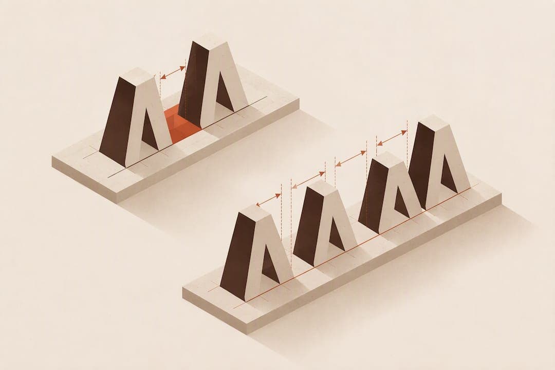
Kerning adjusts the space between two specific letters, while tracking changes spacing evenly across a range of characters, words, or a whole block of text. CSS handles both: letter-spacing controls tracking, and font-kerning toggles a font's built-in kerning tables. Leading, the vertical space between lines, is a separate control entirely. Tools like Adobe's kerning and tracking controls and formatting platforms rely on this distinction to keep type readable at any size.
TL;DR:
- Kerning is essential for adjusting problematic letter pairs, especially in large or display type, where default font metrics often under-correct common spacing issues.
- Tracking modifies spacing across an entire selection, and small positive or negative values in CSS are used to fine-tune overall density depending on context.
- It's best to set global tracking first for rhythm and texture, then manually kerning only the specific pairs that still appear uneven after that adjustment.
- Overtracking body text causes readability problems and is a common mistake, easily fixed by resetting spacing to default and applying small, targeted adjustments.
- Rely on font-kerning for most body text, reserving manual kerning for display or highly tapered type, and check adjustments at final output size and device to ensure proper spacing.
Table of Contents
- What kerning is and when it actually matters
- Tracking, letter-spacing, and how it shapes density
- How do you tell whether you need kerning or tracking?
- Adjusting kerning and tracking across design tools and CSS
- The workflow order that saves you rework
- Common mistakes and how to fix them fast
- Trusting the font versus stepping in yourself
- Turn typographic control into a finished book
- Sources
- FAQ
What kerning is and when it actually matters
Kerning is the process of adjusting space between two individual characters, using either the kerning pairs built into a font or manual overrides you set yourself, and it works differently from tracking, which changes spacing uniformly across a run of text, according to Wikipedia's entry on kerning. Most fonts ship with metrics kerning: a table of predefined pairs the type designer already balanced. Optical kerning, by contrast, calculates spacing based on the actual shapes of adjacent letters, which helps when you mix fonts or sizes that lack good built-in tables.

Kerning values are typically measured in units of 1/1000 em, and they scale with type size: a 20-unit adjustment reads differently at 12 points than at 72 points. This is why kerning rarely shows up as a concern in body paragraphs, where letters sit small and close together, but becomes critical in logos, headlines, and any short line of display type where every gap is visible.
Certain letter combinations cause trouble across nearly every typeface. Pairs like "AV," "To," and "WA" create awkward pockets of white space because of how their diagonal or curved strokes meet. Designers watch for these pairs specifically when setting large type, since a font's default kerning table often under-corrects them at bigger sizes.
Tracking, letter-spacing, and how it shapes density
Tracking spreads or tightens the space across a whole selection of characters at once, rather than targeting individual pairs, and it maps directly to the letter-spacing property in CSS. On the web, W3C guidance on inline spacing recommends specifying letter-spacing in em units so it scales proportionally with font size across different screens and layouts.
Practical ranges vary by context. Small positive tracking, often in the range professionals use for spaced caps and captions, opens up letters that would otherwise feel cramped when set in all capitals. Negative tracking, on the other hand, tightens large display headlines that would otherwise look loose or disconnected at scale.
Tracking and readability trade off differently depending on where you apply it. Body text set at default tracking is almost always the most legible option, since type designers already balanced spacing for continuous reading. Push tracking too far in either direction on a paragraph and reading speed drops. Display text tolerates far more adjustment: a tightened headline or a widely tracked all-caps label can look intentional rather than broken, as long as you check it at final size.

How do you tell whether you need kerning or tracking?
The core difference comes down to scope: kerning fixes a single problem pair, tracking adjusts an entire range. That distinction matters because tracking can hide a kerning problem rather than solve it. If you widen tracking across a whole headline to fix one ugly gap between two letters, you've changed the rhythm of every other pair just to patch one spot.
A few quick diagnostic checks help you decide which tool to reach for:
- Toggle font-kerning off and on to see whether the font's built-in table is already handling the pairs you're worried about.
- Apply a small tracking delta, something like plus or minus 0.01em, and watch whether the whole line improves or just shifts the same problem sideways.
- Zoom to the actual output size, since spacing that looks fine at 100% zoom can open up visible gaps once a headline hits full display scale.
- Inspect the specific gap rather than the whole line: if only one or two pairs look off while the rest of the line reads evenly, that's a kerning job, not a tracking job.
For numeric starting points, tight display headlines often land within a small negative range of overall tracking, while spaced-out caps or small labels tend to be set with modest positive tracking, according to typographic guidance from Typography Master. Reach for kerning instead of tracking whenever a global adjustment would fix one pair but throw off the rhythm of everything around it, since that's exactly the situation kerning exists to solve.
Adjusting kerning and tracking across design tools and CSS
Every major desktop app groups these controls in a similar spot, and the web version works almost the same way once you know the property names.
In Illustrator, InDesign, and Photoshop:
- Select your text and open the Character panel, where kerning and tracking sit as adjacent fields.
- Choose Metrics or Optical from the kerning dropdown, or switch to Optical when you're mixing fonts or sizes.
- Place your cursor between two letters and use Alt (Option on Mac) plus the left or right arrow key to manually kern that specific pair.
- Hold Ctrl (Cmd on Mac) plus Alt (Option) and press the arrow keys to adjust tracking across a wider selection.
- Reset a value to zero by selecting the text and typing 0 directly into the kerning or tracking field.
In CSS:
- Set
letter-spacingin em units rather than pixels, so spacing holds its proportion as font size changes across breakpoints. - Add
font-kerning: normal;to make sure the browser applies the font's built-in kerning tables rather than skipping them for rendering speed. - A heading might use
letter-spacing: -0.03em;for a tightened display look, while a small caps label might useletter-spacing: 0.05em;for legibility.
Desktop apps generally work in 1/1000 em units because that's how font kerning tables are built, while CSS favors plain em values since they scale cleanly across responsive layouts, a distinction W3C's inline spacing guidance addresses directly for web typography. Avoid adjusting tracking on body paragraphs regardless of platform, and always check your spacing choices at the final output size and on the actual devices readers will use, since a laptop screen and a phone screen render fine spacing differently.
The workflow order that saves you rework
Professional practice recommends setting overall tracking first to establish the texture of a line, then applying manual kerning only to the pairs still causing trouble, according to typography usage guidance from the University at Buffalo. This order matters because kerning and tracking values are cumulative and calculated relative to the current type size, so kerning a pair before your tracking is finalized means redoing that kerning work once tracking shifts, as Adobe's documentation notes.
A simple four-step checklist keeps this manageable:
- Choose your type size first, since kerning and tracking values scale with it.
- Set overall tracking to establish the texture you want for the line or block.
- Toggle font-kerning on to let the font's built-in table handle the majority of pairs automatically.
- Manually kern whatever pairs still look wrong without touching the tracking you already locked in.
Pro Tip: Lock your tracking value before you start manual kerning, so you're never chasing a moving target.
Common mistakes and how to fix them fast
Overtracking body text is the most frequent error, and it's easy to reverse: select the paragraph and reset letter-spacing to 0 or its default value, then only adjust if there's a clear reason. Negative tracking pushed too far on small text causes letters to collide or touch, which you can catch by checking a printed proof or a zoomed screenshot at actual size.
Font-kerning sometimes gets switched off by accident, especially when copying styles between elements, and it's worth double-checking your CSS or Character panel settings if spacing suddenly looks uneven. Switch to optical kerning when you're combining mixed fonts or sizes, since built-in kerning tables often fall short in those situations, a limitation covered in Apple's font technology documentation.
- Check a printed proof and a few device screens, not just your editing software's preview.
- Reset kerning and tracking to zero before troubleshooting, then rebuild adjustments from a clean baseline.
- Test small deltas, quarter-point or half-point changes, rather than large jumps that overcorrect.
Trusting the font versus stepping in yourself
Metric kerning built into a font is good enough for almost all body text, and second-guessing it paragraph by paragraph wastes time better spent elsewhere. Manual kerning earns its place in display type: a book title on a cover, a chapter heading, a single line where every letter carries weight. A stubborn gap between two capital letters in a title can look sloppy until a two-unit nudge closes it, and that's the kind of fix worth doing by eye rather than by formula. For the spacing decisions specific to book interiors, from paragraph texture to line spacing, the Alhora blog covers those contexts in more depth.
— James
Turn typographic control into a finished book
Getting kerning and tracking right in a headline is one thing. Carrying that same control through an entire manuscript, across paragraph styles, drop caps, and every export format a retailer accepts, is a different job, and it's the one Alhora is built for. Its typesetting engine applies the spacing, justification, and hyphenation rules professional formatters rely on automatically, so you're not manually kerning every chapter heading across a 300-page book.
Where design software like Illustrator or InDesign gives you granular control over a single spread, some book formatting software is built to carry those same typographic decisions consistently across an entire book, then export it ready for multiple publishing platforms. Authors and formatters working on a full manuscript can see how this fits their workflow on the book formatting software page, or go straight to the Mac or Windows version to start formatting a project today.
Sources
- Kerning and tracking (InCopy help) — Adobe
- Kerning — Wikipedia
- Managing inline space — W3C
- Typography usage guidance — University at Buffalo
FAQ
What are the four types of typography?
Typography is commonly grouped into serif, sans serif, script, and display categories, each suited to different tones and reading contexts. Serif and sans serif dominate body text, while script and display styles tend to appear in headlines, logos, and short decorative lines.
What is tracking in typography?
Tracking is the uniform adjustment of space across a range of characters, words, or an entire block of text, rather than between just one pair of letters. On the web it corresponds to the CSS letter-spacing property, and professionals commonly set it in em units so it scales with font size.
Is tracking the same as letter spacing?
Tracking and letter-spacing describe the same uniform spacing adjustment, with "tracking" used more often in design software like Illustrator and InDesign and "letter-spacing" used as the CSS property name on the web. Both apply evenly across a selection rather than targeting a specific pair.
What's the opposite of kerning?
There isn't a single named opposite, but tracking is the closest contrast, since it changes spacing uniformly across a range instead of adjusting one specific pair. Where kerning targets an individual gap, tracking treats the whole selection the same way.