
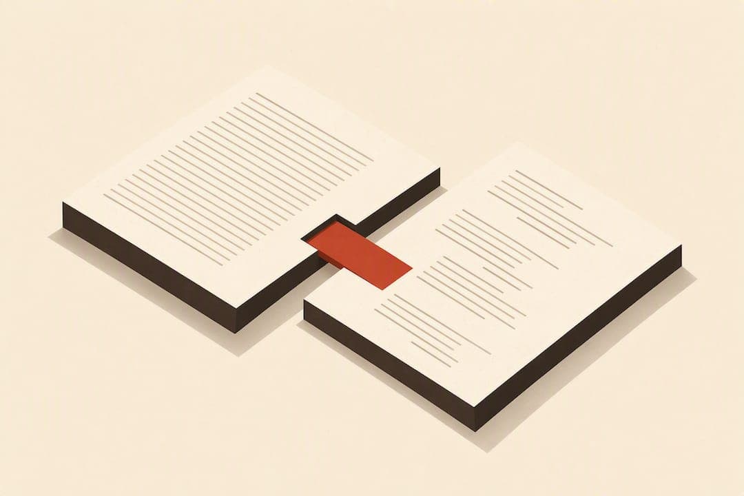
The single most important rule in poetry book formatting is this: preserve every intentional line break, and choose a trim size and layout that won't force your lines to reflow. Before you touch a single poem, run three checks: confirm your trim size against your longest line, use manual line breaks instead of letting your word processor wrap lines on its own, and order a physical proof at final trim size before you call the file done.
TL;DR:
- A trim size must be based on your longest poem line to prevent reflows that distort rhythm and meaning during printing and digital formats.
- Maintain wide margins and use the one poem per page rule to ensure visual breathing space and avoid confusing page breaks.
- Use Shift+Enter for line breaks and only Enter for stanza or poem breaks to preserve stanza integrity across formats.
- Choose a simple, legible font like Garamond or Baskerville at 11pt with appropriate leading (1.25 to 1.5 times font size) to control pacing and avoid congestion.
- Always proof your final files on physical prints and actual e-reader devices to catch margin issues, improper line breaks, and special character errors before publishing.
Table of Contents
- What Is Poetry Book Formatting, Exactly?
- Essential Formatting Checklist: Trim, Margins, and Page Breaks
- Typography and White Space: Fonts, Leading, and Stanza Spacing
- Line Breaks, Manuscript Mechanics, and Tool-Specific Tips
- Preparing Print and Ebook Files and Proofing
- How Alhora and James Approach Poetry Formatting
- Handling Special Characters and Diacritics in Poetry
- Hyphenation and Line Justification Best Practices
- Guidance on Incorporating Author Notes or Commentary
- Indexing Poems or Themes Within the Book
- Cover Formatting Basics for Typography and Imagery
- Craft First, Production Second: A Formatting Philosophy
- Get Your Poetry Manuscript Formatting Right the First Time
- Sources
- FAQ
What Is Poetry Book Formatting, Exactly?
Poetry book formatting is the set of layout decisions, trim size, margins, line spacing, font, and page breaks, that determine whether a poem appears on the page the way the poet intended it. It's a different discipline from prose formatting. A novel can reflow across devices and trim sizes without losing meaning. A poem can't. Move one line to the next page, and you've changed the poem's rhythm, its breath, sometimes its meaning entirely.
That distinction is why professional formatting guides treat layout as an extension of the poet's voice rather than a cosmetic afterthought. Editors and readers focus on rhythm and pacing when the formatting gets out of the way. When it doesn't, a five-line stanza turns into three lines on one page and two orphaned lines on the next, and the poem stops working.
Self-publishing poetry books adds a second layer of complexity most fiction authors never face: you're formatting for both a fixed print trim and a reflowable digital format, often from the same manuscript. Getting both right means understanding where poetry formatting tips overlap with standard book design, and where poetry demands its own rules entirely.
Essential Formatting Checklist: Trim, Margins, and Page Breaks
Before you format a single poem, lock down four structural decisions. Get these wrong and you'll be redoing every poem in the book later.
Pick your trim size by measuring your longest line first, not by picking a size you like the look of. The three trims that dominate poetry publishing are 5"×8", 5.5"×8.5" (often called digest size), and 6"×9". A 5.5"×8.5" digest trim is the most common choice for a reason: it balances a comfortable line length against a page count that doesn't feel padded. If your longest line runs 14 to 16 words, a 5"×8" trim will force runovers on nearly every poem. Measure your longest line in your working font and size, then test it against the live text width of each trim before you commit.
Here's what each trim actually does to your manuscript:
- 5"×8": Tightest line length, works best for shorter-lined free verse and minimalist collections.
- 5.5"×8.5": The most forgiving digest trim for mixed line lengths, the safest default for most poetry collections.
- 6"×9": Widest live text area, useful for longer narrative lines or collections with prose poems mixed in.
Set margins wider than the platform minimum. Amazon KDP requires a minimum interior margin that scales with page count, but minimums exist to prevent text loss during trimming, not to produce good design. Professional poetry layouts typically start at 0.75" to 1" outer margins and 0.5" to 0.75" gutter margins on the binding side, adjusted upward as page count increases. Tight margins make a poetry collection feel cramped, which is the opposite of the white space poems need to breathe.
Apply the one poem per page rule wherever the poem allows it. A single short poem sharing a page with another poem's ending confuses the eye and undercuts both pieces. If a poem runs longer than one page, break it at a stanza boundary, never mid-stanza, and never leave a single orphaned line stranded at the top or bottom of a page.
Center the poem block on its longest line, not on the full text-block width. This technique preserves visual weight and keeps short lines from drifting awkwardly against the left margin when the whole block is centered on the page instead. Most formatting software handles this automatically once you define a poem's frame, but if you're working manually, measure the longest line's width and center that block, letting every other line align left within it.
Typography and White Space: Fonts, Leading, and Stanza Spacing
Font choice in poetry books should stay quiet. A serif typeface like Garamond, Baskerville, or Adobe Caslon does the job without calling attention to itself, and that's the point: gimmick fonts and novelty formatting read as unprofessional to most editors, no matter how well-intentioned. Body text usually sits between 10pt and 12pt, with 11pt the most common choice for poetry. Poem titles typically run 2 to 4 points larger than the body, often in the same serif family, sometimes in small caps.
Leading, the vertical space between lines, matters more in poetry than almost anywhere else in book design because it controls pacing. The standard range is 1.25 to 1.5 times your font size. At 11pt, that puts your leading between 13.75pt and 16.5pt. Too tight, and stanzas feel congested. Too loose, and the poem loses its sense of connected breath between lines.
Pro Tip: If a poem feels rushed on the page even though the line breaks are correct, try increasing leading toward the 1.5x end of the range before you touch anything else. Pacing problems are often spacing problems.
A few settings to lock in before you format your first poem:
- Set stanza spacing using paragraph "space after" values, not extra blank lines. Blank line breaks reflow unpredictably across formats; a defined space-after value doesn't.
- Never double-space poetry body text. Line spacing settings handle rhythm; double spacing is a manuscript-submission convention, not a finished-book one.
- Define a hanging indent for runover lines (long lines that wrap) so the wrapped portion is visually distinct from a new line, typically indented 0.25" to 0.5".
- If runovers happen on nearly every poem, the real fix is usually a wider trim, not a hundred manual indent adjustments.
Line Breaks, Manuscript Mechanics, and Tool-Specific Tips
The mechanical distinction that trips up more poets than any other formatting rule: use Shift+Enter for line breaks within a stanza, and Enter only between stanzas. Getting this backward is one of the most common manuscript errors, because Enter creates a new paragraph, and paragraph settings (including your stanza spacing) apply to every line you've broken that way. The result: stanza spacing that looks fine on your screen and falls apart the moment the file gets reflowed for a different format.
Here's the sequence that keeps a manuscript clean from first draft to final proof:
- Build a poem paragraph style first, before typing a single poem. Set its leading, space-after, and indent values once, and apply it consistently.
- Type line breaks with Shift+Enter, stanza breaks with Enter, every time, without exception.
- Insert an actual page break (Insert > Page Break, never a string of empty paragraph returns) between separate poems.
- Apply a heading style to poem titles so your table of contents can generate automatically instead of being built by hand.
- Lock the paragraph style before final export and check every poem against it, since pasted text sometimes carries hidden formatting from its source.
Word handles this well once you've built the paragraph style and applied a hanging indent for runovers. Pages tends to interpret line breaks more literally, which helps with stanza integrity but can fight you on runover indents. InDesign gives you frame-level control that neither word processor can match, which is why many formatting studios and typesetting services move to it for collections with complex visual poems, concrete poetry, or unconventional spacing that a standard paragraph style can't capture.
Watch for three pitfalls that surface late: auto-hyphenation breaking a word your poem never intended to split, auto-capitalization "correcting" a deliberate lowercase line-start, and forgetting that every runover indent you set manually has to be rechecked if you change your trim size afterward.
Preparing Print and Ebook Files and Proofing
Your print PDF checklist has four non-negotiables: embed every font (never rely on the reading system having it installed), flatten all layers, confirm your trim and bleed settings match your platform's specs exactly, and, if your interior runs 48 pages or more, decide on perfect binding rather than saddle stitch so the spine can carry text. Below that page count, saddle stitch is usually cheaper and lies flatter on the page, which matters for a poetry book readers will keep open while reading.
KDP and IngramSpark both publish minimum margin requirements, but minimums are a floor, not a design target. Professional layouts generally build in noticeably more white space than either platform requires, because tight margins make a poem look cramped even when they're technically compliant.
Ebooks introduce a constraint print never has: reflowable EPUB text resizes to fit the reader's screen and font choice, which is exactly what a poem's line breaks can't survive unmanaged. Complex layouts often need a fixed-layout EPUB or specific markup workarounds, like forced line breaks and indent tags, that emulate the runover behavior your print edition handles natively. Test every poem with a runover on an actual e-reader, not just in preview mode.
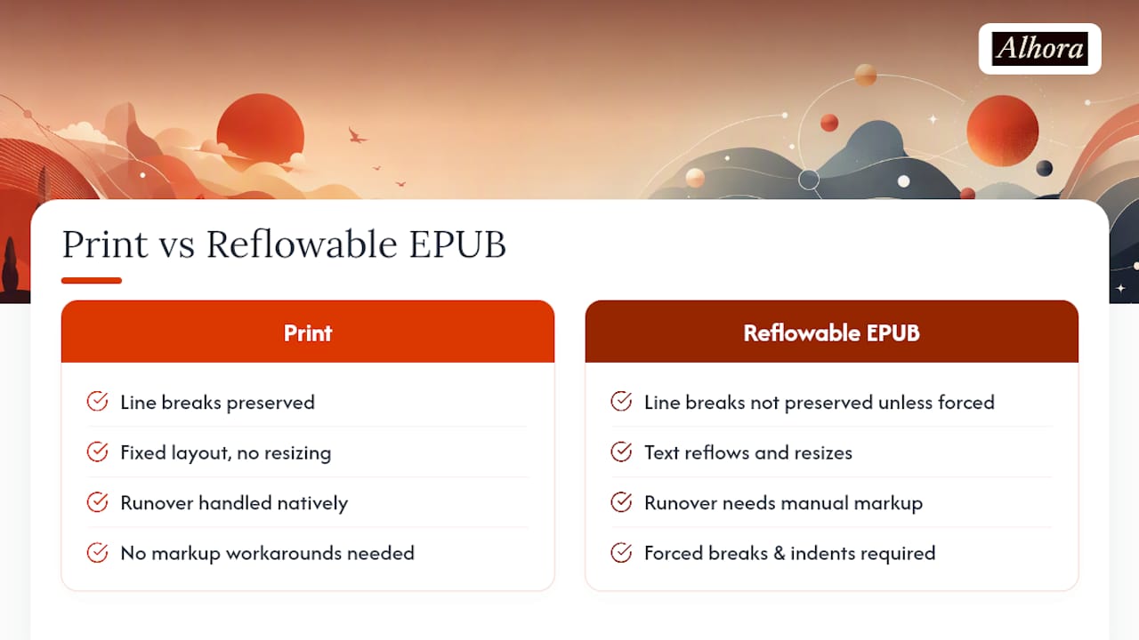
Before you call any file final, order a physical proof at your exact trim size. Screen previews miss margin problems, leading that reads differently under print lighting, and page breaks that looked fine digitally but land badly on paper.

How Alhora and James Approach Poetry Formatting
The workflow that avoids most late-stage rework runs in a fixed order: pick your trim size, build your poem paragraph style, set leading and stanza spacing, proof every runover, then export for print and EPUB together so you catch mismatches early instead of after the fact.
Some book formatting software runs real-time validation against publishing standards as you build the file, so a margin or trim problem surfaces while you're still working, not after upload. Its typesetting engine handles leading, stanza spacing, and runover indents consistently across the manuscript, and its built-in assistant, Inkia, flags formatting issues without touching your creative text. What James checks last, every time: embedded fonts and a final proof at trim size. Those two things catch what screens can't.
Handling Special Characters and Diacritics in Poetry
Poets write with accents, em dashes, ligatures, and non-English characters more often than most prose authors, and formatting software doesn't always preserve them correctly across export formats. A poem that quotes French, Spanish, or Irish requires diacritics like é, ñ, or ó to survive the trip from manuscript to print PDF to EPUB without corrupting into a substitute character or a blank box.
The safest practice is to type special characters using your word processor's native input rather than pasting them from a web source, since pasted text sometimes carries hidden font substitutions that don't map correctly once exported. Before final export, search your manuscript for every diacritic and special character you've used, and check each one in the exported print PDF and the EPUB file separately. Print and digital formats sometimes handle the same character differently, especially with older or less common Unicode symbols.
Em dashes and en dashes deserve their own check. Poets use them for very different rhythmic effects, a hard stop versus a softer connector, and autocorrect settings in Word and Pages frequently convert one into the other without asking. If a poem depends on that distinction, turn off autocorrect for dashes before you start formatting, not after you've typed 60 poems.
Hyphenation and Line Justification Best Practices
Turn off automatic hyphenation for the entire manuscript. A word processor's hyphenation algorithm doesn't know that breaking a word mid-line in a poem changes its visual and rhythmic weight in a way it never would in a prose paragraph. Manual control matters more here than almost anywhere else in book design.
Justification deserves the same caution. Fully justified text (flush on both left and right margins) stretches word spacing to fill the line, which works fine in a prose paragraph but distorts a poem's intended rhythm by inserting irregular gaps between words the poet never wrote there. Left-aligned, ragged-right text is the standard for poetry for exactly this reason: it preserves the poet's actual spacing decisions instead of a program's attempt to even them out.
The one exception worth knowing: some formal or visually structured poems intentionally use justified or centered text as part of their shape on the page, concrete poetry and some centered free verse being the clearest examples. In those cases, justification is a deliberate craft choice, not a default setting, and should be built into that poem's specific formatting rather than applied manuscript-wide.
Guidance on Incorporating Author Notes or Commentary
Author notes, whether they explain context behind a poem, translate a foreign phrase, or offer a brief reflection, need clear visual separation from the poem itself so a reader never confuses commentary with the poem's own lines. The most common approach is a smaller point size, often 1 to 2 points below body text, set in italics or a light-weight version of the same serif font, placed either directly beneath the poem or gathered in a dedicated notes section at the back of the book.
Placing notes at the back keeps the poem's page visually clean and lets the reader choose whether to break rhythm and consult a note or read straight through. Placing notes directly under each poem sacrifices some visual purity but works better for collections where context is essential to understanding, translated work or poems referencing specific historical events, for instance.
Whichever placement you choose, apply it consistently across the entire collection. A book that footnotes some poems and appends notes for others at the back reads as inconsistent, and it forces the reader to relearn your system every few pages.
Indexing Poems or Themes Within the Book
A full poetry collection doesn't strictly need an index the way a nonfiction book does, but a well-organized table of contents functions as one when it's built with intention. List poems in the order they appear, and if your collection groups poems into thematic sections, name those sections clearly in the TOC so a reader or reviewer can navigate by theme rather than only by page number.
For longer collections, a second index listing poems alphabetically by title, common in retrospective or "selected works" collections, gives readers and reviewers a faster way to locate a specific piece they remember by name rather than by its position in the book. This is optional for a debut collection but becomes genuinely useful once you're publishing a third or fourth book and readers start requesting specific poems from earlier work.
Build your table of contents from heading styles applied to poem titles, not by typing page numbers manually. A manually typed TOC breaks the moment you add, remove, or reorder a single poem, and reordering poems is one of the most common revisions a manuscript goes through before final approval.
Cover Formatting Basics for Typography and Imagery
A poetry cover carries more weight than most genre covers because it has less room to work with, no character art, no genre iconography readers instantly recognize, just typography, color, and often a single evocative image. The title typography usually gets more visual space on a poetry cover than on a novel cover, and font choice should echo the tone of the collection: a delicate serif for lyrical or meditative work, a bolder sans serif for urgent or contemporary free verse.
Keep cover text legible at thumbnail size, since most readers will encounter the cover first as a small image on a retail page before they ever hold the physical book. That means avoiding overly thin fonts or busy background imagery behind the title text. Contrast between title and background matters more on a poetry cover than almost any other design choice, because there's rarely a large illustration doing the work of catching the eye instead.
Front matter and interior order should follow standard book convention regardless of cover style: title page, copyright page, dedication (if included), then the table of contents, before the poems begin. That sequence is what readers and reviewers expect, and deviating from it without reason reads as an oversight rather than a stylistic choice.
Craft First, Production Second: A Formatting Philosophy
Every rule in this guide serves one priority: preserve the poem's line-level intention before you optimize anything else. Page count, binding cost, and print margins matter, but they're secondary decisions that should bend around the poem, not the other way around.
That said, know when to call in a designer or typesetter. Concrete poetry, visual shape poems, and collections with unconventional spacing often exceed what a standard paragraph style can handle cleanly, and that's not a failure of skill, it's a different job.
Sequencing matters as much as layout. Open with a poem that sets tone rather than your strongest piece, and distribute your best work throughout the collection instead of front-loading it. Readers sustain attention longer when strength is spread, not stacked.
— James
Get Your Poetry Manuscript Formatting Right the First Time
Some book formatting software gives you real-time validation against KDP and IngramSpark standards as you build your poem paragraph styles, so a margin or leading mistake surfaces while you're still working instead of after you've already uploaded a file.

A typesetting engine can handle stanza spacing, runover indents, and leading consistently across a collection, and export to both print-ready PDF and EPUB from the same file, which matters when maintaining line-level intention across formats that behave differently. A built-in assistant may flag formatting inconsistencies as you work but never rewrite or alter your poems. A first session in Alhora's book formatting software typically covers setting your trim size, building your poem style, and running a proof export, enough to see whether every line break landed where you intended. If you're preparing files specifically for Amazon, the KDP-focused formatting tools walk through platform-specific margin and export checks before you submit. Start a session and see your first poem proofed at final trim size.
Sources
For platform specs and further formatting examples, consult BookBaby's poetry formatting guide, Kent Poetry's manuscript mechanics, and Alhora's KDP margin requirements breakdown.
- Formatting a Poetry Manuscript – Home
- How to Write a Poetry Collection for Print (2026 Guide) : Publishing Xpress
- Shapes on the page: How to format poetry
FAQ
How Should a Poetry Book Be Formatted?
Preserve every intentional line break using manual breaks rather than automatic text wrap, choose a trim size based on your longest line, and keep one poem per page wherever the poem's length allows it.
What Are the Three R's of Poetry?
Definitions vary by source and context, and no single formatting-specific version applies universally, so treat any "three R's" framing you encounter elsewhere with caution rather than as an established formatting rule.
What Is the Proper Format for a Poetry Manuscript?
A submission-ready poetry manuscript typically uses a standard serif font at 11 to 12pt, one poem per page, and consistent stanza spacing built through paragraph styles rather than manual blank lines, with Shift+Enter used for breaks within a stanza.
What Are the Typical Dimensions of a Poetry Book?
The three most common trim sizes are 5"×8", 5.5"×8.5" (digest, the most frequent choice), and 6"×9", with the right choice depending on your longest line length.
Does Formatting Software Like Alhora Change My Poems?
No. Alhora validates layout against publishing standards and flags formatting issues through its Inkia assistant, but it never writes or alters your creative text.