

Skip decorative image-based drop caps in reflowable ebooks. They break across devices and trip up screen readers. Use CSS ::first-letter with relative sizing, build in a fallback, and test before you publish. A validated export tool like Alhora catches rendering problems before readers ever see them.
TL;DR:
- Drop caps should be avoided in ebooks with assistive technology users, unless implemented with CSS techniques proven to be reliable across platforms.
- The
::first-letterpseudo-element is the most accessible and predictable method, but support forinitial-letterremains inconsistent across reading systems.- Authors must test drop caps on at least three devices, including screen readers and different orientations, to ensure proper rendering and accessibility.
- Kindle's conversion process often strips or alters CSS effects, making simple
::first-letterstyling more reliable thaninitial-letter.- Replacing drop caps with enlarged first words or decorative elements provides a safer, more consistent visual cue for digital chapter openings.
Table of Contents
- Should You Use Drop Caps in Your Ebook?
- What Are the Safest CSS Techniques for Drop Caps?
- How Do You Add a Drop Cap to an EPUB File?
- Does Kindle Handle Drop Caps Differently?
- How Do You Test and Build in Fallbacks?
- What Are Good Alternatives to Drop Caps?
- An Editor's View on When Drop Caps Are Worth the Risk
- Get Drop Caps and Formatting Right the First Time
- Where to Learn More About Accessible Drop Caps
- Sources
Should You Use Drop Caps in Your Ebook?
Drop caps earn their keep in specific genres. Historical fiction, epic fantasy, and illustrated storybooks lean on that opening flourish to signal "settle in, this is a chapter." A contemporary thriller or a technical nonfiction title gains nothing from one and risks more.

The trade-off is real: a drop cap can make a chapter opening feel considerably more finished, but reflowable EPUB and Kindle formats render that same flourish unpredictably across devices. What looks elegant in Apple Books can collapse into a stray oversized character in an older Kindle app.
Before you commit, run through this checklist:
- Audience sensitivity. Publishing for readers who use screen readers, have dyslexia, or rely on assistive tech? Skip the drop cap or use only the safest CSS method.
- Platform spread. Selling across KDP, Apple Books, Kobo, and Google Play multiplies the number of rendering engines your design has to survive.
- Testing capacity. If you can't preview the result on at least three reading systems, don't ship it.
- Fallback plan. Decide now what happens if the drop cap fails to render, before you're troubleshooting a live file.
If your storybook or illustrated title leans heavily on visual design, the step-by-step print layout guidance for children's books is worth a look for print-first thinking.
What Are the Safest CSS Techniques for Drop Caps?
The ::first-letter pseudo-element is the method to reach for first. It targets the first character of a paragraph without inserting extra markup, which matters more than it sounds. According to AccessibleWeb's research on CSS pseudo content, this approach is the most accessible because it leaves the actual text intact for screen readers instead of splitting it into separate elements.
A basic implementation floats the letter, sets a larger font size, and controls line height so surrounding text wraps cleanly:
- Use
float: leftto let body text wrap around the letter. - Set
font-sizeinemunits, not pixels, so the drop cap scales when a reader adjusts their font size. - Adjust
line-heighton the drop cap itself to control how many lines of text it spans.
CSS initial-letter is the more modern option and, in theory, cleaner. It lets you specify how many lines tall the letter should stand. The catch: support for initial-letter remains partial across reading systems, so treat it as a progressive enhancement, not your only method.
Avoid wrapping the first character in an image or a styled <span> with a background graphic. That approach frequently causes screen readers to either skip the letter or read it twice, once as the image and once as the surrounding word.
Pro Tip: Always size drop caps in em units, never pixels or points. A reader who bumps their font size up two notches on a Kobo shouldn't end up with a drop cap that overlaps three lines of body text.
How Do You Add a Drop Cap to an EPUB File?
Calibre's built-in editor is the most accessible tool most indie authors already have for this. Here's the workflow:
- Open your EPUB in Calibre's ebook editor and locate
stylesheet.cssin the file browser. - Add a
.dropCharacterclass targeting the first paragraph of a chapter, using::first-letterwhere possible rather than wrapping a character in a span. - If your toolchain forces you to wrap the character manually, do it only for that single letter. Never wrap the whole first word.
- Apply the class to the opening paragraph of each chapter individually. Evelyn Chartres's Calibre walkthrough covers this chapter-by-chapter process in detail, including how quotation marks and inline italics can throw off your selector.
- Save your changes and preview inside Calibre before exporting.
- Load the finished EPUB into Apple Books, Kobo's desktop app, and a Readium-based reader to compare rendering.
Watch for two common failure points: a chapter that opens with a quotation mark (which becomes the "first letter" instead of the intended character) and any paragraph with inline formatting tags wrapping that first letter. Both need manual checking, not assumptions.
Does Kindle Handle Drop Caps Differently?
Yes, and this is where most authors get burned. Kindle's rendering pipeline converts your file into KPF or KFX format, and that conversion can strip or alter CSS effects that displayed fine in your EPUB. What renders as a crisp drop cap in Calibre's previewer might flatten into a plain oversized letter, or nothing at all, once KDP processes it.
- Stick with
::first-letteroverinitial-letterfor Kindle, since it degrades more predictably when support is inconsistent. - Consider a raised cap instead of a full multi-line drop cap. It's a smaller visual change and survives conversion more reliably.
- Always run your file through the KDP previewer before publishing, checking multiple font sizes and both portrait and landscape orientation on tablet views.
Treat the previewer as a required step, not an optional one. It's the only way to see what Amazon's own pipeline actually does to your CSS.
How Do You Test and Build in Fallbacks?
Testing a drop cap on one device tells you almost nothing. Reading systems interpret CSS differently enough that a style needs real cross-device scrutiny before it goes into a finished book.
Run these checks:
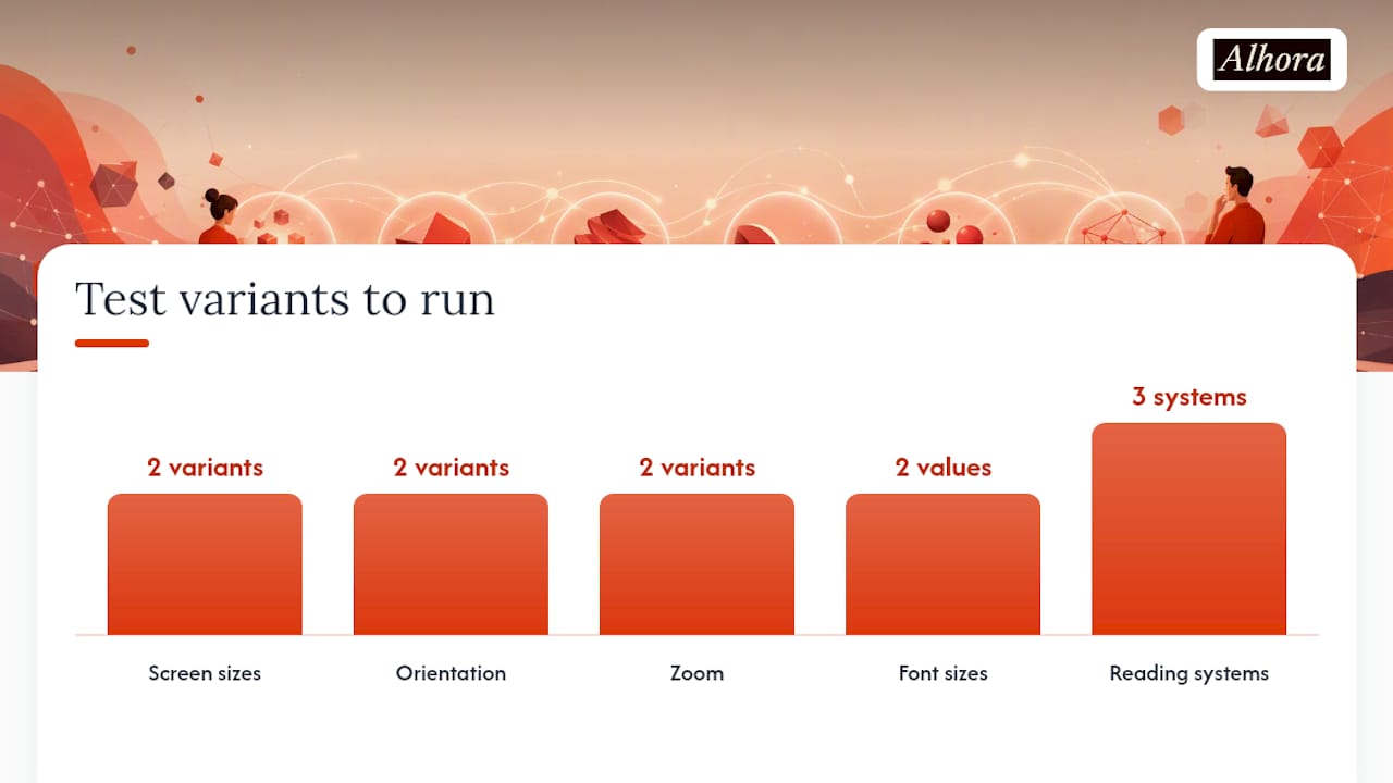
- View the chapter opening on both a phone-sized screen and a full tablet or e-reader.
- Zoom the text in and out, and rotate between portrait and landscape.
- Change the reader's font size setting to at least two different values.
- Turn on a screen reader (VoiceOver, TalkBack, or a desktop equivalent) and listen to how the opening paragraph gets read aloud.
One useful discipline: build a single-chapter test EPUB with only your drop cap style applied, then preview it across at least three reading systems and run it through an accessibility validator before touching your full manuscript. Fix problems there, not after you've applied the style to twenty chapters.
If any of these checks fail, your fallback should already be decided: switch to a raised cap, enlarge the first word instead, or drop the flourish entirely for the ebook edition while keeping it for print. The DAISY Accessible Publishing Knowledge Base frames this plainly: drop caps are genuinely difficult to make both consistent and accessible at once, so a graceful fallback isn't a compromise, it's the standard.
What Are Good Alternatives to Drop Caps?
A raised cap gives you most of the visual signal with a fraction of the risk. It's just a larger capital letter sitting on the same baseline as the rest of the line, styled with a bigger font-size and sometimes a different font weight, no floating or line-spanning required.
Other options that hold up better across reading systems:
- Enlarged first word or two, sometimes paired with small caps or slightly wider letter spacing, to mark a chapter opening without any layout risk.
- A short decorative ornament (a small glyph or symbol) centered above the first line, which doesn't interact with the paragraph's text flow at all.
- A blank line or extra spacing before the chapter's first paragraph, a minimal but effective visual pause.
Many working authors keep the full drop cap for their print edition and switch to one of these for the ebook, a compromise that The Book Designer's guidance on chapter openings treats as standard practice rather than a downgrade.
An Editor's View on When Drop Caps Are Worth the Risk
Alhora's typesetting checks flag drop caps more often than any other decorative element authors ask about, and there's a reason for that. The letter itself isn't the problem. The problem is that authors test it once, on their own laptop, in their own reading app, and assume that's representative. It rarely is.
Alhora's validation runs a manuscript through the rendering realities of multiple platforms before export, which catches exactly the kind of silent failure a single preview misses. When a drop cap genuinely serves the book, that AI-assisted check flags formatting risk without touching your prose. When it doesn't, you'll know before a reader does. If you're formatting a series or a heavily designed title, that's the point where hiring a professional formatter or leaning on validated software stops being a luxury and starts being basic risk management.
— James
Get Drop Caps and Formatting Right the First Time
Alhora is the alternative to guessing whether your chapter openings will survive contact with Kindle's conversion pipeline. Its typesetting engine handles justification, hyphenation, and widow and orphan control automatically, and validates your EPUB and Kindle exports across the platforms you're actually publishing to, KDP, Apple Books, Kobo, Draft2Digital, and more, before you hit upload.

That validation extends to accessibility checks, so a drop cap or any other typographic flourish gets flagged if it's likely to cause screen reader trouble instead of surviving only as a hopeful guess. The AI-assisted proofreading engine spots formatting risks without rewriting a word of your manuscript, keeping full creative control in your hands. If you're tired of previewing chapter openings on five different apps and still finding surprises, start formatting your manuscript with Alhora and see your export validated before it ever reaches a reader.
Where to Learn More About Accessible Drop Caps
For deeper technical grounding, the DAISY Accessible Publishing Knowledge Base covers accessibility standards directly. Evelyn Chartres's Calibre tutorial walks through hands-on EPUB editing, and Amazon's KDP resources cover previewer tools for Kindle files.